
An Interest In:
Web News this Week
- April 1, 2024
- March 31, 2024
- March 30, 2024
- March 29, 2024
- March 28, 2024
- March 27, 2024
- March 26, 2024
Some of Our Sources
- BoingBoing
- Mashable
- Pearsonified
- Six Revisions
- Line 25
- Specky Boy
- Spyre Studios
- Design Modo
- Android Dissected
- Dev To
Help Webnuz
Referal links:
Creating a fun, fast, secure and sustainable website
In the last couple of months, I've been writing (some would say preaching!) about security, performance, accessibilty and other aspects of frontend development.
Then I discovered, that my own website hadn't been updated in almost 10 years, and didn't really live up to my current standards!
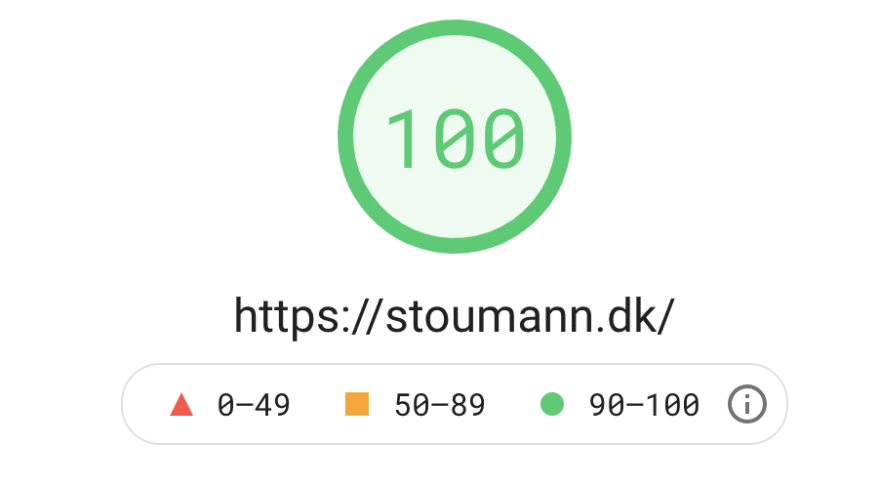
In this post, I'll show you how I re-wrote my site, and achieved the perfect Lighthouse score:

Before I started out, I set some goals for the site:
Playful
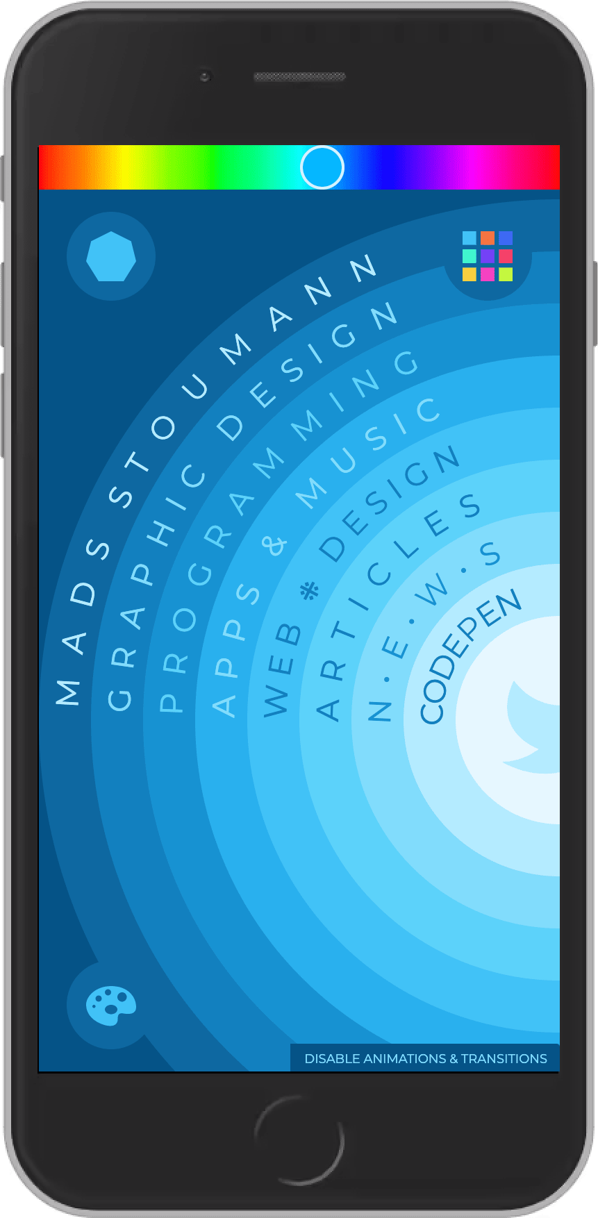
I wanted the site to be engaging and playful. The content is very simple, so I wanted to present it in an alternate way. I ended up with a circular navigation:

On mobile, I show a part of the circle:
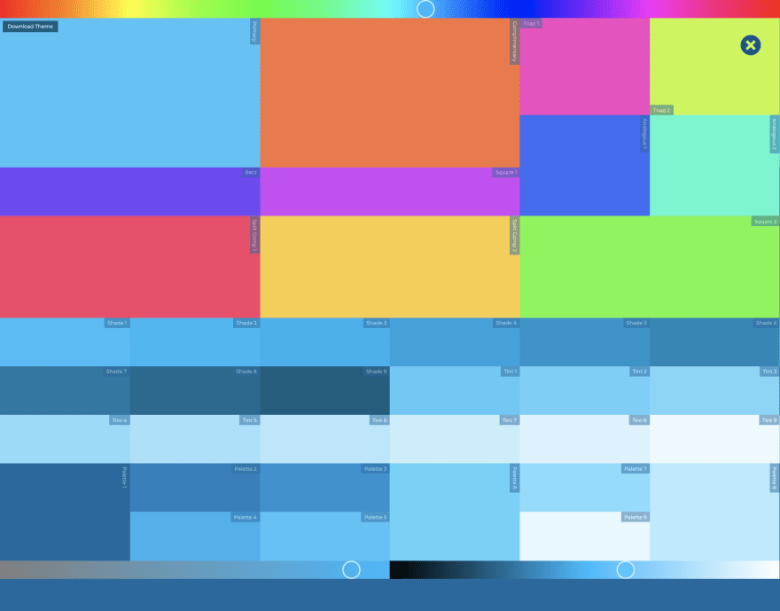
The playfulness is achieved with two tools.
The first is a color tool (toggle it by clicking on the colorful square-icon top right) with hue-, saturation- and lightness-sliders - and an option to download the CSS for the theme, you create:
The other tool is a polygon-tool (toggle it by clicking the hexagon-icon top left).
This tool has two sliders: one for adding sides to the polygons, and one for midpoints:

Combining the two tools, you can create crazy results like this:

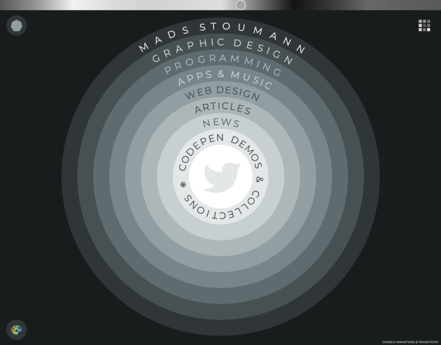
In the bottom left corner, there's a color-palette-icon, that'll enable a high-contrast black-and-white mode:
And finally, in the bottom right corner, there's a button where you can toggle on/off transitions and animations. Why? I've written about it here.
Valid
Many sites these days don't have valid markup. This is bad. Most browsers will try to "figure out" what's going on, and "auto-correct" markup mistakes. This requires extra "calculations" for the browser, and it might prevent a crawler from indexing the page correctly. I use Validity for testing the validity of my markup.
Accessible
I haven't tested the site with a real screen-reader, only with the one you get with Windows. Additionally, I've taken multiple actions in order to make it more accessible:
Document Outline
I use HTML5 Outliner to test the outline of a page:

Keyboard-friendly
You can navigate the site without a pointer-device. I use focus-visible and custom styles for outlines (even on the circular navigation), when you're using a keyboard. You "open" an article with Enter, close it with Escape - and I've included focus-trapping, so you can cycle the links within an article.
The tools use <input type="range">, which can be updated with the arrow keys.
Disable animations
As mentioned earlier, you can disable animations and transitions.
Visual deficiencies
In the Rendering-tab of Chrome Dev Tools, you can emulate visual deficiencies.
Test all of them, one by one, to see if any of them is unreadable.
Here's deuteranopia:
The reason why I've included the hue-slider as part of the main design, is for people with visual deficiencies. Hopefully, no matter which visual deficiency a user has, s/he can choose a color-palette of their own choice.
The main navigation is readable with blurred vision:

Zooming-in, the text should be readable as well:

Fast
The combined size of the minified HTML, CSS and JavaScript of the entire website is approx. 11kb.
I've not used a build-tool, it's all hardcoded.
Most logic is in CSS Custom Properties.
All the colors in the color tool, for instance, are auto-generated colors using calc() in CSS, based on values from the hue-, saturation- and lightness-sliders.
I use the Montserrat-typeface, but host the font-files on my own server, avoiding a round-trip to Google Fonts. The font is preloaded:
<link rel="preload" href="assets/fonts/montserrat-v15-latin-regular.woff2" crossorigin="anonymous" as="font" type="font/woff2">Secure
I use a Content-Security-Policy:
<meta http-equiv="Content-Security-Policy" content=" default-src; script-src 'self'; style-src 'self'; img-src 'self' data:; font-src 'self'; connect-src 'self'; media-src 'self'; object-src 'none'; frame-src; form-action; base-uri; manifest-src 'self';">... and I've set up Security Headers:
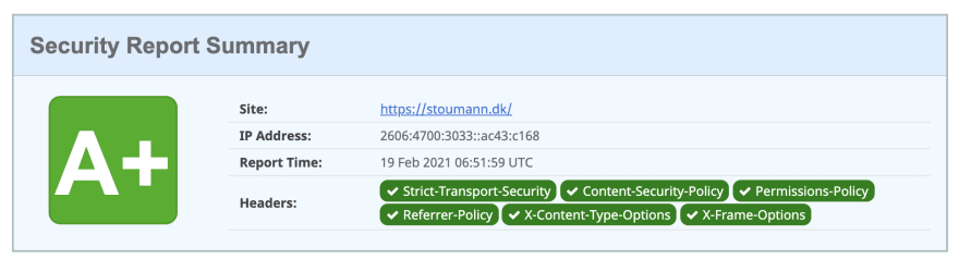
Mozilla Observatory:
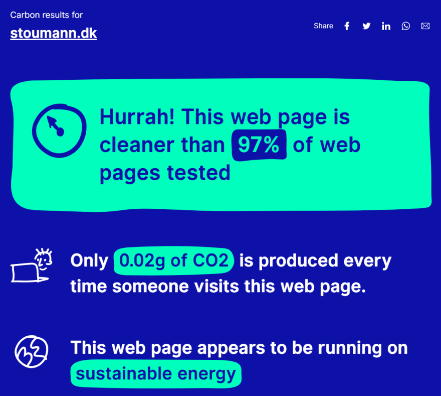
Sustainable
Because I use a green CDN (Cloudflare) - and because of the low page-weight, it's very easy to achieve a good sustainability-score:
In web-development, sustainability equals performance, so PageSpeed is happy as well:
PWA and offline
I've added a site.manifest and a ServiceWorker with caching, so the site works offline.
Google are improving Progressive Web App offline support detection, so I'll have to make some updates before August 2021!
Final thoughts
Hope you liked this walkthrough of my new site. Remember, nothing lasts forever in the world of web! The perfect scores will most likely change soon, as the web and what we expect of it, change as well.
Go check it out: stoumann.dk
Thanks for reading!
Original Link: https://dev.to/madsstoumann/creating-a-fun-fast-secure-and-sustainable-website-50nk
Dev To
More About this Source Visit Dev To