
An Interest In:
Web News this Week
- April 1, 2024
- March 31, 2024
- March 30, 2024
- March 29, 2024
- March 28, 2024
- March 27, 2024
- March 26, 2024
Some of Our Sources
- Mashable
- Technology Review
- Web Designer Wall
- Six Revisions
- FanExtra - PSD
- Wal You
- Design Modo
- Codrops
- Android Headlines
- Dev To
Help Webnuz
Referal links:
Never make your text container a flexbox container
Flexbox is great. Unfortunately, many developers use it in a wrong way. To be more precise, they use it automatically everywhere even when it should not be used.
Let's take the following example
<div class="box">Lorem ipsum dolor sit amet, consectetur adipiscing elit. Quisque semper augue ac leo tincidunt euismod.</div>.box { width: 300px; height: 300px;}Now, you are given the common task to center the content of the box horizontally and vertically. Well a trivial task:
let's use flexbox!
.box { width: 300px; height: 300px; display: flex; align-items: center; justify-content: center;}It's done, the content is centred and the result looks perfect, isn't it?
No, what you have done is a mistake
To understand why it's wrong let's modify our content slightly by introducing a link in our content
<div class="box">Lorem ipsum dolor sit amet, <a href="#">consectetur adipiscing</a> elit. Quisque semper augue ac leo tincidunt euismod.</div>Now run the code and see the result:


Don't worry, what you see is not a bug but it's indeed the logical result of the flexbox algorithm (non-intuitive but logical). To understand this behavior let's take a look into the specification:
Loosely speaking, the flex items of a flex container are boxes representing its in-flow contents.
Each in-flow child of a flex container becomes a flex item, and each contiguous sequence of child text runs is wrapped in an anonymous block container flex item.
In our first case, we only have one sequence of text and this one will get wrapperd into an anonymous block to become a flex item. There is no strange result in this case since the whole text is wrapped together.

In the second case, things are different. We have an in-flow child (our link <a>) and on each side of it we have a sequence of text so we end having 3 blocks: the link + 2 anonymous blocks for the text
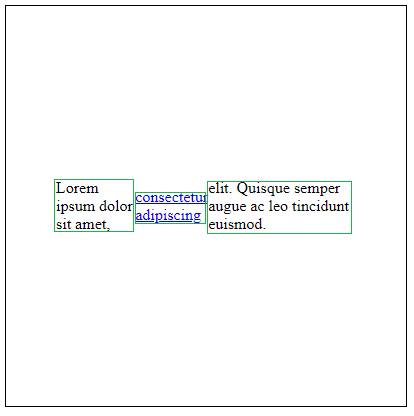
Now it becomes more clear. We have 3 boxes perfectly centred using flexbox following a row direction (the default one) but the result is clearly not what we want at all.
The fix in such situation is easy: We simply add an extra wrapper around the text and it's done.
<div class="box"><div>Lorem ipsum dolor sit amet, <a href="#">consectetur adipiscing</a> elit. Quisque semper augue ac leo tincidunt euismod.</div></div>This post is not about fixing this particular situation. It's more to highlight some unwanted result that may occur when badly using flexbox. The above is one basic example among a lot you will probably face and the fix may not be always trivial.
The real issue is not finding the fix. The real issue is to see the issue which may only happen for some particular content (like in the above when adding a link). You may write a lot of CSS and you notice the issue very late when changing the content slightly then you are good to redo many of your code.
This said you should always remember this gold rule:
Flex[box] is for boxes and not for texts so never make your text container a flexbox container.
Original Link: https://dev.to/afif/never-make-your-text-container-a-flexbox-container-m9p
Dev To
More About this Source Visit Dev To