
An Interest In:
Web News this Week
- April 1, 2024
- March 31, 2024
- March 30, 2024
- March 29, 2024
- March 28, 2024
- March 27, 2024
- March 26, 2024
Some of Our Sources
- BoingBoing
- Web Designer Wall
- Creative Curio
- Fuel Your Creativity
- Crazy Leaf Design
- My Ink Blog
- Stylized Web
- Freelance Switch
- Web Resource Source
- Codrops
Help Webnuz
Referal links:
Svelte Quick Tip: Using "actions" to integrate with JavaScript libraries (Tippy tooltips)
Hello, World!
One of Svelte's super powers is how freaking easy it is to integrate with non-Svelte JavaScript libraries using "actions".
Actions allow you to attach all sorts of interesting behavior to elements in a reusable way without needing to write custom Svelte components. They're pretty neat!
In the post, we will learn how to use the plain-JavaScript tooltip library Tippy.js in your Svelte project by using a custom Svelte action.
I think you'll be pretty impressed how simple this is, especially compared to frameworks like React.
Let's go!
Impatient? Checkout the Svelte REPL here
The button
Let's say we have a button with a title attribute that we want to add a tooltip to:
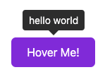
<button title="hello world">Hover me</button>Now, rather than doing something like making a <Tooltip> component that we have to wrap our components in, let's take advantage of actions!
The action
To write our action, we're going to use the awesome JavaScript tooltip library Tippy.js rather than writing our own custom tooltip library (which you likely don't want to do!).
The action is quite simple and just involves determining what to show in the tooltip, creating a Tippy instance, attaching it to the element's node, passing some props to it and then cleaning up when it is unmounted from the DOM:
// tooltip.jsmodule.exports = function tooltip(node, params = {}) { // Determine the title to show. We want to prefer // the custom content passed in first, then the // HTML title attribute then the aria-label // in that order. const custom = params.content; const title = node.title; const label = node.getAttribute("aria-label"); const content = custom || title || label; // Let's make sure the "aria-label" attribute // is set so our element is accessible: // https://developer.mozilla.org/en-US/docs/Web/Accessibility/ARIA/ARIA_Techniques/Using_the_aria-label_attribute if (!label) node.setAttribute("aria-label", content); // Clear out the HTML title attribute since // we don't want the default behavior of it // showing up on hover. node.title = ""; // Support any of the Tippy props by forwarding all "params": // https://atomiks.github.io/tippyjs/v6/all-props/ const tip = tippy(node, { content, ...params }); return { // If the props change, let's update the Tippy instance: update: (newParams) => tip.setProps({ content, ...params }), // Clean up the Tippy instance on unmount: destroy: () => tip.destroy(), };};I don't know about you, but I think this is pretty flipping cool!
Let's walk through this:
First, we determine the text to show in the tooltip. In this case, we want to prefer the custom content first, then the title and then the aria-label so that we are intelligent about the value and allow for sane defaults. We then set the aria-label attribute if it is not set (automatic accessibility win! ). We also clear out the title field so it doesn't show the default browser behavior of having the title visible on hover.
Then, we call tippy(...) with the current node. The current node value is what your action will get when it is attached to an element. The second argument is any parameters we want to pass to the action. In this case, we are using the params to allow us to pass whatever params we want directly to Tippy.
We assigned the Tippy instance to a variable which we use to update the Tippy props if they change in update and to safely remove the Tippy instance if the component is unmounted, to prevent memory leaks, in destroy.
That's all there is to it!
Now, let's use our spiffy new tooltip action!
Putting it together
Import the action
First, we will need to import the tooltip action in our Svelte component:
<!--App.svelte or whatever other component you want to use the tooltip in!--><script> import tooltip from "./tooltip";</script>Include Tippy CSS/JS
Now, we have to import the Tippy JS and CSS code. Since this example was built for the Svelte REPL, we are using a CDN for this, but you will likely want to instead bundle these assets in your build process (which is out of the scope of this article, check the Tippy docs).
<svelte:head> <script src="https://unpkg.com/@popperjs/core@2"></script> <script src="https://unpkg.com/tippy.js@6"></script> <link rel="stylesheet" href="https://unpkg.com/tippy.js@6/themes/light.css" /> <link rel="stylesheet" href="https://unpkg.com/tippy.js@6/themes/light-border.css" /></svelte:head>Use your action!
Using our new tooltip action is quite simple, all we need to do is use the use: directive on any element and we now have a tooltip:
<button use:tooltip title="hello world">Hover Me!</button>Pretty cool eh!?
We can now also pass custom props to Tippy if we want:
<!-- using aria-label: --><button use:tooltip aria-label="Aria label!"> With "aria-label"</button><!-- custom tooltip content: --><button use:tooltip={{ content: "Hi there!" }}> Custom tooltip</button><!-- setting a tooltip theme: --><button use:tooltip={{ theme: "light" }} title="Light theme!"> Light theme</button>Going further
Now this is just a basic example, you can take this and extend it to match the needs of your application by, for example, configuring default themes, animations and positions as needed that way you don't have to repeat this code throughout your app.
In fact, I think this code is so simple that it's probably not worth packing into an npm package, but if you think it should, let me know .
You can also apply using actions to all sorts of non-framework specific libraries in your Svelte apps. If you come up with something cool you want to share, let others know in the comments below!
Fin
I think this feature of Svelte is incredibly compelling because it makes it trivial to integrate with the wide world of JavaScript libraries without tying you directly to a framework which, in frameworks like React, just isn't as easy.
In the 6+ years of using React, I've found that I often don't leverage the vast universe of JS libraries that work directly with the DOM because it is, in a way, an anti-pattern in the React world. In addition, trying to integrate such libraries in React is often more difficult and fragile.
What Svelte gives us here is the power to leverage the entire ecosystem of incredible JS libraries that many of us (at least in the React world) have tended to ignore. Hell, you can even use jQuery libraries if you wanted to !
If you're writing Svelte apps, I'd encourage you to take advantage of actions as they allow you to write clean, flexible and platform-agnostic features in many cases.
And if you're not writing #svelte apps yet, consider jumping in the pool, the water is warm!
Thanks for reading!
Have other tips, ideas, feedback or corrections? Let me know in the comments!
Don't forget to follow me on Dev.to (danawoodman), Twitter (@danawoodman) and/or Github (danawoodman)!
Photo by Joshua Aragon on Unsplash
Original Link: https://dev.to/danawoodman/svelte-quick-tip-using-actions-to-integrate-with-javascript-libraries-tippy-tooltips-2m94
Dev To
 An online community for sharing and discovering great ideas, having debates, and making friends
More About this Source Visit Dev To