
An Interest In:
Web News this Week
- March 21, 2024
- March 20, 2024
- March 19, 2024
- March 18, 2024
- March 17, 2024
- March 16, 2024
- March 15, 2024
Some of Our Sources
- Technology Review
- Spoon Graphics
- Smashing Magazine
- Abduzeedo
- TutsPlus - Design
- Crazy Leaf Design
- Web Design Ledger
- Stylized Web
- CSS Tricks
- Hashedout
Help Webnuz
Referal links:
The Ultimate Practical Guide to CSS Grid
CSS Grid is a really powerful tool and I'll show you exactly why.
The main objective of CSS Grid is to change completely how we design user interfaces based on grid systems. Grid was the first CSS module created specifically to solve layout problems that we've been working around since forever.
As the title says, this a practical guide, so I gonna show you a lot of code/examples and almost no concepts. If you wanna know/learn more about the CSS Grid concepts, I'm gonna recommend some material for you:
First, a reminder! Grid and Flexbox are NOT enemies. They can work perfectly together, you just need to know when to use which of them.
- Flexbox: is essentially for putting items in ONE dimension (row or column);
- Grid: used when working with TWO dimensions;
Let's dive in!

Note: I highly recommend you check the CodePens embed here in this article. Go there and play a little bit with the code
1. Center it like a boss
I'm pretty sure you already had a lot of trouble centering an item. What if I told you all you need are two lines of code?
Imagine you have a parent div and a child div, then all you got do is this:
.parent { display: grid; place-items: center;}CodePen example:
2. repeat + grid-template-columns
There are some powerful functions and properties of CSS Grid. Two of them are repeat [MDN Docs] and grid-template-columns, which can help A LOT to create some nice grids.
repeat allows a large number of columns or rows to be in a recurring pattern using a super concise form.
You can but you shouldn't create a grid template like this:
.parent { display: grid; grid-template-columns: 1fr 1fr 1fr 1fr 1fr 1fr 1fr 1fr 1fr 1fr 1fr 1fr;}Or you can use repeat and make it look like this:
.parent { display: grid; grid-template-columns: repeat(12, 1fr);}It's waaaay better, right?
CodePen example:
3. Infinite responsive grid
If you wanna create a responsive grid full of items of the same size, you can achieve that using three lines of CSS.
.grid { display: grid; gap: 1rem; grid-template-columns: repeat(auto-fit, minmax(240px, 1fr));}CodePen example:
4. Basic layout organizer
What if you wanna organize your layout in a simple way? Something standard like this:
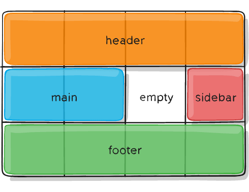
It's super easy, barely an inconvenience! (someone got the reference?)
We only need to use grid-template-areas and grid-area to organize our page!
Your HTML could look like this:
<body> <container> <header>Header</header> <article>Article</article> <aside>Sidebar</aside> <nav>Ads</nav> <footer>Footer</footer> </container></body>And your CSS like this:
container { display: grid; height: 100%; /* Explicit grid */ grid-template-areas: "topbar topbar topbar" "sidebar content ads" "footer footer footer"; grid-template-columns: 1fr 3fr 1fr; grid-template-rows: 15% 50% 20%; gap: 35px;}header { grid-area: topbar; }aside { grid-area: sidebar; }article { grid-area: content; }nav { grid-area: ads; }footer { grid-area: footer; }And your result:
CodePen example:
5. Grid + Flexbox =
Just a little proof of how these two guys can work pretty well together like macaroni and cheese.
We'll use grid to design the page itself and flexbox to organize the cards themselves. And it's highly responsive, of course.
container { display: grid; grid-gap: 1rem; grid-template-columns: repeat(3, 1fr);}.card { display: flex; flex-direction: column; justify-content: space-between; padding: 1rem;}CodePen example:
6. An AMAZING Photo Gallery
To wrap this up, I'll show you a small piece of code that creates a beautiful photo gallery
Another nice thing: Your grid can be animated! Using the powerful grid-template-areas, grid-area and CSS animation we can make some cool effects.
.animated-grid { display: grid; gap: 1rem; height: 85vh; margin-bottom: 200px; grid-template-areas: 'a b c d' 'l e' 'k f' 'j i h g'; grid-template-rows: repeat(4, 25%); grid-template-columns: 240px auto auto 240px; --standard-delay: 100ms;}.card { background-color: rgb(36, 243, 147); animation: cardEntrance 700ms ease-out; animation-fill-mode: backwards;}And YES, you can even use emojis to name an area.
CodePen example:
(Click on 0.5x scale for a better visualization or visit the CodePen page itself)
That's all, folks!
Thanks for reading this and if you enjoyed your reading or learned something new, don't forget to slap that button!

Helpful resources to learn more about CSS Grid:
Original Link: https://dev.to/richardnikolas/the-ultimate-practical-guide-to-css-grid-32oe
Dev To
 An online community for sharing and discovering great ideas, having debates, and making friends
More About this Source Visit Dev To