
An Interest In:
Web News this Week
- March 21, 2024
- March 20, 2024
- March 19, 2024
- March 18, 2024
- March 17, 2024
- March 16, 2024
- March 15, 2024
Some of Our Sources
- Simplebits
- Web Designer Wall
- Joshua Blankenship
- Smashing Magazine
- TutsPlus - Design
- Fuel Your Creativity
- Web Designer Depot
- Web Design Ledger
- Codrops
- Willems Lab
Help Webnuz
Referal links:
Make Animated Content Placeholders with HTML and CSS
In the same spirit of my previous article on creating loading animations with web technologies, on this post I'll be demonstrating how one can create content placeholders for their web projects using HTML and CSS.
It's a good practice to let the user know that something is going on in the background such as the retrieval of data from the database by displaying an animation that will later be replaced by the loaded data than having nothing displayed which might give the impression that either the page is broken or has issues especially for users that have a weak connection.
In the wide range of animations that one can choose from within the latest web trends content placeholders seem to be the best of the pile as they display animations that carry a look closest possible to the content to be displayed. They can be positioned to hold the place of different types of data from text paragraphs to content cards as evident on major websites such as youtube, instagram and facebook.
On to creating our animated content placeholder.
The anatomy of the placeholder animation consists of two div blocks, the parent block that acts as the animation's wrapper with a darker background and a child block relatively positioned to the parent spanning the entire height of the parent with a lighter colored gradient background which will be animated infinitely, moving it from out of view from the left side of the parent past it to out of view on the right side of the parent.
below is a demonstration of the animated placeholder.
Here is a preview of the anatomy of the placeholder animation: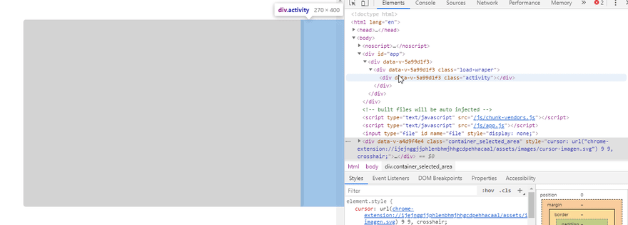
The template of the placeholder animation is as follows.
<div class="load-wraper"> <div class="activity"></div></div>And the stylesheet to animate the placecholder animation.
.load-wraper{ position: relative; height: 100%; width: 100%; background-color: rgb(211,211,211); z-index: 44; overflow: hidden; border-radius: 5px;}.activity{ position: absolute; left: -45%; height: 100%; width: 45%; background-image: linear-gradient(to left, rgba(251,251,251, .05), rgba(251,251,251, .3), rgba(251,251,251, .6), rgba(251,251,251, .3), rgba(251,251,251, .05)); background-image: -moz-linear-gradient(to left, rgba(251,251,251, .05), rgba(251,251,251, .3), rgba(251,251,251, .6), rgba(251,251,251, .3), rgba(251,251,251, .05)); background-image: -webkit-linear-gradient(to left, rgba(251,251,251, .05), rgba(251,251,251, .3), rgba(251,251,251, .6), rgba(251,251,251, .3), rgba(251,251,251, .05)); animation: loading 1s infinite; z-index: 45;}@keyframes loading { 0%{ left: -45%; } 100%{ left: 100%; }}To make the animation smoother make sure the child block (.activity) is as wide as posible, here it's width is 45% of the parent's total width.
At this point the animated placeholder block is complete and that's all on implementing it.
What's left is placing the placeholder within the wireframes of any content card layout blocks to see the animated placeholder in action.
Let's demonstrate an example of this:
- A card component's animated placeholder.

The HTML for the the above cards is as follows:
<div class="card"> <div class="card-image"> <div class="load-wraper"> <div class="activity"></div> </div> </div> <div class="card-content"> <div class="card-text"> <div class="load-wraper"> <div class="activity"></div> </div> </div> </div></div><div class="card"> <div class="card-image"> <div class="load-wraper"> <div class="activity"></div> </div> </div> <div class="card-content"> <div class="card-avatar"> <div class="load-wraper circular"> <div class="activity"></div> </div> </div> <div class="card-avatar-text"> <div class="load-wraper"> <div class="activity"></div> </div> </div> </div></div>Adding the stylesheet to the cards:
.card{ margin: 20px; height: 260px; width: 400px; position: relative; float: left;}.card-image{ height: 200px; width: 400px; position: relative;}.card-content{ margin-top: 20px; min-height: 40px; display: flex;}.card-avatar{ width: 40px; float: left; flex: none;}.card-avatar-text{ margin-left: 20px; float: left;}.card-content, .card-text, .card-avatar, .card-avatar-text{ height: 40px; position: relative;}.card-content, .card-text, .card-avatar-text{ width: 100%;}.circular{ border-radius: 50%;}Go ahead and get creative with animated placeholders in your web projects.
Original Link: https://dev.to/xinnks/make-animated-content-placeholders-with-html-and-css-3ekn
Dev To
 An online community for sharing and discovering great ideas, having debates, and making friends
More About this Source Visit Dev To