
An Interest In:
Web News this Week
- March 21, 2024
- March 20, 2024
- March 19, 2024
- March 18, 2024
- March 17, 2024
- March 16, 2024
- March 15, 2024
Some of Our Sources
- Technology Review
- Pearsonified
- Fuel Your Creativity
- Inspiredology
- Noupe
- Reencoded
- CSS Globe
- CSS Tricks
- Daily Now
- Dev To
Help Webnuz
Referal links:
Animating real world data on an interactive map using Python
In this tutorial, we're going to cover step-by-step how to create an animated map that visualizes real world UK energy consumption per year at the regional level!
This type of visualization is known as a choropleth and can yield highly visual, comprehensive insights into our data from a geospatial perspective .
If you would rather follow along in a Jupyter Notebook, you can find that, as well as the datasets, here
Prerequisites
For this tutorial, we'll need three third-party libraries that you'll have to install to follow along!
NOTE: geopandas can be a bit tricky to install if you're a Windows user, check their official installation instructions or this blog post for guidance (or drop a comment below and I'll try to help!).
Downloading our datasets
If you don't feel like downloading them from the UK government website, you can get them from the repo as well and skip this part:
- Sub-national total final energy consumption statistics: 2005 to 2018 (csv)
- NUTS Level 1 (January 2018) Super Generalised Clipped Boundaries in the United Kingdom
The energy data
The first dataset we are going to download is the Sub-national total final energy consumption statistics: 2005 to 2018 (csv). This .csv contains UK energy consumption data from 2005-2018 broken down to the local administrative level.
The regional shapefile
The second dataset we'll need is the NUTS Level 1 (January 2018) Super Generalised Clipped Boundaries in the United Kingdom.
The dataset we need can be found by clicking Download > Shapefile. This shapefile contains polygonal coordinates that will allow us to map geospatial data.

And now... time to code!
Importing the libraries
import jsonimport pandas as pd import geopandas as gpd import plotly.express as px import plotly Importing the datasets
Okay, we're ready to get to work!
Luckily, pandas and geopandas provide us with some handy functions that make importing datasets straightforward and painless!
# Importing the energy dataset into a pandas.DataFramedf = pd.read_csv("path/to/Subnational_total_final_energy_consumption_statistics.csv")# Importing the shapefile into a geopandas.GeoDataFramegdf = gpd.read_file("path/to/NUTS_Level_1_(January_2018)_Boundaries.shp")Observing our datasets
Before we dive into preparing our data, let's take a look and see what it is we're working with . We want to find a way to match our geographic data to our energy data.


In this case, we can see that the df["NAME"] and gdf["nuts118nm"] columns both contain names of geographic regions!
With this in mind, we can now start working towards the goal of unifying these datasets for the animation by preparing both datasets in such a way that these region names match.
Feel free to get familiar with this data! Look at the column names, see what's available to us, and just mess around with it.
Geographic data
Preprocessing the geographic data
Preparing the geographic data is relatively straightforward. We know that we want our region names to match those contained in df so we'll perform some routine text munging.
# Remove unnecessary info, whitespace, and title the names gdf["nuts118nm"] = gdf["nuts118nm"].str.replace("(England)", "", regex=False)gdf["nuts118nm"] = gdf["nuts118nm"].str.strip()gdf["nuts118nm"] = gdf["nuts118nm"].str.title()Mapping to a Coordinate Reference System
Currently, looking at our gdf["geometry"] column tells us that our polygons point to coordinates in an arbitrary space.
We can easily project gdf's coordinates to actual Earth coordinates in preparation of mapping them on our choropleth.
Additionally, we will convert the geospatial data into a format known as GeoJSON.
gdf = gdf.to_crs(epsg=4326)geojson = json.loads(gdf.to_json())Energy data
Preparing the energy data
After looking at the dataset, we can see that we are provided the data in two sets of units, Gigawatt hours (GWh) and Kilotonne of oil equivalent (KTOE). For this tutorial, we are going to be working exclusively in GWh.
We can also see after some investigating that our regional data is provided as all uppercase values. The full dataset is broken down to the Local Administrative Unit level but we're going to filter out only the regions.
# Filter only the GWh rowsdf = df[df["UNIT"] == "GWh"]# Filter the uppercased regions and title themdf = df[df["NAME"].str.isupper()]df["NAME"] = df["NAME"].str.title()Let's see what this has left us with:
df["NAME"].unique()>>> array(['North East', 'North West', 'Yorkshire And The Humber', 'East Midlands', 'West Midlands', 'East Of England', 'Greater London', 'South East', 'South West', 'Inner London', 'Outer London', 'Northern Ireland', 'Scotland', 'Wales'], dtype=object)Combining the London rows
Uh oh! In gdf["nuts118nm"], London is listed only once but in df["NAME"], it is broken into three separate regions: "Inner London", "Outer London", "Greater London". No worries, we'll sum these all together into just "London" rows.
# Filter only the rows that contain the "London" substringlondon_rows = df["NAME"].str.contains("London")# Set all of these rows as "London"df.loc[london_rows, "NAME"] = "London"# Group these rows by name and year and sum df = df.groupby(["NAME", "YEAR"], as_index=False).sum()Creating the animation
And now for the moment we've all been waiting for...
we're now ready to create and animate our choropleth!
Luckily, plotly.express has the choropleth_mapbox function which lets us do this easily and efficiently.
For this animation, we will visualize the df["ALL_FUELS_TOTAL"] column which contains the aggregate energy consumption per region per year.
# Max/min y-bounds for our color range min_y = df["ALL_FUELS_TOTAL"].min()max_y = df["ALL_FUELS_TOTAL"].max()# Choropleth map fig = plotly.express.choropleth_mapbox( df, geojson=geojson, locations="NAME", color="ALL_FUELS_TOTAL", animation_frame="YEAR", featureidkey="properties.nuts118nm", color_continuous_scale=plotly.colors.diverging.Temps, range_color=(min_y, max_y), title="Energy consumption (GWh)")# Start visualization hovered over the UK fig.update_layout( mapbox_style="carto-positron", mapbox_zoom=3.3, mapbox_center={ "lat": 55.3, "lon": -3.43 })fig.show()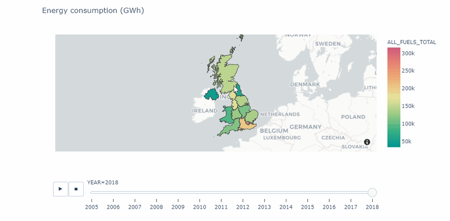
In conclusion
And there you have it! In just a few quick steps, we were able to combine real world data into a meaningful and exciting visualization.
If you're interested in further exploring real world data and visualizations, check out the UK energy consumption dashboard I've been working on (if it doesn't load right away, give it a minute or try reloading as I am currently on the Heroku free hosting plan).
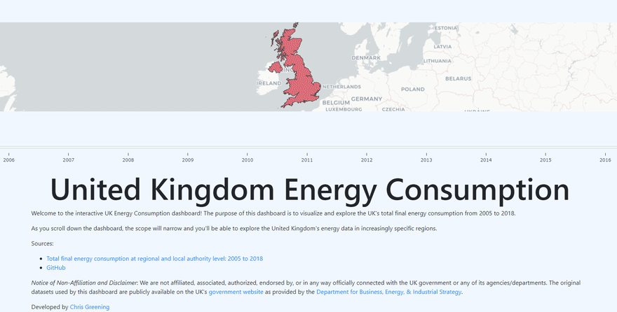
 chris-greening / UK-Energy-Consumption
Analysis of UK energy consumption data between 2005-2018
If you enjoyed this blog post, be sure to check out some of my other work as well and leave me some feedback in the comments below!

Original Link: https://dev.to/chrisgreening/animating-real-world-data-on-an-interactive-map-using-python-17pd
Dev To
More About this Source Visit Dev To