
An Interest In:
Web News this Week
- March 21, 2024
- March 20, 2024
- March 19, 2024
- March 18, 2024
- March 17, 2024
- March 16, 2024
- March 15, 2024
Some of Our Sources
- Mashable
- Spoon Graphics
- Six Revisions
- Vandelay Design
- Inspiredology
- Web Designer Depot
- Fudge Graphics
- CSS Tricks
- Web Resource Source
- TechPowerUp
Help Webnuz
Referal links:
How to Build a Skeleton Layout in React
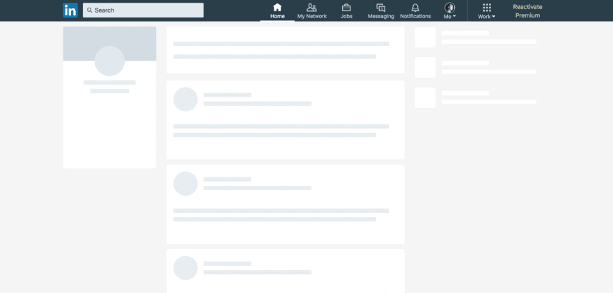
The use of a Skeleton Layout for asynchronous content is becoming more and more popular across mobile and web apps alike. Google, Facebook, LinkedIn, Youtube and many more use a skeleton layout to display what the content and layout might look like, before it loads. Using one in your own project is a nice styling effect for your users, and also might just improve the SEO of your project in the near future by reducing "cumulative layout shift". This post shows you how easy it is to add a skeleton layout that updates after asynchronous content is loaded.
isLoaded State
React allows for us to set state from isLoaded: false to isLoaded: true when an asynchronous function has completed. This will be the basis for which set of content we will display. We will create two CSS classes for our content based on the isLoaded state: .loading and .loaded. We will then do an if statement that will return the JSX for the .loaded content, IF isLoaded = true. If isLoaded = false, the app will return the JSX for the .loading content, which will be out skeleton layout.
// JSXclass App extends React.Component { constructor(props){ super(props); this.state = { isLoaded: false, asyncData: [] } };render(){ asyncFunction = () => { // Async function fetches asyncData, and upon fetch updates state from `isLoaded:false` to `isLoaded:true` } if(this.state.isLoaded===true){ // If state.isLoaded=true, component will render complete layout and async content return( <> <LayoutContent className="loaded" /> </> ); } return( // While state.isLoaded=false, component will only render skeleton layout <> <LayoutContent className="loading" /> </> );};};CSS
The CSS we need to style will include our two classes: .loading and .loaded. This gives you a little freedom for how you would like your skeleton layout to look, but I chose an animated approach from StackFindOver for the styling for the CodePen example below.
// Skeleton Layout styles and animation.loading { position: relative; background: #cccccc;}.loading:after { content: ""; display: block; position: absolute; top:0; width: 100%; height: 100%; transform: translateX(-100px); background: linear-gradient(90deg, transparent, rgba(255,255,255,0.2), transparent); animation: loading 0.8s infinite;}@keyframes loading { 100% { transform: translateX(100%); }}// Loaded styling.loaded { // Styles}Some additional things to note when it comes to CSS styling:
- Width and Height of components should be defined to reduce content jumping
- Consider using CSS Flexbox for responsive components with max-width/height defined
- If component sizes vary based on content consider adding an "overflow-y: scroll" property
Example Application
Feel free to steal some of the code from this CodePen example, but note you will likely need to adjust some of the styling to fit your own application.
Conclusion
Skeleton layouts not only give your application a fun and useful loading screen as asynchronous content loads, but also might just improve you application's SEO and user experience. Hopefully this blog post and the example gives you some ideas on how to apply a skeleton layout in your own project!
Have you used a Skeleton Layout in your project?
Comment if you have used a similar method, or have suggestions for improvements!
Original Link: https://dev.to/lukekyl/how-to-build-a-skeleton-layout-in-react-21hb
Dev To
 An online community for sharing and discovering great ideas, having debates, and making friends
More About this Source Visit Dev To