
An Interest In:
Web News this Week
- April 1, 2024
- March 31, 2024
- March 30, 2024
- March 29, 2024
- March 28, 2024
- March 27, 2024
- March 26, 2024
Some of Our Sources
- Pearsonified
- Abduzeedo
- Crazy Leaf Design
- Web Design Ledger
- Reencoded
- 24 Ways
- Stylized Web
- Android Headlines
- Willems Lab
- Dev To
Help Webnuz
Referal links:
Display your PWA / website fullscreen
In this short article I will show you how to expand your installed PWA to the full edge of the screen of a mobile device and how to take care of design issues that might occur.
Standalone mode
As soon as the user has added your PWA to the home screen and opened it, it runs in a standalone mode, where the e.g. the navigation bar of the browser will disappear and we can produce more app-like designs.
We can detect if the PWA is running in standalone mode inside our application like this:
// on iOS Safariwindow.navigator.standalone// on Android Chromewindow.matchMedia( '(display-mode: standalone)').matchesBecause of the platform difference, a more popular approach is to define a start_url inside your manifest.json file, where we can add a parameter that will be added, when the app is started in standalone mode. Then we can check for the parameter inside our application to make changes to our UI.
To display it fullscreen and remove native control elements, we also have to add the display property with the value standalone (fullscreen won't work). Here's our current manifest:
// manifest.json{ "name": "Example App", "display": "standalone", "start_url": "/?standalone=true"}Meta Tags
To display your app fullscreen, we will also have to add a few meta tags.
You might already have a viewport meta tag, but make sure viewport-fit=cover is inside it (separated by ;):
<meta name="viewport" content="width=device-width; initial-scale=1; viewport-fit=cover">Then we have to add the mobile-web-app-capable and status-bar-style meta tags:
<meta name="mobile-web-app-capable" content="yes"><meta name="apple-mobile-web-app-capable" content="yes"><!-- possible content values: default, black or black-translucent --><meta name="apple-mobile-web-app-status-bar-style" content="black-translucent">Note that we can decide, whether the status bar should have a white (default), black or transparent (with white color) background. Take into account that this meta tag is only used when the app starts, so it's app-wide and we can't modify the meta tag later to change the color dynamically.
Because we also want to be able to display content underneath the status bar, we'll use the transparent background (black-translucent). This will also shift our app up to the top of the screen.
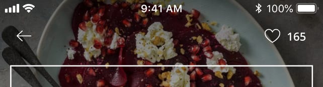
Now we can produce fancy headers that look like this:
Safe Area
Since we can display content underneath the status bar now, we'll have to make sure that the white text will always be readable (e.g. with a decorative shadow or ensuring dark background colors) and that there will be no interactive elements underneath. Also we might have to take the notch into account, which some newer iOS versions have:

To solve those problems we can utilize the safe-area CSS env variables (supported since iOS >= 11.1 and Chrome >= 69):
.element { height: env(safe-area-inset-top); width: env(safe-area-inset-left); margin: env(safe-area-inset-right); // you can also use fallback values padding: env(safe-area-inset-bottom, 20px);}As an example, I implemented a sticky navigation bar vue component for my app, which has an element with the top safe-area applied as height. It will be transparent as long as the transparent property is true and the user has not scrolled down. Here's the crucial of the component:
<!-- NavigationBar.vue --><div class="sticky top-0"> <div class="h-safe-area-inset-top" :class="{ 'bg-black': !transparent || (transparent && scrollTop > 0) }" ></div> ...</div><style>.h-safe-area-inset-top { height: env(safe-area-inset-top); }.bg-black { background-color: #444; }</style><script>export default { data() { return { scrollTop: 0 } }, props: { transparent: { type: Boolean, default: false } }, methods: { scrollListener(e) { this.scrollTop = e.target.scrollTop; } }, mounted() { window.addEventListener('scroll', this.scrollListener); }}</script>If you have a question, don't hesitate to leave a comment. Happy coding and designing!
Original Link: https://dev.to/oncode/display-your-pwa-website-fullscreen-4776
Dev To
 An online community for sharing and discovering great ideas, having debates, and making friends
More About this Source Visit Dev To