
An Interest In:
Web News this Week
- March 21, 2024
- March 20, 2024
- March 19, 2024
- March 18, 2024
- March 17, 2024
- March 16, 2024
- March 15, 2024
Some of Our Sources
- BoingBoing
- Joshua Blankenship
- The Logo Smith
- Smashing Magazine
- Six Revisions
- TutsPlus - Design
- You The Designer
- Inspiredology
- Fudge Graphics
- Android Headlines
Help Webnuz
Referal links:
How to Create an Animated SVG Face With CSS
Learn how to create an animated SVG face using CSS animations, transforms, and an optional pinch of JavaScript.
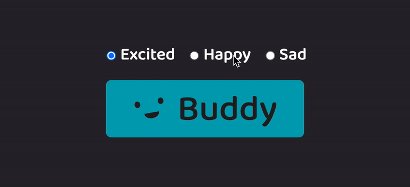
This is an isolated demo of the animations in use for ButtonBuddy.dev, my web app where you can learn about accessible button contrast then generate your own accessible button color palette.
Here's a preview of the demo that allows you to change Buddy's emotions:
Create the SVG Face
We can achieve a basic face using two SVG elements:
- two
ellipsefor the eyes - one
pathfor the mouth
But first we need our base SVG element, for which we'll include the viewBox attribute which acts like a window into the SVG and provides hints at the SVG aspect ratio:
<svg viewBox="0 0 100 60"></svg>Next, we'll add the eyes. These will be nearly identical except for the cx attribute, which moves the position of the ellipse along the x-axis.
<svg viewBox="0 0 100 60"> <ellipse cx="15" cy="12" rx="8" ry="9" class="eye right-eye" fill="currentColor" /> <ellipse cx="80" cy="12" rx="8" ry="9" class="eye left-eye" fill="currentColor" /></svg>We add fill="currentColor" so that the color defaults to the text color of the SVG's nearest ancestor.
You can review the MDN docs on ellipse for more info on the other attributes.
Finally, we add a path for the smile:
<svg viewBox="0 0 100 60"> <!-- (ellipses) --> <path stroke-linecap="round" d="M30 40 c0 20, 40 20, 40 0" fill="currentColor" stroke="currentColor" /></svg>Let's break down the attributes:
stroke-linecap="round"- this changes the default "end" of the path stroke from square to provide a softer end. This will be most obvious for the "happy" and "sad" emotions.fillandstroke- we again usecurrentColoras described for theellipses. Using it forfillcreates the appearance of an open-mouth smile for our default emotion of "Excited".d- this is what draws the path.M30 40positions the starting point (left point of the smile) at position30on the x-axis and position40on the y-axis. This is relative to ourviewBox.- Next we create a curve -
c- by creatingx ypairs. Every two numbers are a pair, so0 20means0x 20y. These are relative to theMvalues, and create control points for the SVG to draw Bzier curves as described in the MDN docs.
Here's the face with the Bzier curve control points visualized:

Styling the Emotions
Our first emotion, "Excited", is the default state as mentioned.
For both "Happy" and "Sad", we want to remove the fill on path to change the mouth appearance to a closed-mouth smile. We'll also increase the stroke-width:
svg.happy path,svg.sad path { fill: transparent; stroke-width: 6px;}The full demo shows how to use clamp for a more dynamically sized stroke-width and button font-size.
For sad, we need to flip the smile upside down, and we can quickly accomplish this with a CSS transform:
svg.sad path { transform: scaleY(-1); transform-origin: 50% 80%;}Where scaleY(-1) horizontally flips the element. Since we have multiple elements within the SVG, we had to also use transform-origin to make sure the transform of the path was relative to it's original location. TBH, this took a little trial and error to find these values :)
In the demo, you'll also see a transition added to enable smoothly moving from one emotion to the next. Altogether, these properties allow simple but effective animations without the need to pull in an animation framework.
Animating the Wink
The wink also uses a transform but within an animation setup with @keyframes. We alternate between a "squint", which is achieved by flattening the eye ellipse, and fully open to produce the wink effect:
@keyframes wink { 0%, 20%, 70% { transform: scale(1.5, 0.25); } 30%, 50%, 90%, 100% { transform: scale(1); }}The squint uses a classic animation trick similar to a ball squish that simultaneously slightly widens the element (1.5) while also reducing it's height (0.25) within the scale function. Those numbers are proportions of the computed element size. So to bring it back to the original size, we update the values both to 1 (since it's the same for both, we can define it with a single number).
To apply the wink animation uses the following CSS rule:
svg.wink .eye:last-of-type { /* Ensure the default element is at normal scale */ transform: scale(1); transform-origin: 90% 20%; animation: wink 480ms ease-in-out 1;}Again we had to adjust the transform-origin for the same reasons as discussed for the smile path.
We applied the animation with a duration of 480ms, an easing function of ease-in-out, and play it 1 time.
But you may have noticed in the preview gif at the beginning (or if you skipped to the demo) that the wink repeats every so often. For this, we need to add in a bit of JavaScript to re-trigger the animation.
The very minimal Javascript finds the SVG element, then uses setInterval to add the wink class every 5000 milliseconds (5 seconds).
Importantly, we add an event listener attached to animationend to remove the wink class. Adding and removing the wink class allows restarting the animation at the interval.
const buddy = document.querySelector(".buddy svg");setInterval(() => { buddy.classList.add("wink");}, 5000);// Remove the wink class to reset the animation after it endsbuddy.addEventListener("animationend", () => { buddy.classList.remove("wink");});The demo includes an extra check to only allow adding the wink class if Buddy isn't "Sad".
Demo
You can review the full demo in this CodePen, and then check out ButtonBuddy.dev to create your own accessible button color palette!
If you enjoyed this tutorial and ButtonBuddy, check out my other CSS resources at ModernCSS.dev and consider buying me a coffee.
Original Link: https://dev.to/5t3ph/how-to-create-an-animated-svg-face-with-css-5djd
Dev To
 An online community for sharing and discovering great ideas, having debates, and making friends
More About this Source Visit Dev To