
An Interest In:
Web News this Week
- April 1, 2024
- March 31, 2024
- March 30, 2024
- March 29, 2024
- March 28, 2024
- March 27, 2024
- March 26, 2024
Some of Our Sources
- Slashdot
- Technology Review
- Simplebits
- The Logo Smith
- Spoon Graphics
- Fudge Graphics
- Reencoded
- 24 Ways
- Freelance Switch
- The Verge
Help Webnuz
Referal links:
Simple React Carousel
Carousel is commonly used in any websites that want to present key point of their products using images, but carousel can not only contain images, but can also contain cards with any content.
To implement carousel people usually use packages like react-responsive-carousel, pure-react-carousel. BUT what if you don't want to add more packages to your application?
Then let's make a simple one!
In this article I'll guide you through how to make a simple react carousel, of course you can adjust it to your needs. I'll also add a link to my finished projects on GitHub.
Prequisites
If you already have a project ready, skip this step.
You need to have Node.js installed, if you already installed Node.js let's create a new React app.
npx create-react-app my-appcd my-appnpm run startAfter that you need to open the project folder with you IDE of choice, I'm using VS Code.
Create new component
Create a new folder called Carousel in your components folder (I usually put it in src/components/Carousel).
Create a new file called Carousel.js and open it.
After that let's start with the basic component file first, copy this code to your file.
Carousel.js
import React from 'react'const Carousel = () => { return ( <div> </div> )}export default CarouselAdd this component to your page
After we create the component, we need to import it on the page that we'll be using it, for demonstration purpose I'll put it on my App.js.
App.js
import Carousel from "./components/Carousel/Carousel"const App = () => { return ( <div> <Carousel> </Carousel> </div> )}export default AppNow we can see the changes we made on the Carousel component.
Creating the carousel
Let's go back to Carousel.js file and add more HTML and some styling to it.
Carousel.js
import React from 'react'import './carousel.css' //will be added laterconst Carousel = (props) => { const {children} = props return ( <div className="carousel-container"> <div className="carousel-wrapper"> <div className="carousel-content-wrapper"> <div className="carousel-content"> {children} </div> </div> </div> </div> )}export default CarouselWe are adding a prop to the component called children which is the content that will be displayed on the Carousel.
The next step is to create a css file that will be used to style the Carousel component. Let's create a file called carousel.css in the same directory as Carousel.js.
carousel.css
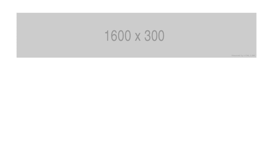
.carousel-container { width: 100%; display: flex; flex-direction: column;}.carousel-wrapper { display: flex; width: 100%; position: relative;}.carousel-content-wrapper { overflow: hidden; width: 100%; height: 100%;}.carousel-content { display: flex; transition: all 250ms linear; -ms-overflow-style: none; /* hide scrollbar in IE and Edge */ scrollbar-width: none; /* hide scrollbar in Firefox */}/* hide scrollbar in webkit browser */.carousel-content::-webkit-scrollbar, .carousel-content::-webkit-scrollbar { display: none;}.carousel-content > * { width: 100%; flex-shrink: 0; flex-grow: 1;}Next let's add the content to the Carousel. I'll be using placeholder image provided from placeholder.com.
App.js
...<Carousel> <img src="https://via.placeholder.com/1600x300" alt="placeholder" /> <img src="https://via.placeholder.com/1600x300" alt="placeholder" /> <img src="https://via.placeholder.com/1600x300" alt="placeholder" /></Carousel>...For demonstration purposes I'm adding some styling to the parent div on App.js.
App.js
...<div style={{ maxWidth: 1200, marginLeft: 'auto', marginRight: 'auto', marginTop: 64 }}> ....</div>...The results should look like this. As you can see there is only 1 image visible and it's not scrollable.
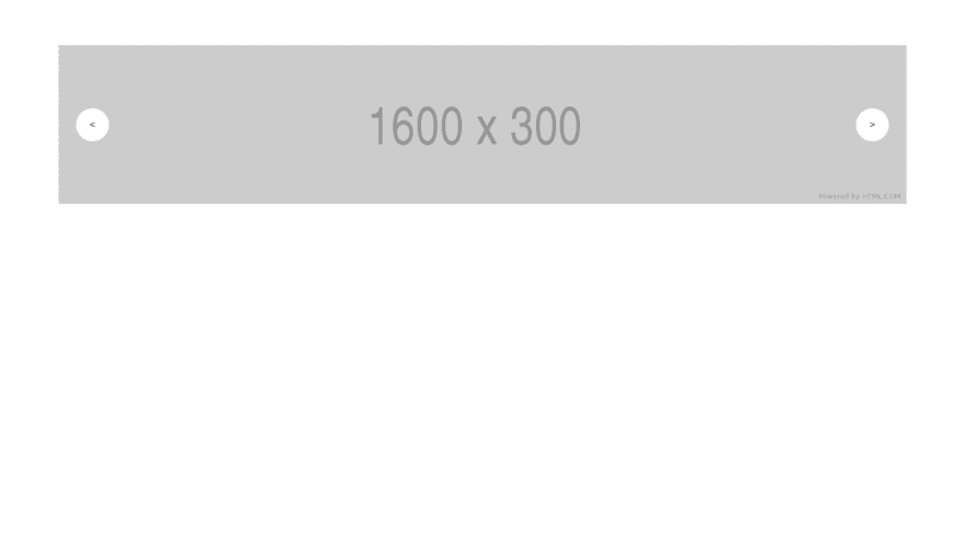
Adding control (Layout)
The next step is to add control so the user can interact with it. We'll only add previous and next button for now. I'll talk more about other control on my next posts.
Carousel.js
...<div className="carousel-wrapper"> {/* You can alwas change the content of the button to other things */} <button className="left-arrow"> < </button> <div className="carousel-content-wrapper"> ... </div> {/* You can alwas change the content of the button to other things */} <button className="right-arrow"> > </button></div>...carousel.css
....left-arrow, .right-arrow { position: absolute; z-index: 1; top: 50%; transform: translateY(-50%); width: 48px; height: 48px; border-radius: 24px; background-color: white; border: 1px solid #ddd;}.left-arrow { left: 24px;}.right-arrow { right: 24px;}...We've finished the basic layout for the Carousel control. Next we need to add the javascript to handle when the button get clicked and when to hide the button.
Adding control (Functionality)
For the Carousel control to be usable, we need to defined a state for the current active index (currentIndex) and the total item that passed to the Carousel (length).
Carousel.js
...const [currentIndex, setCurrentIndex] = useState(0)const [length, setLength] = useState(children.length)// Set the length to match current children from propsuseEffect(() => { setLength(children.length)}, [children])...After that let's add a transform style to the carousel-content, this is the style property that will handle the scrolling for the Carousel. This property will be controlled by the currentIndex state.
Carousel.js
...<div className="carousel-content-wrapper"> <div className="carousel-content" style={{ transform: `translateX(-${currentIndex * 100}%)` }} > {children} </div></div>...Next we will add a function to handle when the control button is clicked.
Carousel.js
...const next = () => { if (currentIndex < (length - 1)) { setCurrentIndex(prevState => prevState + 1) }}const prev = () => { if (currentIndex > 0) { setCurrentIndex(prevState => prevState - 1) }}...Let's bind the function to onClick listener on both of the button.
Carousel.js
...<button onClick={prev} className="left-arrow"> <</button>...<button onClick={next} className="right-arrow"> ></button>...And... it works!
Hide the control button
Okay, this is the final thing that need to be done, which is add a condition to hide the control button when not needed (e.g. previous button when it currently on the first slide, next button when it currently on the last slide)
Carousel.js
...{ currentIndex > 0 && <button onClick={prev} className="left-arrow"> < </button>}...{ currentIndex < (length - 1) && <button onClick={next} className="right-arrow"> > </button>}...And we are done!
We've finished creating a simple Carousel. You can check the final full code on my Github.
I hope this posts works for you!
Thank you!
Original Link: https://dev.to/rakumairu/simple-react-carousel-24m0
Dev To
 An online community for sharing and discovering great ideas, having debates, and making friends
More About this Source Visit Dev To