
An Interest In:
Web News this Week
- April 18, 2024
- April 17, 2024
- April 16, 2024
- April 15, 2024
- April 14, 2024
- April 13, 2024
- April 12, 2024
Some of Our Sources
- Slashdot
- Techcrunch
- Just Creative
- Smashing Apps
- Six Revisions
- Fuel Your Creativity
- My Ink Blog
- 24 Ways
- The Verge
- TechPowerUp
Help Webnuz
Referal links:
CSS Underline: 10 Examples
To design links or create animations of menu buttons, you might need to use underlines. From this article, youll learn about several methods of creating a CSS underline: using text-decoration, border-bottom, background-image, box-shadow properties, or even SVG.
CSS Text-Decoration Property
The text-decoration property is the most straightforward way to underline text. The main issue with text-decoration, however, is its lack of customizability. Well see more customized examples further in this article.
For now, lets see how we can use text-decoration for a simple CSS underline.
The text-decoration property is a shorthand property for 3 other properties:
text-decoration-line (required): overline, underline, underline overline, line-throughtext-decoration-style: solid, dotted, dashed, wavy, doubletext-decoration-color: for example, #ccc, blue, currentColor, or inherit
Here are several examples:

To remove the underline, simply use text-decoration: none.
If you want to add CSS underline on hover only, use these CSS rules:
a { text-decoration: none; }a:hover { text-decoration: underline; }An alternative to text-decoration is the border-bottom property. With border-bottom, you can also add a padding. In the example below, the first link is created with the text-decoration property, and the second one with border-bottom:
a:nth-of-type(1) { color: #32557f; text-decoration: underline #32557f dashed;}a:nth-of-type(2) { color: #32557f; text-decoration: none; border-bottom: 2px dashed #32557f; padding-bottom: 3px;}Now lets focus on fancier styling of the CSS underline.
Gradient Underline
You can create a gradient underline with background: linear-gradient and some other background properties. Heres an example:
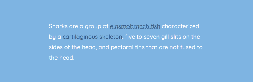
<p>Sharks are a <a href="#">group of elasmobranch fish</a> characterized by a cartilaginous skeleton, five to seven gill slits on the sides of the head, and pectoral fins that are not fused to the head.</p> a::after { content: ""; display: block; width: 32px; padding-top: 3px; border-bottom: 2px solid #f9dd94;} Read more tips on CSS gradients in CSS Gradients: 8 Examples of Usage.
Short Underline
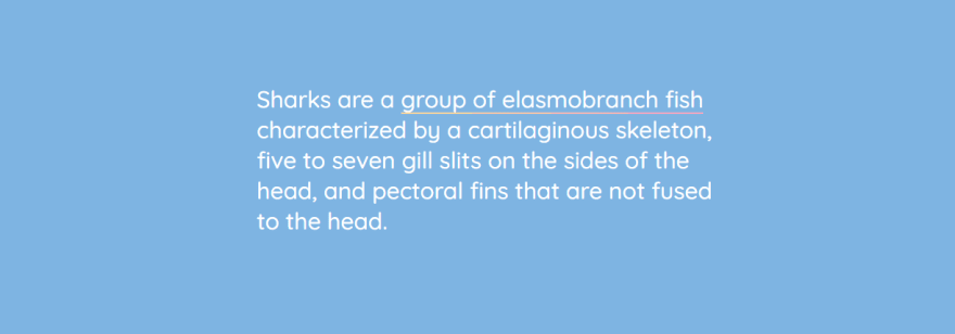
CSS underline can be of any width or height even shorter than the word or the link. For example, if you need to create a short underline to mark the beginning of a sentence or a title, use the ::after pseudo-element with the border-bottom property:

<p>Sharks are a <a href="#">group of elasmobranch fish</a> characterized by a cartilaginous skeleton, five to seven gill slits on the sides of the head, and pectoral fins that are not fused to the head.</p>a::after { content: ""; display: block; width: 32px; padding-top: 3px; border-bottom: 2px solid #f9dd94;}You can also set CSS underline thickness (for example, 2 px) by applying border-bottom: 2px solid #f9dd94;.
Marker-Style Underline
You can create a short skewed underline with the transform property:
h1 { padding: 30px 0 8px; position: relative;}h1::before { content: ""; position: absolute; left: 7%; bottom: 16px; width: 150px; height: 14px; transform: skew(-12deg) translateX(-50%); background: rgba(238,111,87,0.5); z-index: -1;}Moreover, you can create a marker-style underline for a long piece of text. Heres an example inspired by Codepen.io/Ash:

body { padding: 4rem;}.box { padding: 2rem; max-width: 14rem; background-color: #f2f2f2; border-radius: 4px; max-width: 50rem;}Underline-specific styles:
:root { /* The intrinsic width of the underline stroke (in pixels). This is * the same as the height of the cap images. Don't specify the * units! This is because of some of the calculations we do later on. */ --underline-intrinsic-width: 8; /* The actual width of the underline stroke we want to render (in pixels). * You can modify this, and the sizing and positioning should be calculated * accordingly. Again, Don't specify the units! */ --underline-width: 12; /* The color used to draw the underline. It should match the color * used in the cap images... unfortunately we can't modify the SVG * fill via CSS because it's a background image. */ --underline-color: #f1a1e3; /* We need to know the width of the cap images so that we * can position everything on the x axis accordingly. */ --underline-cap-width: 4px; /* The border is positioned relative to the bottom of the line. * We can move it upwards a little to create an overlap effect. */ --underline-offset-y: -2px; /* The padding to add to the x axis. By default, the caps would be * aligned with the beginning and end of the line. */ --underline-padding-x: 0.12em;}.text { display: inline; --underline-width-scale: calc(var(--underline-width) / var(--underline-intrinsic-width)); padding: 0 calc(var(--underline-padding-x) + calc(var(--underline-cap-width) * var(--underline-width-scale))); box-decoration-break: clone; background-repeat: no-repeat; color: #32557f; background-image: linear-gradient(180deg, var(--underline-color), var(--underline-color)), var(--cap-image-left), var(--cap-image-right); background-position-x: calc(var(--underline-cap-width) * var(--underline-width-scale)), 0, 100%; background-position-y: calc(100% - var(--underline-offset-y) * -1); background-size: calc(100% - calc(var(--underline-cap-width) * var(--underline-width-scale) * 2)) calc(var(--underline-width) * 1px), auto calc(var(--underline-width) * 1px), auto calc(var(--underline-width) * 1px); font-size: 3rem; font-weight: bold; --underline-width: 20; --underline-offset-y: -2px; /* The cap images to use that form the left and right shape.*/ --cap-image-left: url(https://files-6lc03kjqt.now.sh/left-2.svg); --cap-image-right: url(https://files-e7gkh52mq.now.sh/right-2.svg);}Using Images as CSS Underline
You can also use actual images (e. g. SVG or PNG) to style CSS underlines. Here are a couple of examples inspired by John D. Jamesons CodePen.
Star-shaped CSS underline:
body { line-height: 1.6;}p { background-image: url("https://s3-us-west-2.amazonaws.com/s.cdpn.io/78779/star.svg"); background-position: 0 1.3em; background-size: 10px 9px; background-repeat: repeat-x;}You can find more underline examples on sharkcoder.com
Original Link: https://dev.to/sharkcoder/css-underline-10-examples-3k7m
Dev To
 An online community for sharing and discovering great ideas, having debates, and making friends
More About this Source Visit Dev To