
An Interest In:
Web News this Week
- April 19, 2024
- April 18, 2024
- April 17, 2024
- April 16, 2024
- April 15, 2024
- April 14, 2024
- April 13, 2024
Some of Our Sources
- Just Creative
- The Logo Smith
- Smashing Apps
- Vandelay Design
- Inspiredology
- Reencoded
- CSS Globe
- Stylized Web
- Web Resource Source
- Android Headlines
Help Webnuz
Referal links:
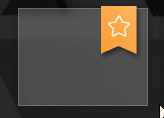
CSS morphable clip-path Ribbons
Today let's create some truly awesome ribbons by using the CSS clip-path property for exciting shapes.
Read the full article or watch me code this on Youtube:
Result
Setup
This is the basic markup we'll be needing for our ribbons. It's a sample wrapper with the actual div.ribbon and a div.content inside the ribbon.
<div class="sample"> <div class="ribbon slant-down" style="--color: #8975b4;"> <div class="content"></div> </div></div>As you can see, the CSS is designed that way, that certain things can be overridden through CSS custom properties on the ribbon itself.
For the ribbon's positioning to work, the enclosing div.sample must have position: relative; set. Otherwise it will end up in places you would not want it to go.
.sample { width: 128px; height: 96px; /* this one is important: */ position: relative; // ...}Positioning
Now for the positioning of the ribbon, its position is set to absolute in order to be able to move it freely as you want. The default position is 10 pixels left off the right margin and 3 pixels shifted upwords such that it looks like a piece of cloth hanging over the edge. Of course, the --right and --top custom properties can be overriden like we saw it before with the --color.
.ribbon { $default-right: 10px; $default-top: -3px; position: absolute; right: var(--right, $default-right); top: var(--top, $default-top);}Sizing
For all ribbons to have a reasonable default sizing which can also be adjusted individually, the width and min-height is set on the div.content. Adjusting width or height can again be achieved by overriding --width and --height.
.ribbon { $default-width: 32px; $default-height: 36px; ... > .content { width: var(--width, $default-width); min-height: var(--height, $default-height); }}Color & Basic Styling
The color is given through the --color custom property which also has a default value. It's also quite useful to have pre-defined CSS classes that reusably set the ribbons color, like you would do it e.g. with a .success class setting the color to green.
.ribbon { $default-color: #2ca7d8; ... > .content { ... color: white; font-size: 1.25rem; text-align: center; font-weight: 400; background: var(--color, $default-color) linear-gradient(45deg, rgba(black, 0) 0%, rgba(white, 0.25) 100%); padding: 8px 2px 4px; }}Shaping
Finally, with clip-path the shape of the ribbon is defined. By default it's just a rectangle.polygon(...) takes an arbitrary list of X and Y coordinates that define the actual shape the target element is clipped to. The rect(...) function could have been used here instead of a polygon, but if you read on until Morphing section, you will see, why it is used here.
.ribbon { > .content { ... clip-path: polygon(0 0, 100% 0, 100% 100%, 50% 100%, 0 100%); }}Now, for each desired shape of the ribbon an own clip-path is defined, depending on the class being set on the div.ribbon.
Using percentages is not always that useful as it depends too much on the actual size of the element. Since the lower contour should always stay the same independently of the actual content height, calc(100% - 8px) is used to ensure, that e.g. in case of the .up ribbon, the middle point is always shift up by exactly 8 pixels.
.ribbon { &.down > .content { clip-path: polygon(0 0, 100% 0, 100% calc(100% - 8px), 50% 100%, 0 calc(100% - 8px)); } &.up > .content { clip-path: polygon(0 0, 100% 0, 100% 100%, 50% calc(100% - 8px), 0 100%); } &.slant-up > .content { clip-path: polygon(0 0, 100% 0, 100% calc(100% - 12px), 50% calc(100% - 6px), 0 100%); } &.slant-down > .content { clip-path: polygon(0 0, 100% 0, 100% 100%, 50% calc(100% - 6px), 0 calc(100% - 12px)); } &.check > .content { clip-path: polygon(0 0, 100% 0, 100% calc(100% - 20px), 40% 100%, 0 calc(100% - 12px)); }}Drop Shadow
To make the ribbon stand out a little more, a drop shadow is added. Due to the clip-path the usual box-shadow cannot be used here, as it also cuts of the shadow itself and does not take the shape of clip-path into account. Therefore a filter with drop-shadow is used on the parent element, as it is able work with the actual resulting shape of the content.
It's important to set this on the parent element, as clip-path also cuts off this shadow as well.
.ribbon { ... /* box-shadow will not work here */ filter: drop-shadow(2px 3px 2px rgba(black, 0.5));}Morphing
And to make fancy as hell, we allow our ribbon to morph from one shape to another, by including the clip-path property in the list of transitionable properties.
This is the point, where we're required to make _all shapes have the same number of points to make this work. If the number of points differs from one shape to another, it simply jumps, which is not what we want here.
.ribbon { > .content { transition: clip-path 1s, ...; }}Original Link: https://dev.to/crayoncode/css-morphable-clip-path-ribbons-1ld6
Dev To
 An online community for sharing and discovering great ideas, having debates, and making friends
More About this Source Visit Dev To