
An Interest In:
Web News this Week
- April 4, 2024
- April 3, 2024
- April 2, 2024
- April 1, 2024
- March 31, 2024
- March 30, 2024
- March 29, 2024
Some of Our Sources
- Techcrunch
- Simplebits
- Web Designer Wall
- Smashing Magazine
- Smashing Apps
- You The Designer
- Specky Boy
- Android Dissected
- Hashedout
- The Verge
Help Webnuz
Referal links:
Bulma CSS - A curated list with resources
Hello Coders,
This article is a short introduction to Bulma CSS - the popular open-source CSS framework based on Flexbox. With more than 40k stars on Github and 300+ contributors, Bulma is a great alternative to Bootstrap being modular, developer-friendly, and easy to customize. The article also provides a shortlist with starters styled with Bulma to end up the theoretical content with something usable for our daily projects.
Thanks for reading! Content provided by AppSeed - a platform used by many developers across the globe. TL;DR;
- What is Bulma CSS
- How to use/import Bulma CSS
- Bulma basics: layouts, elements, components, forms
Bulma Starters
- A super simple one-page starter (demo)
- (Free) Bulma Fresh - one-page project crafted by CSS Ninja
- (Free) Bulma Krypton - a complete website styled with Bulma
- (Free) Flask Play - a simple Flask starter provided by AppSeed

According to the CSS 2020 Survey Results published by StateOfCSS.com, Bulma CSS scores the 3rd position of the satisfaction scale, right after Tailwind and Pure CSS. This is not a surprise for those that use Bulma on daily basis.

What's so special about Bulma CSS? Let's find out together.
- Modern Framework - based on Flexbox specifications
- Mobile first, responsive
- Lightweight, modular and JS Free
- Built-in components: Cards, Tabs, Menus
- Actively supported and versioned by 300+ contributors
To get started with Bulma is quite easy. We can open an editor, create a minimal HTML file that includes Bulma CSS and (optionally) Font Awesome:
<!DOCTYPE html><html lang="en"><head> <title>Bulma CSS - Starter Page</title> <link rel="stylesheet" href="https://cdn.jsdelivr.net/npm/[email protected]/css/bulma.min.css" crossorigin="anonymous" /> <link rel="stylesheet" href="https://cdnjs.cloudflare.com/ajax/libs/font-awesome/5.15.1/css/all.min.css" crossorigin="anonymous" /></head><body> <div class="container is-fluid"> <!-- Add here Bulma Stuff --> </div></body></html>The relevant assets are loaded via CDN (no download required):
- bulma.min.css - minified version of Bulma 0.9.1
- font-awesome - minified version v5.15
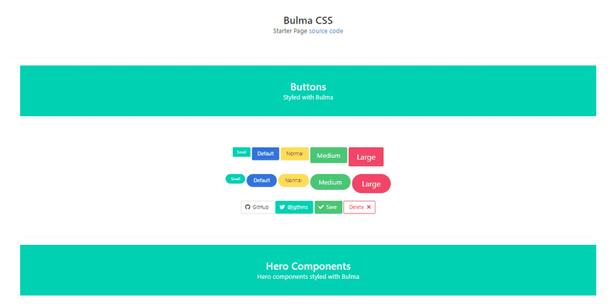
Bulma - Buttons
The code snippet that code some simple buttons is fairly simple:
<button class="button is-primary is-small">Small</button><button class="button is-link">Default</button><button class="button is-warning is-normal">Normal</button><button class="button is-success is-medium">Medium</button><button class="button is-danger is-large">Large</button>The output for this code looks like on this screenshot:

To round the layout, we can use the qualifier "is-rounded" as presented in this code snippet:
<button class="button is-rounded is-primary is-small">Small</button><button class="button is-rounded is-link">Default</button><button class="button is-rounded is-warning is-normal">Normal</button><button class="button is-rounded is-success is-medium">Medium</button><button class="button is-rounded is-danger is-large">Large</button>
Bulma - Hero Component
This component can be invoked by using class "hero" as the main container and this will code a full-width banner on the page.

Bulma - Contact Form
In this section, we will style a contact form with an image on the left and the form fields on the right.

The relevant code:
- Define a container for all elements: class "container"
- Define two columns with 6 rows each: class "column is-6"
- The left container will expose the image
- The right container will contain the form:
<form> <div class="field"> <div class="control"> <input class="input" type="email" placeholder="Email"> </div> </div> <div class="field"> <div class="select is-fullwidth"> <select> <option disabled selected>Select product</option> <option>Product 1</option> <option>Product 2</option> <option>Product 3</option> </select> </div> </div> <div class="field"> <div class="control"> <textarea class="textarea" rows="5"></textarea> </div> </div> <div class="field"> <div class="control"> <button class="button is-primary is-fullwidth">Submit</button> </div> </div></form>Bulma - Cards
The card component comprises several elements that you can mix and match. All card elements should be bundled inside a "card" container:
- card header
- card image
- card content
- card footer
Let's visualize a sample with for cards styled with an inner image, text, and a loading bar.
Here is the code for the first card:
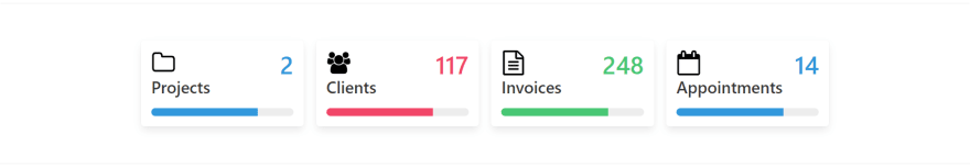
<div class="box"> <div class="media"> <div class="media-left"> <figure class="image is-48x48"><img src="media/icons/folder-o.svg"> </figure> </div> <div class="media-content has-text-right"> <h3 class="title is-1 has-text-info">2</h3> </div> </div> <h4 class="title">Projects</h4> <progress class="progress is-info" role="progressbar" value="75" max="100"> </progress></div>This card can be customized by changing the CSS qualifiers provided by Bulma:
- Resize the image by using class is-96x96 (image gets a double size)
- Update the Number and class to has-text-warning
- Progress bar to use is-success class and value 25 of 100
With all those changes applied, the new layout is:

Bulma - Team Cards
Using cards for our team or pricing is quite a common component used in many templates. Bulma helps us to code a team section using a minimum CSS code:
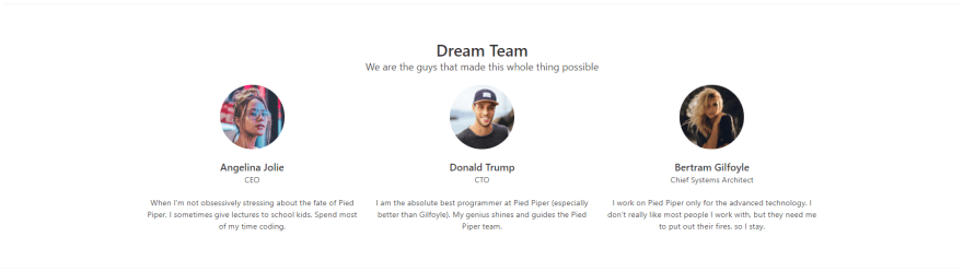
Let's take a look at the first card and analyze the relevant CSS classes:
<div class="column is-4"> <div class="level"> <div class="level-item"> <figure class="image is-128x128"> <img class="is-rounded" src="media/team-1.jpg" alt=""> </figure> </div> </div> <h5 class="title is-5">Angelina Jolie</h5> <p class="subtitle is-6">CEO</p> <p>When I'm not obsessively stressing ...</p></div>- The card width has 4 cells (we need three cards on a row)
- The Image has the figure container and the inner "is-rounded" image
- The descriptors "is-5" and "is-6" are classes defined for headings objects
All above samples are saved on a single file mentioned in the top section: Index.html - For LIVE demo, please access this link.
To learn more about this amazing framework feel free to access the official Bulma CSS website or jump directly and read the docs. To pass over the theory, we can take a look at a few Bulma CSS starters already coded and customized.
Bulma Fresh
This is a super simple one-page starter with a hamburger menu and a popup for authentication forms. The UI is crafted by Css Ninja agency and the code can be downloaded directly from Github under the MIT License.
- Bulma Fresh - source code
- Bulma Fresh Demo - LIVE Deployment

Bulma Krypton
Krypton is a one-page landing page starter built by Css Ninja Studio. Krypton is licensed under the MIT license and based on this permissive license, the UI can be used for unlimited hobby & commercial projects:
- Bulma Krypton - source code

Thanks for reading! For more resources please access:
- Bulma CSS - official website and docs
- More Bulma CSS apps and starters provided by AppSeed
- Bulma Builder - a handy tool to create Bulma -based templates in minutes
Thank you! Btw, my (nick) name is Sm0ke and I'm pretty active also on Twitter.
Original Link: https://dev.to/sm0ke/bulma-css-a-curated-list-with-resources-4o8j
Dev To
 An online community for sharing and discovering great ideas, having debates, and making friends
More About this Source Visit Dev To