
An Interest In:
Web News this Week
- April 23, 2024
- April 22, 2024
- April 21, 2024
- April 20, 2024
- April 19, 2024
- April 18, 2024
- April 17, 2024
Some of Our Sources
- Simplebits
- Just Creative
- The Logo Smith
- Creative Curio
- Fuel Your Creativity
- Inspiredology
- 24 Ways
- Web Resource Source
- Willems Lab
- The Verge
Help Webnuz
Referal links:
How to create slick TV show title sequences
Similar to my last article, I want to focus on the thought process behind creating and implementing something. Often, it can be more enlightening than delving into code. I will highlight how I made some decisions, and share the discoveries I made along the way.
Some of the opening and closing title sequences for TV show are really slick these days. I thought it would be fun to recreate some of them. It should be a good opportunity to learn more about typography, and improve my CSS and animation skills.
First stop, Killing Eve. I will show you the finished article first.
I really like Killing Eve. The title is very well crafted with beautiful typography and a subtle animation. It was created by Matt Wiley.
If you're not familiar with the TV show, below is a video compilation of the title sequence for every episode!
For each episode, the title changes in the following ways:
- The background color and the text color is different;
- The oozing blood trail runs down a different characters (either the 'K', 'N', or 'V');
- There is a different accompanying song.
The song selection is excellent. Coincidentally, I saw in the titles that there is a Song Co-ordinator who must do this! I found myself searching for some of the featured music after watching a few different episodes!
What I want to do is create a montage similar to the video above, but make it random. The colors, the oozing blood trail character, and the song will be chosen at random each time it plays.
Design Decisions
Ideally, we would use the original typeface, but fancy typefaces tend to carry a pricetag. This is just for fun, so I'm only looking at free options. If we get lucky and can use the original typeface for free, then we would have more options to create it whatever way we like.
It looks like the typeface was custom-made by Matt Wiley for the TV show. It doesn't appear to be published. So, we definitely need to search for free alternative.
The closest match I could find is Deutschlander. It would need to be edited in a few ways to match the original typeface. We need to make a scalable vector graphic (SVG) to be able to do this. What we can do is convert the title text to a SVG path, and then we can edit it whatever we want to.
SVG is desirable for this type of animation generally because it is scalable, we know everything will look good on different screen sizes without any extra work. Text can be a bit tricky to work with animations, if you want to scale it or move forward/backwards, then you can get some undesirable results with some typefaces.
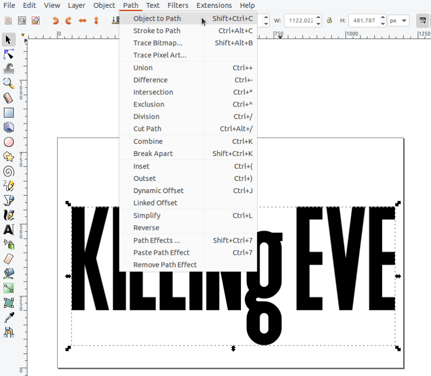
If you're not familiar with converting text to a path, you can do it in Inkscape by selecting the text instance, and selecting "Object to Path" (as below). You can do the same in most vector graphics tools.
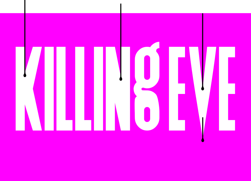
When I typed out the text "KILLING EVE", I was surprised that the 'g' glyph is actually lower case, while the others are all uppercase! It didn't register until it was in front of my nose! It's an unusual decision but it works well!

In the image above, you can see how I transformed the text. The text on top is the text that I typed out as normal. Below the red arrow, is the version I edited as a SVG path. I had to change the shape of a few glyphs (E, L, g, V). All gylphs needed to be made narrower and taller.
The next thing to figure out is how do we create the dripping blood trails?
Morphing the path for a glyph to "cut out" and animate the blood trail is possible, but it would be complicated. There are some JavaScript libraries to help with that (such as GSAP MorphSVGPlugin), but it's a last resort.
It's probably easiest to overlay an instance of the blood trail over each of the chosen gylphs. So, we can do something like the image below.
The black objects are the overlayed blood paths. We change the fill of these to match the background colour (pink in this case) to create the effect. We just hide them until we need to animate them. There is one variaion on the effect - the blood trail at the bottom of the 'V' glyph matches the text colour (white in this case), so it appears like the glyph is oozing.
For the dripping animation, we want it to trickle slowly down. There is another effect happening at the same time it is moving, the droplet at the bottom of the trail is growing in size. Again, we could morph a single path into a different path to achieve this effect, but it would be overkill (pardon the pun).
So, it's probably best we split the blood trail into 2 different paths : the trail (can make it a rect) and the droplet. We just need to synchronise the speed of descent of both of these.
We prefer to use the transform and opacity properties for our animation as they are the most performant.

The movement for the trail is straightforward, it is a translation along the Y axis with transform: translateY(50px);. You can try out the values to see what gives you the required result.
Similarly, for the droplet we want to move it on the Y axis, but also scale it up at the same time. When we use transform: scale(1.2); to make something 20% bigger, it also reduces the amount we need to move it. So we need to reduce the amount of the Y translation to get it to match the trail.
The final bit of the animtion is have the entire title (omniously) move towards the viewer. This is a translation along the Z axis. To get the amount of movement correct, we must also set the perspective on the parent element. So we can use something liketransform: translateZ(100px); on the SVG, and perspective: 1100px; on the body (the parent element) to get the right effect.
That's the thought process behind it.
The animation can be done in CSS or in JavaScript. I chose to do in JavaScript with the GreenSock (GSAP) library. The random elements can't be done in CSS.
There is an implication if you use JavaScript to execute an infinite looping animation like this. Most libraries use requestAnimationFrame() under the hood. When you switch tabs on a browser, if the browser finds an animation that uses requestAnimationFrame(), it will slow it down to save resources. So when you open the tab again, the animation might be in an odd state. This animation could have some ghosting of multiple blood trails for a little while before it returns to business as usual.
To prevent this tab-switching issue, you need to intervene and suspend the animation yourself when the window loses focus.
What I learned
I learned a bit more about GSAP:
- You can have simultaneous tweens execute on the same timeline by using a label or specifying a time variable. Prior to that, I was creating separate timelines.
- You can't repeat an animation if you want to use a random function to change the selector for a tween each time it repeats. The best solution I found is to wrap the call to the random function and the associated timeline in a
setIntervalcall. You can check the code to see what I did! - If you want to randomise a tween value, you can use built-in random functions.
Exploring typefaces and reading more about typography has trained my eye more.
Schitts Creek and Orange is the New Black
I'm including the title sequences for Schitts Creek and Orange is the New Black here also. I think the design/development process is less edifying, so I haven't gotten into them! I will just tell what the typography choices are.
You can click on the text in the codepens to replay the animations.
I had a similar journey with the typeface for Orange Is The New Black. The original is called Damaged Guts, which has a commercial license. I found a free alternative called CF Punk Fashion and scuffed it up more in editing to give a similar effect!
The typeface used for Schitts Creek is Linotype Didot. I found a suitable alternative in Playfair Display.
Source code
The source code for 3 titles sequences is available in this github repo.
The end
Also, if you're a fan of The Queen's Gambit, I found this interview with the designer behind the title sequences. I have added some of them to my TODO list!
I hope you enjoyed this short design thinking tour.
Happy holidays wherever you are!
Original Link: https://dev.to/robole/how-to-create-slick-tv-show-title-sequences-407o
Dev To
More About this Source Visit Dev To