
An Interest In:
Web News this Week
- April 24, 2024
- April 23, 2024
- April 22, 2024
- April 21, 2024
- April 20, 2024
- April 19, 2024
- April 18, 2024
Some of Our Sources
- Web Designer Wall
- Pearsonified
- The Logo Smith
- TutsPlus - Design
- Web Designer Depot
- Reencoded
- Line 25
- Daily Now
- Dev To
- TechPowerUp
Help Webnuz
Referal links:
How To Create A "Glassmorphic" Template In Pure HTML & CSS.
What Is Glassmorphism?
If you're hearing the term "Glassmorpism" for the first time, well... It only just got my attention a few hours before this post so, What is glassmorphism?
Glassmorphism is a new trend which is getting more traction on websites like Dribble, Behance etc and I've seen a couple of awesome designs made using this trendy UI.
Here's an example by Rishabh Saxena
It is important to note that as of the time of writing this blog, glassmorphism is not widely used on the web yet. So we're going to be exploring the power of our creativity.
Attributes/Characteristics
- Translucency (frosted-glass)
- Detailed Colors (becomes cloud-like)
- Shadows
- Everything else...
prerequisites
To follow up with this tutorial, Since it might require we copy-paste some code to test things out, we'll:
- Create an HTML and CSS file ( index.html and index.css)
- Link to the full working code on GitHub if you ever get stuck.
- Link to Live website for reference.
The main CSS property to watch out for is the backdrop-filter. Feel free to get documentations to any CSS or HTML properties on MDN. The backdrop-filter : blur(_px) is what gives it the frosty-like glass effect.
The backdrop-filter does more than just blur a background. Again, check the MDN for the full documentation.
In order for this to work effectively, the element has to be partly translucent(mimicking a glass-effect).
Now, in our index.html let's paste the code block below
<!DOCTYPE html><html lang="en"> <head> <link rel="stylesheet" href="./index.css" /> <meta charset="UTF-8" /> <meta name="viewport" content="width=device-width, initial-scale=1.0" /> <meta name="description" content="Glassmorphism" /> <meta name="keywords" content="glassmorphism,UIUX" /> <meta name="author" content="emmaccen" /> <title>Glass Morphism</title> </head> <body> <div class="landingContainer"> <div class="centered"> <h1 class="title">Changing The World</h1> </div> <div class="glassContainer"> <div class="cover"></div> </div> </div> </body></html>I won't be doing any explanation on the HTML code snippet since its pretty basic.
index.css
body { margin: 0; padding: 0;}* { box-sizing: border-box;}.landingContainer { /* span the entire desktop height : height: 100vh;*/ height: 100vh; font-family: helvetica; /* set a gradient background with 3 colours https://coolors.co/ */ background: linear-gradient( to right, rgba(32, 191, 85), rgba(32, 164, 243), rgba(11, 79, 108) );}.centered { /* center content */ display: flex; justify-content: center; align-items: center; /* so it takes up its containers height (landingContainer)*/ height: inherit;}.title { color: whitesmoke; /* cover the entire page width : font-size: 10vw;*/ font-size: 10vw; text-align: center;}/* The real deal starts here*/.glassContainer { position: absolute; /* center content */ display: flex; justify-content: center; align-items: center; top: 0; width: 100%; height: 100%;}.cover { transition: 0.5s all ease; height: 70%; width: 70%; background-color: rgba(255, 255, 255, 0.25); /* box-shadow: none|h-offset v-offset blur spread color |inset|initial|inherit; */ box-shadow: 0 8px 32px 0 rgba(31, 38, 135, 0.37); /* For the fog-like glass effect */ backdrop-filter: blur(4px); -webkit-backdrop-filter: blur(4px); border-radius: 10px;}/* responsiveness */@media (max-width: 700px) { .cover { height: 30%; }}Now for the CSS code above.
- I got my colour combo from Coolors.co so, you can mix and match to replace mine.
- I've included comments in the code, so I won't have to explain here again. You can Check MDN for full documentation if any CSS property isn't clear.The result should look something like this:

So that's it. This tutorial is pretty basic and I wanted it to be something we can go through in 5-10Mins. I hope this wasn't a waste of your precious time.
My Thoughts
Am really looking forward to 2021 and the awesome real-world application of people's creativity with Glassmorphism. I have a feeling it'll trend for quite a while if done right.
Pro Tips
- You can save a lot of time by checking out glassmorphism.com. It's a website that helps you generate glassmorpic CSS styles on the fly. Also, you can modify as you wish (it comes with visual representations too)
- Glassmorphism is not limited to the web alone if you build/design native apps, you might want to implement these designs too.
Conclusion
Am always happy when I get feedback about my blogs, so don't hesitate to play with the comment/discussion area, like and bookmark this blog if you love it or share with others.
You can follow me on Twitter, or send me a sample of what you've created.
You can also fork/clone the repo on GitHub. I have two branches created. The Master/Main branch is what we practised in this tutorial. The Second branch is what we have as the cover image of the article.
If you read up to this point, thank you I appreciate your will to learn and am happy to have you reading this.
Check out other Glassmorphic designs on dribble.com
More Design Inspiration
Design by Aakash Raj Dahal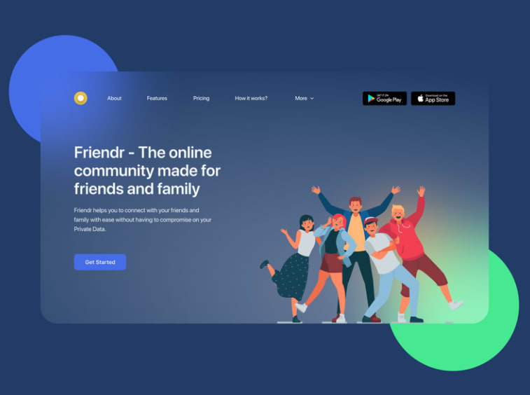
Mobile design by Brightlab
Original Link: https://dev.to/emmaccen/how-to-create-a-glassmorphic-template-in-pure-html-css-3jo4
Dev To
 An online community for sharing and discovering great ideas, having debates, and making friends
More About this Source Visit Dev To