
An Interest In:
Web News this Week
- April 19, 2024
- April 18, 2024
- April 17, 2024
- April 16, 2024
- April 15, 2024
- April 14, 2024
- April 13, 2024
Some of Our Sources
- Engadget
- Technology Review
- TutsPlus - Code
- Team Treehouse
- Smashing Magazine
- Inspiredology
- 24 Ways
- Android Dissected
- Daily Now
- The Verge
Help Webnuz
Referal links:
How to make an animated dropdown with Vue and Tailwindcss
There will be a time when you have to make a custom dropdown, I happened to make one recently at work and this is the approach I took.
I will be creating a Nuxt.js project since that's what I am usually preferring over vanilla Vue these days.
Alright, lets do this.
TL;DR Here's the demo
1. Setting up our project.
To create a Nuxt project run npx create-nuxt-app dropdown and select Tailwindcss as our choice of framework when setting up the project.

Nuxt is still in the process of adding the newly released Tailwindcss 2.0, hence we will be installing the v2 manually, in order to that. Let's run a few commands in our project
npm i -D tailwindcss@npm:@tailwindcss/postcss7-compat postcss@^7 autoprefixer@^9This will update the Post css in our nuxt project which is necessary to run the latest version of Tailwind.
Since I won't be changing any of tailwind's config, so I won't create a custom config file, if you want to know how to how to customise tailwindcss.
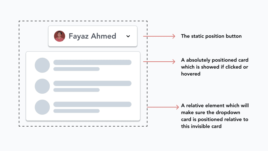
2. How does it work?
So, a dropdown will basically have three things technically.
- A button or link which is the users action.
- A card element which will be displayed when the above button/link is clicked or hovered.
- A hidden wrapping
divwhich will be acting as a container for the button and the dropdown content
3. Making the dropdown
I will be making a vue component, which is better for isolating the dropdown's state, making sure the code is readable and clean.
PS, you can clear out the boilerplate from index.vue in pages & default.vue in layouts folders resp.
- Import a component called
<dropdown>in yourindex.vuepage.
<template> <div class="min-h-screen flex items-center justify-center"> <dropdown /> </div></template>- Create a file called dropdown.vue in the components folder.
Now let's add some code, a lot of code actually, but that is what we need when we need a good looking UI tbh, there's not short cuts.
<template> <div class="relative inline-block text-left text-gray-800" v-on-clickaway="closeMenu" > <div> <span class="rounded-md shadow-sm"> <button @click="isMenuOpen = !isMenuOpen" type="button" class="inline-flex items-center justify-between w-full rounded-md border border-gray-300 h-10 px-4 py-4 bg-white text-sm leading-5 font-medium text-gray-700 hover:text-gray-500 focus:outline-none focus:border-blue-300 focus:shadow-outline-blue active:bg-gray-100 active:text-gray-800 transition ease-in-out duration-150 btn-focus" id="options-menu" aria-haspopup="true" aria-expanded="true" > <span> {{ label }} </span> <img src="https://s.svgbox.net/hero-solid.svg?ic=chevron-down&fill=grey-800" class="-mr-1 ml-2 h-5 w-5" /> </button> </span> </div> <transition enter-active-class="transition ease-out duration-100" enter-class="transform opacity-0 scale-95" enter-to-class="transform opacity-100 scale-100" leave-active-class="transition ease-in duration-75" leave-class="transform opacity-100 scale-100" leave-to-class="transform opacity-0 scale-95" > <div v-if="isMenuOpen" class="origin-top-right absolute right-0 mt-2 w-56 rounded-md shadow-lg text-sm overflow-hidden border z-20" > <div class="rounded-md bg-white shadow-xs" role="menu" aria-orientation="vertical" aria-labelledby="options-menu" > <div> <div class="bg-gray-100 p-4 flex items-center"> <div class="w-full"> <img class="h-8 w-8 rounded-full mb-2" src="https://fayazz.co/fayaz.jpg" alt="avatar" /> <p class="font-semibold text-base">Fayaz Ahmed</p> <button class="flex items-center justify-between w-full focus:outline-none" > <p class="text-gray-600">[email protected]</p> <img src="https://s.svgbox.net/hero-solid.svg?ic=cog&fill=grey-700" class="h-4 w-4" /> </button> </div> </div> </div> <div class="border-t border-gray-100"></div> <div class="py-1"> <nuxt-link to="/" class="p-4 flex items-center space-x-2"> <img src="https://s.svgbox.net/hero-outline.svg?ic=currency-rupee" class="h-6 w-6" /> <span> Transaction History </span> </nuxt-link> <nuxt-link to="/" class="p-4 flex items-center space-x-2"> <img src="https://s.svgbox.net/hero-outline.svg?ic=heart" class="h-6 w-6" /> <span> Favourites </span> </nuxt-link> </div> <div class="border-t border-gray-100"></div> <div class="py-1"> <nuxt-link to="/" @click.native="isMenuOpen = false" class="p-4 flex items-center space-x-2" > <img src="https://s.svgbox.net/hero-outline.svg?ic=logout" class="h-6 w-6" /> <span> Logout </span> </nuxt-link> </div> </div> </div> </transition> </div></template>PS, I have also installed a clickaway plugin for my project called vue-clickaway. You can just import it as a directive in your component to handle the clicks outside the dropdown and close it.
Here's what I did to animate the dropdown
I used the vue transition component to make it work and these are the tailwind classes, which did the magic.
enter-active-class="transition ease-out duration-100"enter-class="transform opacity-0 scale-95"enter-to-class="transform opacity-100 scale-100"leave-active-class="transition ease-in duration-75"leave-class="transform opacity-100 scale-100"leave-to-class="transform opacity-0 scale-95"Basically, it's just scaling the dropdown card to 95 and back to 100.
Let me know if you need any help on this.
Original Link: https://dev.to/fayaz/vue-tailwindcss-a-match-made-in-heaven-animated-dropdown-1nm
Dev To
 An online community for sharing and discovering great ideas, having debates, and making friends
More About this Source Visit Dev To