
An Interest In:
Web News this Week
- April 16, 2024
- April 15, 2024
- April 14, 2024
- April 13, 2024
- April 12, 2024
- April 11, 2024
- April 10, 2024
Some of Our Sources
- Techcrunch
- Technology Review
- Web Designer Wall
- Joshua Blankenship
- You The Designer
- Wal You
- Freelance Switch
- Hashedout
- The Verge
- TechPowerUp
Help Webnuz
Referal links:
Angular: Create A Lazy Loaded Tailwind Modal
I have the opportunity to participate to Owlly, an amazing and meaningful open source project, founded by Sandro Scalco, which aims to enable digital democracy in Switzerland.
Last week, as we were discussing the need to pre-render the main Angular application using Scully, we also took the decision to migrate it to Tailwind CSS.
As a result, I notably had to create a custom generic lazy loaded modal.
Meta
This blog post has been published in November 2020. The solution has been tested with Angular v11 and Tailwind v2.
Introduction
This tutorial describes the creation of a generic dialog with Angular and Tailwind CSS. With generic, I mean that the goal is the creation of a dialog's container which can be reused several times in the application, with different content, without the need to rewrite everything multiple times.
In addition, it was and is also important to me that the modal content is lazy loaded for the best performances.
Add Tailwind CSS
I have tried various solutions to add Tailwind CSS to Angular application and despite a small issue, which is probably going to be solved soon, the Tailwind schematic provided by the team ngneat is by far the simplest method I tried out.
ng add @ngneat/tailwindRun the above command, follow the prompt and enjoy.
Service
In order to open and close any modals, we create a service modal.service.ts. It takes care of these operations and, it also takes care of attaching them to the DOM body.
Regarding this operation, to be honest with you, I did not know spontaneously how such things can be coded in Angular and, I had to google for a solution. Fortunately, I found this nice article of Carlos Roso which describes the required steps.
Finally, as the service is provided in root, it is worth to notice that we keep in memory the reference to the component which is currently attached, respectively displayed. Doing so, we are allowing only one modal at a time. If would have the requirement to display multiple elements at the same time, I would suggest you to handle these with an array instead of a single class variable.
import { ApplicationRef, ComponentFactoryResolver, ComponentRef, EmbeddedViewRef, Injectable, Injector, Type,} from '@angular/core';@Injectable({ providedIn: 'root',})export class ModalService<T> { private componentRef: ComponentRef<T> | undefined; constructor( private componentFactoryResolver: ComponentFactoryResolver, private appRef: ApplicationRef, private injector: Injector ) {} async open(component: Type<T>): Promise<void> { if (this.componentRef) { return; } this.componentRef = this.componentFactoryResolver .resolveComponentFactory<T>(component) .create(this.injector); this.appRef.attachView(this.componentRef.hostView); const domElem = (this.componentRef.hostView as EmbeddedViewRef<any>) .rootNodes[0] as HTMLElement; document.body.appendChild(domElem); } async close(): Promise<void> { if (!this.componentRef) { return; } this.appRef.detachView(this.componentRef.hostView); this.componentRef.destroy(); this.componentRef = undefined; }}Modal Container
To initialize the modal, the container, we create a new module modal.module.ts.
import {NgModule} from '@angular/core';import {CommonModule} from '@angular/common';import {ModalComponent} from './modal.component';@NgModule({ declarations: [ModalComponent], imports: [CommonModule], exports: [ModalComponent],})export class ModalModule {}We then add the related component modal.component.ts which does not do much except being created with a state display per default initialized to true and exposes a function close.
As we are lazy loading the modals, these are going to be displayed upon creation, therefore the default state is open respectively not closed.
The close function contains a small timeout so that the modal first graphically fade away before being effectively detached from the DOM by the service we just created previously.
import {Component} from '@angular/core';import {ModalService} from '../../services/modal.service';@Component({ selector: 'app-modal', templateUrl: './modal.component.html', styleUrls: ['./modal.component.scss'],})export class ModalComponent<T> { display = true; constructor(private modalService: ModalService<T>) {} async close(): Promise<void> { this.display = false; setTimeout(async () => { await this.modalService.close(); }, 300); }}The HTML code of the container is extracted from the free overlay example provided by Tailwind. We are using a section for which we apply a fixed position and to which we give a z-index of 10 . In addition, we are responsively styling the required spaces, shadows and sizes.
Beside the UI itself, it is worth to notice that we are using the Angular content projection capability, ng-content, to be able to add any content in the modal respectively to makes this dialog a generic container.
We also attach the close function to the section and, we stop the propagation of the $event on its content, otherwise the modal would close itself each time one of its children would be clicked or pressed.
<section [class.open]="display" class="fixed z-10 inset-0 overflow-y-auto" (click)="close()"> <div class="flex items-center justify-center min-h-screen pt-4 px-4 pb-20 text-center sm:p-0 bg-gray-900 bg-opacity-40" > <div (click)="$event.stopPropagation()" class="inline-block align-bottom bg-white rounded-lg text-left overflow-hidden shadow-xl transform transition-all sm:my-8 sm:align-middle sm:max-w-lg sm:w-full" role="dialog" aria-modal="true" aria-labelledby="modal-headline" > <div class="bg-white px-4 pt-5 pb-4 sm:p-6 sm:pb-4"> <ng-content></ng-content> </div> </div> </div></section>Finally, we animate the opening and closing of the modal upon the style class open with some custom CSS. It might be possible to achieve this with some Tailwind utilities but, I felt more confident to solved it that way.
section { visibility: hidden; opacity: 0; &.open { visibility: inherit; opacity: 1; } transition: opacity 250ms ease-in;}Modal Example
The above service and container being set, we are now able to use these to create any modals. As for example the following one in which the user would be able to input a username.
Note that the example contains a form but, it is not mandatory. To the contrary and really important to notice:
I advise you to DO NOT create a separate file for the module declaration but, in this specific case, to declare its module within the same file as the component.
You might not face the same error as I did but, as we are using a bunch a core components declared and referenced in another separate module, Angular was complaining at build time it was unable to resolve these until I finally figured out that adding the module within the component file would solve the build issue.
Beside this, your component being projected in the modal container, it basically works as any other standalone component.
In case you would like to add a button to close the modal from its content or close it following the completion of a function, you can, as displayed in the example, use a ViewChild to access the container and call the close method we declared previously.
import {Component, NgModule, ViewChild} from '@angular/core';import { FormGroup, FormBuilder, Validators, FormsModule, ReactiveFormsModule,} from '@angular/forms';import {CommonModule} from '@angular/common';import {ModalModule} from '..//modal/modal.module';import {ModalComponent} from '../modal/modal.component';@Component({ selector: 'app-newsletter', templateUrl: './newsletter.component.html', styleUrls: ['./newsletter.component.scss'],})export class NewsletterComponent { @ViewChild('modalComponent') modal: | ModalComponent<NewsletterComponent> | undefined; newsletterForm: FormGroup; constructor( public fb: FormBuilder, ) { this.newsletterForm = this.fb.group({ username: ['', [Validators.required]] }); } async createRecord(): Promise<void> { console.log(this.newsletterForm.value); await this.close(); } async close(): Promise<void> { await this.modal?.close(); }}@NgModule({ imports: [ CommonModule, FormsModule, ReactiveFormsModule, ModalModule, ], declarations: [NewsletterComponent],})export class NewsletterComponentModule {}The key of the template is the encapsulation of the content in the container, in the app-modal component we have created previously. Beside, as for the code of the component, nothing particular to notice.
<app-modal #modalComponent> <form [formGroup]="newsletterForm" (ngSubmit)="createRecord()"> <label for="username" class="block mt-2 text-xs font-semibold text-gray-600" >Username <span class="text-red-600">*</span></label > <input id="username" type="text" name="firstname" formControlName="username" class="block w-full p-3 mt-2 text-gray-700 bg-gray-200 appearance-none focus:outline-none focus:bg-gray-300 focus:shadow-inner" required /> <ng-container *ngTemplateOutlet="toolbar"></ng-container> </form></app-modal><ng-template #toolbar> <div class="py-3 flex justify-end"> <button (click)="close()" type="button" class="rounded-md shadow-lg sm:tracking-wider mx-2 border border-gray-300 px-4 py-2 bg-white text-gray-700 hover:bg-gray-50 focus:outline-none focus:ring-2 focus:ring-offset-2 focus:ring-indigo-500 sm:mt-0 sm:ml-3 sm:w-auto sm:text-sm" > Close </button> <button type="submit" class="bg-yellow-300 hover:bg-yellow-400 text-black font-bold rounded-md shadow-lg sm:tracking-wider py-2 px-4" [disabled]="newsletterForm.invalid" >Submit</button > </div></ng-template>Modal Creation
Finally, thanks to dynamic import, we load our example of modal on demand and therefore fetch its related code only when needed. Moreover, we are using our service to open it and attach it to the body of the DOM.
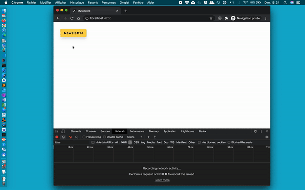
import {Component} from '@angular/core';import {ModalService} from './modal.service';import {NewsletterComponent as NewsletterComponentType} from './newsletter/newsletter.component';@Component({ selector: 'app-landing', template: ` <button type="button" (click)="showNewsletter()" class="bg-yellow-300 hover:bg-yellow-400 text-black font-bold rounded-md shadow-lg sm:tracking-wider py-2 px-4 m-8" >Newsletter</button > `,})export class LandingComponent { constructor(private modalService: ModalService<NewsletterComponentType>) {} async showNewsletter(): Promise<void> { const {NewsletterComponent} = await import( './newsletter/newsletter.component' ); await this.modalService.open(NewsletterComponent); }}If everything work as expected, the modal should be lazy loaded and, we should be able to open and close the example modal.
Epilogue
I am really grateful to have the opportunity to be hired as a freelancer to collaborate on a super project like Owlly. Once again, thank you Sandro for the opportunity. I also hope this tutorial is going to be helpful to anyone looking to set up modals with Angular and Tailwind and if you have idea of improvements, let me know!
To infinity and beyond!
David
You can reach me on Twitter and give a try to our open source editor for slides DeckDeckGo for your next presentations .
Cover photo by Emile Guillemot on Unsplash
Original Link: https://dev.to/daviddalbusco/angular-create-a-lazy-loaded-tailwind-modal-1l0j
Dev To
 An online community for sharing and discovering great ideas, having debates, and making friends
More About this Source Visit Dev To