
An Interest In:
Web News this Week
- April 25, 2024
- April 24, 2024
- April 23, 2024
- April 22, 2024
- April 21, 2024
- April 20, 2024
- April 19, 2024
Some of Our Sources
- BoingBoing
- Just Creative
- Smashing Apps
- Abduzeedo
- Web Designer Depot
- Noupe
- Line 25
- Specky Boy
- Android Dissected
- TechPowerUp
Help Webnuz
Referal links:
Responsive Snakes! And what they can teach you about CSS
"If a snake was responsive..." is my favorite webdev meme. Have a look below if you're not familiar with this extremely important question.

I love it, it is so silly. But at the same time makes us think a little deeper about responsive design and CSS techniques.
And that's what this article is about! Let's talk about four responsive snake implementations, see how they were made and what they can teach us.
There's a CodeSandbox for you to play with at the end
Squishy Snake
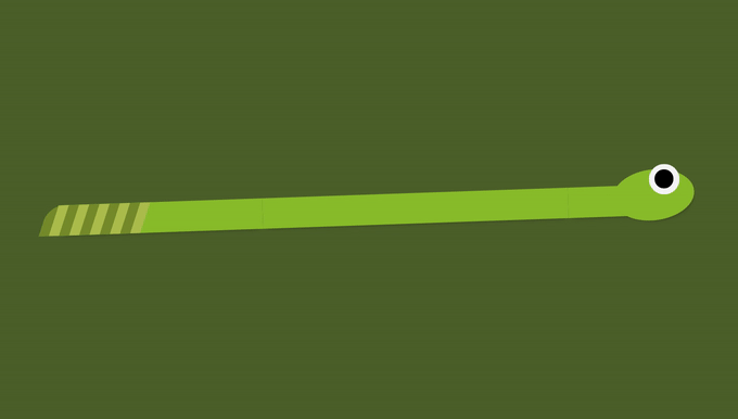
Squishy Snake is the most basic of our responsive snakes. It uses no media queries at all!
Like all the other snakes, it is made by 3 divs: .tail, .body, and .head. And a wrapper, in this case, .snake-1.
<div class="snake-1"> <div class="tail"></div> <div class="body"></div> <div class="head"></div></div>There is quite a lot of CSS responsible for drawing the snake itself. But let's focus only on the rules that make it responsive.
In this first case, I wrote CSS rules that say that the tail width should always be 200 pixels long, that the head should be 100 pixels long, and that the body should fill the rest.
.snake-1 { display: flex;}.tail { flex: 0 0 200px;}.body { flex: 1 0 auto;}.head { flex: 0 0 100px;}You can apply the same technique in real life when your page needs two sidebars and some middle content that should fill the space in between!
Thank you, Squishy Snake . Next!
Curved Snake
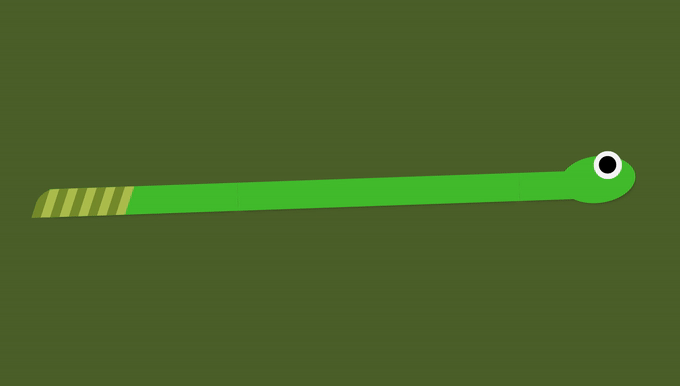
Curved Snake shares the same HTML structure and some CSS, but things get funky when the screen goes short!
The first thing we do is flip the flex order, so instead of horizontal, each snake part is rendered vertically.
.snake-2 { align-items: center; flex-direction: column; height: 62vh; justify-content: space-between;}Now that flex-direction is vertical, we need to update our snake parts so that they have a fixed height instead of width.
.snake-2 .tail { flex: 0 0 30px; width: 100%;}.snake-2 .body { width: 100%;}.snake-2 .head { flex: 0 0 30px; width: 100%;}And finally, we link the tail, body, and head with some extra pseudo-elements. These are the green vertical parts that only exist when the screen collapses.
.snake-2::before,.snake-2::after { content: ''; height: 30vh; position: absolute; right: 0; top: 15px; width: 30px;}.snake-2::after { left: 0; top: 50%;}Now for the real-life takeaway:
Changing flex-direction to vertical is a life-saver when you're doing responsive pages.
Just stay aware that flex-direction: column inverts how divs flow inside a flex container, so justify-content becomes vertical and align-items horizontal!
Thanks, Curved Snake . Onto the next one!
Sliced Snake
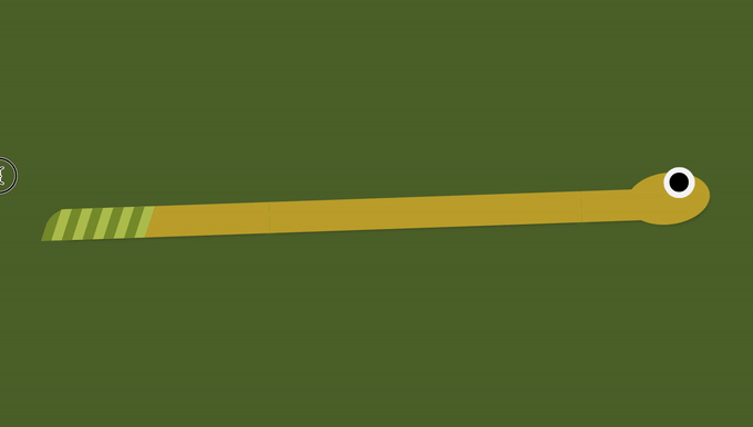
Sliced Snake is pretty much Curved Snake without the ::before and ::after pseudo-elements.
The other difference is that this one doesn't look so lively.
See, the snake eyes are also pseudo-elements (see the CodeSandbox below). So in order to change its eye, all I needed to do was write this handful of CSS:
.snake-3 .head::before { content: "";}Real-life takeaway: If you slice a snake it dies. Don't try dealing with snakes yourself, call your local environmental protection agency!
Thanks, Sliced Snake, you will not be forgotten.
Next!
Scrolly Snake

I love Scrolly Snake. This one is the absolute laziest take on a responsive snake.
Instead of allowing it to overflow off-screen, simply add some width and overflow-w: scroll to it and you're done.
.snake-4 { width: 70%; overflow-x: scroll;}Now, despite Scrolly Snake looking like a really lazy attempt to responsiveness, it teaches us a great lesson:
There are some times that overflow: scroll is the only solution for a responsive problem.
For instance, imagine that you have a huge table full of columns and need to make it responsive, or a super long string that can't be wrapped.
It is important to know all the tools that you have at hand!
CodeSnakebox
Try editing/playing/breaking the examples below:
Thanks for reading! Can you think of another way to make a snake responsive?
Follow me on Twitter and let me know you liked this article!
And if you really liked it, make sure to share it with your friends, that'll help me a lot
Original Link: https://dev.to/vtrpldn/responsive-snakes-and-what-they-can-teach-us-about-css-1o02
Dev To
 An online community for sharing and discovering great ideas, having debates, and making friends
More About this Source Visit Dev To