
An Interest In:
Web News this Week
- March 21, 2024
- March 20, 2024
- March 19, 2024
- March 18, 2024
- March 17, 2024
- March 16, 2024
- March 15, 2024
Some of Our Sources
- Engadget
- Mashable
- TutsPlus - Design
- Fuel Your Creativity
- Crazy Leaf Design
- Stylized Web
- Design Modo
- Web Resource Source
- Willems Lab
- Daily Now
Help Webnuz
Referal links:
Drawing Bill Cipher in CSS
Bill Cipher is a character in the TV show Gravity Falls (highly recommended show by the way, and available on Disney+):

In this post, we are going to draw Bill using different modern CSS properties: gradients, clip-paths, filters... and we are going to review the whole process step by step.
Setting the stage
Let's start by adding some simple styles that will place our drawing on the page's center. First, let's add the "canvas" where we will draw everything:
<div class="canvas"></div>And now the styles: size and Flexbox to the <html> and <body>, to make sure that canvas goes in the absolute center:
html, body { background: #999; width: 100vw; height: 100vh; margin: 0; padding: 0; overflow: hidden; display: flex; align-items: center; justify-content: center;}.canvas { width: 1px; height: 1px; position: relative;}Now that we have the basic structure let's start drawing with CSS.
The body
Let's start by setting the HTML. For the body, we are going to use a single HTML element:
<div class="body"></div>Bill's body is a triangle. There are different ways to make triangles in CSS, the most popular one consists of adjusting the border values... but instead, we are going to use clip-path.
clip-path creates a clipping region that determines which part of the element will be shown. This clipping region can be a circle, an ellipse, a polygon, a path...
CAUTION: The standard definition for clip-path includes a
pathfunction. Unfortunately, it is not supported by any major browser at the moment. Paths can still be used, but they need to be defined inside an SVG and imported with theurlfunction.
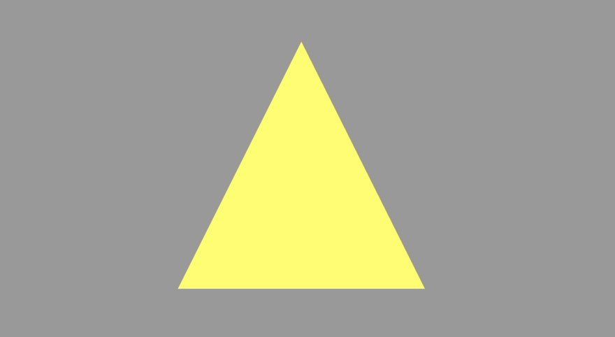
For a triangle, we can opt for the polygon function. The triangle will have 3 points: top center (50% 0%), bottom right (100% 100%), and bottom left (0% 100%); which translated to CSS code looks like this:
.body { position: absolute; left: 50%; top: 50%; transform: translate(-50%, -50%); width: 40vmin; height: 40vmin; background: #ff5; clip-path: polygon(50% 0%, 100% 100%, 0% 100%);}NOTE: we are using the
vminunit. This is a relative unit that will make our drawing responsive: it will grow in larger screens and shrink in smaller ones.
This code will generate something like this:
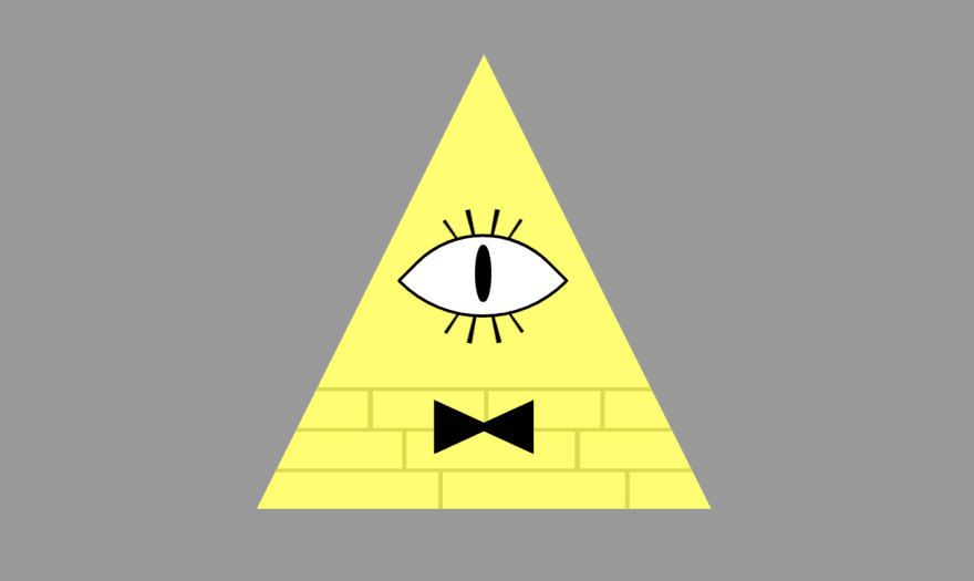
Bill's body also includes three lines of bricks at the bottom. Instead of using additional elements to generate, we will use backgrounds and gradients, and in particular, repeating linear gradients.
To define these backgrounds, we'll use:
background-image(for the gradients),background-position(to place them at the bottom),background-size(so they only occupy part of the body)background-repeat(so they only repeat horizontally)
Here is the code above with the background gradients (with the values separated in different lines so it's easier to see which values apply to each one):
.body { position: absolute; left: 50%; top: 50%; transform: translate(-50%, -50%); width: 40vmin; height: 40vmin; background: #ff5; clip-path: polygon(50% 0%, 100% 100%, 0% 100%); /* first the horizontal lines, then the vertical lines */ background-image: repeating-linear-gradient(to top, transparent 0 30%, #dd2 0 33%), repeating-linear-gradient(to right, transparent 0 40%, #dd2 0 41%), repeating-linear-gradient(to right, transparent 0 25%, #dd2 0 26%), repeating-linear-gradient(to right, transparent 0 30%, #dd2 0 31%); background-position: bottom center, bottom center, 0% 91%, 0% 81%; /* this should be 0% 82%, but then it looks weird :S */ background-size: 100% 27%, 100% 9%, 100% 9%, 100% 9%; background-repeat: repeat-x; /* only one value, applies to all */}And this is how it looks now:

Don't worry about the bricks matching the exact pattern as in the cartoon; Bill's brick pattern sometimes changes (although it commonly goes 4-3-3).
NOTE: The final version of this drawing (see below) combines
repeating-linear-gradientsandlinear-gradients. You could do the same and practice both.
We are now done with the body itself. Let's draw the things that go inside the body.
The eye and the bowtie
Let's start with the bowtie because it is easier. We will use clip-path again, but instead of a triangle, we will give a different shape.
Let's modify the HTML code first:
<div class="body"> <div class="bowtie"></div> <!-- we'll see this two in a second --> <div class="eyelashes"></div> <div class="eye"></div></div>Bill's bowtie is black, and it is positioned right in between the first and second lines of bricks from the top. So let's place a rectangle in that absolute position.
NOTE: when specifying a position, it is calculated from the closest positioned ancestor or the viewport (for fixed). That's why the body needs at least a relative position. (told you it was going to be important ).
.bowtie { position: absolute; bottom: 18%; /* so it matches the top brick line*/ left: 50%; transform: translate(-50%, 50%); /* so it's centered */ width: 22%; height: 12%; background: black; clip-path: polygon(0% 0%, 50% 42%, 100% 0%, 100% 100%, 50% 58%, 0% 100%);}Now we have a nice-looking bowtie:

The eye is going to be slightly trickier, but not too much. The process is going to be "simple": start with a white square with black borders, rotate it 45 degrees, and round the side corners so it looks like an eye:
.eye { width: 25%; height: 25%; background: white; border: 0.35vmin solid black; border-radius: 2% 80% 2% 100%; position: absolute; top: 50%; left: 50%; transform: translate(-50%, -50%) rotate(-45deg);}And we are going to use a pseudo-element like ::before (or ::after) to draw the pupil:
.eye::before { content: ""; display: block; position: absolute; width: 14%; height: 50%; background: black; top: 45%; left: 55%; transform: translate(-50%, -50%) rotate(45deg); border-radius: 100%;}Positioning the pupil inside the eye may be a bit tricky considering that the eye is rotated 45 degrees, so the top is not top and the left is not left (at least not visually). We didn't put it exactly in the center because it looks "weird."
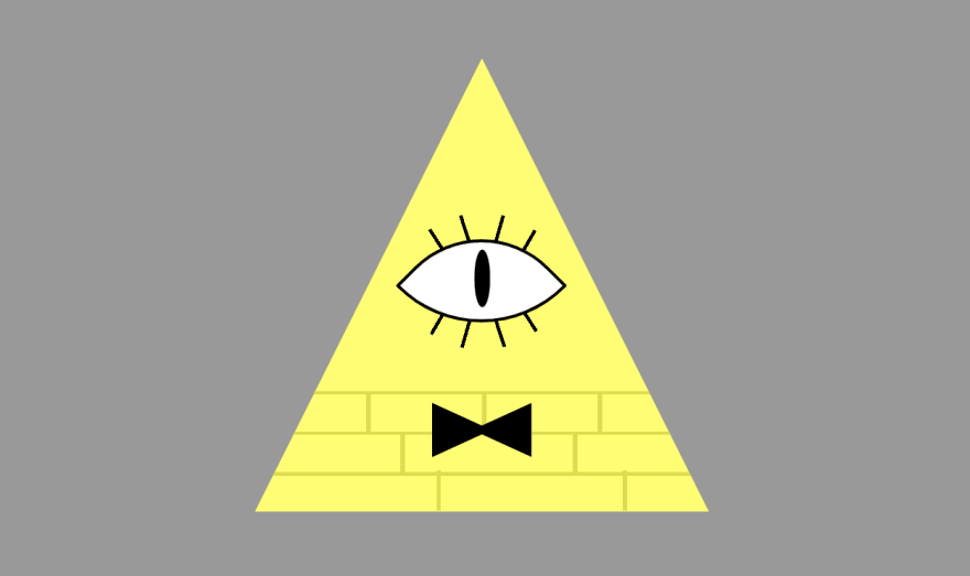
With these couple of changes, we have the body with the eye and a bowtie:

Now for the eyelashes. Although it's not going to look perfect, we are going to use a conic-gradient. We'll create a circle, place it behind the eye, and have radial lines as follow:
NOTE: this
conic-gradientis so we can practice it. As you will see in the result, it doesn't look that great, so we will undo it later and try a different approach.
.eyelashes { position: absolute; width: 35%; height: 30%; border-radius: 50%; top: 49%; left: 50%; transform: translate(-50%, -50%); background-image: conic-gradient( transparent 3%, black 0 4%, transparent 0 9%, black 0 10%, transparent 0 40%, black 0 41%, transparent 0 46%, black 0 47%, transparent 0 53%, black 0 54%, transparent 0 59%, black 0 60%, transparent 0 90%, black 0 91%, transparent 0 96%, black 0 97%, transparent 0 )}The result will look like this:
The eyelashes look a bit "funky" in part because they are not the same width at top and bottom (they are at a radial angle from the center of the ellipse). It is better to use multiple elements or simple linear-gradients instead. something like this:
.eyelashes { abackground: #f007; position: absolute; width: 35%; height: 30%; border-radius: 50%; top: 49.25%; left: 50%; transform: translate(-50%, -50%); background-image: conic-gradient( transparent 3%, black 0 4%, transparent 0 9%, black 0 10%, transparent 0 40%, black 0 41%, transparent 0 46%, black 0 47%, transparent 0 53%, black 0 54%, transparent 0 59%, black 0 60%, transparent 0 90%, black 0 91%, transparent 0 96%, black 0 97%, transparent 0 ); background-image: linear-gradient(57deg, transparent 29%, black 0 31%, transparent 0), linear-gradient(57deg, transparent 71%, black 0 73%, transparent 0), linear-gradient(72deg, transparent 43%, black 0 45%, transparent 0), linear-gradient(72deg, transparent 56%, black 0 58%, transparent 0), linear-gradient(106deg, transparent 56%, black 0 58%, transparent 0), linear-gradient(106deg, transparent 43%, black 0 45%, transparent 0), linear-gradient(120deg, transparent 71%, black 0 73%, transparent 0), linear-gradient(120deg, transparent 29%, black 0 31%, transparent 0); background-size: 100% 50%; background-position: top center, bottom center; background-repeat: no-repeat;}NOTE: we didn't remove the old
background-imagewith theradial-gradient. In CSS, you can have the same property several times in a rule; the last valid one is the one that will be applied. It's like we are keeping theradial-gradientbackground as a fall back (although we don't really need it.)
With this last change, we are done with Bill's body:
The hat
Bill's top hat is easy to draw. It is basically two rectangles: one for the hat and another for the base. We can do that with an element and a pseudo-element like ::before (or ::after).
The CSS should be simple too then:
.hat { width: 4vmin; height: 18vmin; background: black; position: absolute; top: -19.5vmin; left: 0.5vmin; transform: translate(-50%, -100%) rotate(3deg)}.hat::before { content: ""; display: block; position: absolute; width: 280%; height: 1.5vmin; background: black; bottom: 0; left: -90%;}Now our triangle has a hat:

The legs
The arms and legs are interesting because they will allow for some originality. We can make them straight, or round, or with different widths... we are going to do a rounded version of them, but a more straight version would be ok too.
We will draw an ellipse for the first leg, and we will use the left and bottom border to generate a curved extremity. Then with a ::before pseudo-element will draw the foot.
The HTML is a single element:
<div class="leg"></div>And the CSS would look like this:
.leg { width: 6vmin; height: 15vmin; border: 3vmin solid transparent; border-left: 2vmin solid black; border-bottom: 2vmin solid black; border-radius: 50% 10% 50% 50%; transform: skewY(-30deg); position: absolute; top: 13vmin; left: -9vmin;}.leg::before { content: ""; display: block; position: absolute; width: 2.5vmin; height: 8vmin; background: black; transform: skewY(30deg); border-radius: 50%; top: 90%; right: -0.85vmin;}We use transform to skew the ellipse, so it makes the knee even more obvious. And we make the transparent borders a bit thicker to keep the overall width after skewing.
For the second leg, we add another div with class "leg" right after the first one and flip it by adding scaleX(-1) as the first transform:
CAUTION: An element can have more than one transform, and the transforms' order affects the result. In this case, the
scaleX(-1)must be the first one!
After flipping it, we need to adjust some values (left, top, rotation) to place the leg in the right place and to make it slightly different from the first one. The images that are too symmetrical look "fake."
.leg + .leg { top: 13vmin; left: -1vmin; transform: scaleX(-1) rotate(10deg) skewY(-30deg);}The result looks like this:
The arms
Bill's arms are interesting, especially the hands. Sometimes they are displayed with 4 fingers, and some other times, they are displayed as circles/ellipses fists. For simplicity, we are going to stick with this last option.
In this case, the arms are going to be completely different. The left-arm will be bent, resting on the left side. The right arm will have a thumb up.
We make the left arm into an oval (you can watch a video in which I explain how to do it), the basic idea is setting a border-radius and specifying different sizes for vertical and horizontal radius size.
Then we rotate it and position it wherever we want, like this:
.arm-1 { position: absolute; right: 18.5vmin; top: 3vmin; width: 3vmin; height: 12vmin; border: 1.75vmin solid black; border-top: 2.25vmin solid black; border-radius: 100% / 70% 70% 120% 120%; transform: rotate(-90deg);}.arm-1::after { content: ""; display: block; position: absolute; top: 70%; right: 70%; width: 6vmin; height: 4vmin; background: black; border-radius: 50%; transform: rotate(55deg); }For the right arm, we are going to use the right and bottom border of a circle, and the ::before and ::after to draw a hand with a thumbs up:
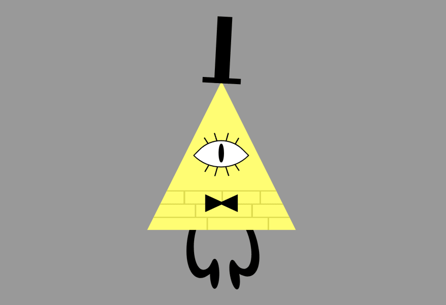
.arm-2 { width: 17vmin; height: 16vmin; border: 1.75vmin solid transparent; border-right-color: black; border-bottom-color: black; border-radius: 50%; position: absolute; top: -6.5vmin; left: 10vmin;}.arm-2::before { content: ""; display: block; position: absolute; width: 6vmin; height: 5vmin; background: black; border-radius: 50%; left: 86%; top: -5%;}.arm-2::after { content: ""; display: block; position: absolute; top: -20%; left: 63%; width: 4vmin; height: 6vmin; border-radius: 50% 40% 40% 40%; box-shadow: 2vmin 0 0 -0.5vmin; transform: rotate(-13deg);}With the two arms, our drawing looks like this:

...and it's almost done. There is only one small detail left...
The glow
If you have watched Gravity Falls, you may have noticed that Bill Cipher glows.
We could add that glow by adding a box-shadow to each element in the drawing, but that may look a bit weird because the glow of the elements on top will go over the elements on the bottom.
Instead, we can use the drop-shadow filter, which will create a unique shadow from all the elements in the container.
CAUTION: all the browsers do not support the
drop-shadowfilter, so it may not be visible in some of them.
We would need to add the filter to the canvas, and it will be done:
.canvas { width: 1px; height: 1px; position: relative; filter: drop-shadow(0 0 1vmin #ffc);}And with that, our drawing is over! We could add small animations to make Bill float up and down or blink (by adding an ::after to the eye)... but I'll leave that to you :)
Conclusion
Here's a demo of how our Bill Cipher's cartoon looks after all the steps described above:
NOTE: In a previous version of this post, I described how to draw Bill using a slightly different code. Unfortunately, while it worked fine on Chrome, Firefox, or Edge (new), it didn't work correctly on Safari.
It's not perfect, but it's cool, and we did it just with HTML and CSS and, during the process, we learned about:
- CSS gradients: for the brick lines and the eyelashes.
- CSS filters: to create a glow around Bill.
- Responsive CSS: by using relative units in different elements.
- Positioning: to place the different elements where they belong.
clip-path: to create the triangled body and the bowtie.- Pseudo-elements: used in the pupil, feet, and hands.
- CSS transforms: to rotate and skew some elements.
- Flexbox: and how to center content horizontally and vertically with Flex.
- CSS combinators: to select the second leg.
As you can see, it may be a simple CSS drawing, but it helped us practice and learn about many many CSS properties.
Original Link: https://dev.to/alvaromontoro/drawing-bill-cipher-in-css-2pg8
Dev To
 An online community for sharing and discovering great ideas, having debates, and making friends
More About this Source Visit Dev To