
An Interest In:
Web News this Week
- March 21, 2024
- March 20, 2024
- March 19, 2024
- March 18, 2024
- March 17, 2024
- March 16, 2024
- March 15, 2024
Some of Our Sources
- Engadget
- Team Treehouse
- TutsPlus - Design
- Creative Curio
- FanExtra - PSD
- My Ink Blog
- CSS Globe
- Wal You
- Design Modo
- Willems Lab
Help Webnuz
Referal links:
Optimize React Apps PageSpeed Insights Score
What we will be working on
We will be working on optimizing the website of the companyI work for coatconnect.com.
PageSpeed Insights is a very powerful tool by Google. It allows us to analyze our website's performance and figure out ways we can improve it.
The problem with SPAs (Single-Page Applications) is that they show content after loading JavaScript chunks first, so it takes a little while on the client before it can actually render content and that can destroyPageSpeed Insightsscore.
Our app has to be an SSR (Server-Side Rendered) app. We are using Reactfor this project, but really you can use any framework you like, the same concepts apply. This is a framework-agnostic article. It works with:
You can go about this in a lot of different ways. You can use:
- React and Express (which I'm using)
- Next.js for React
- Nuxt.js for Vue
- Sapper for Svelte
- Angular Universal
- Gatsby
- JAM Stack
- ...etc
Here's is the final architecture we'll be using:

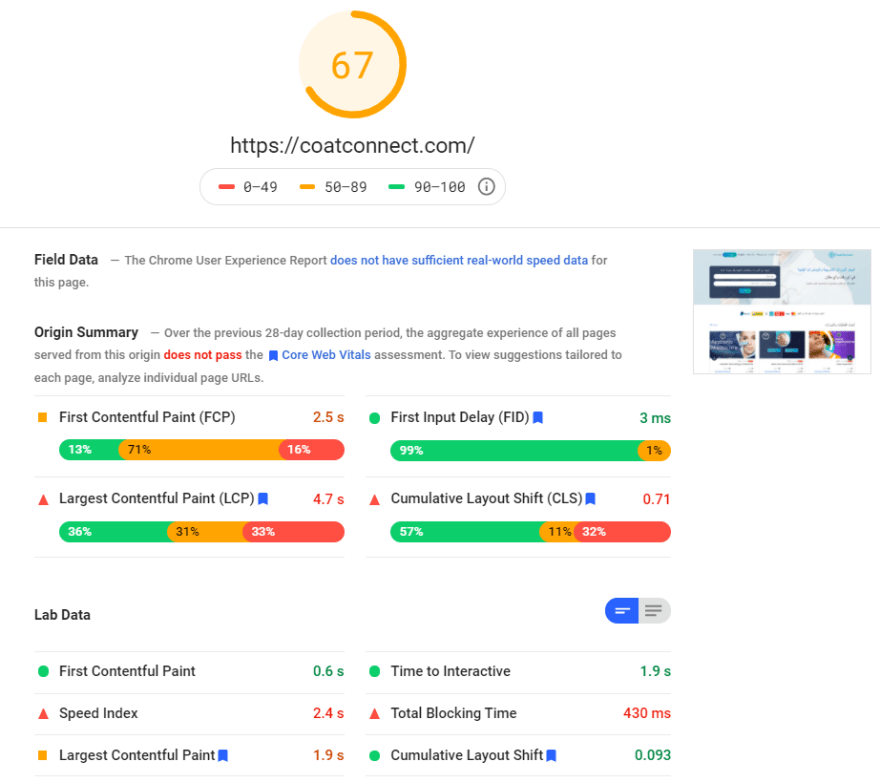
Score before optimization (Mobile)

Score before optimization (Desktop)
We notice there are some major problems that PageSpeed Insights has uncovered for us right out of the box.
Remove unused JavaScript
This can be a tough task for SPAs and a general problem in all frameworks, however, I will only be talking about React, but the same concepts apply in all frameworks.
Bundlephobia
Bundlephobia is a great tool for analyzing bundle sizes of packages you install with NPM.
Moment.js
moment is a huge library with a large bundle size compared to its alternative dayjs

Day.js

Lazy load components
Since we're using Express and React, we can use react-universal-component to split the app into chunks and lazy-load them accordingly.
But really, you can use any framework or any library you want!
Reduce initial server response time (TTFB)
We'll start with the easy one. High TTFB (Time-To-First-Byte) could be caused by a lot of different factors:
- Server resources are low
- Static pages are not cached
The first problem is obvious, we just need to upgrade the server to handle more traffic, but before we do that, let's make sure our pages are properly cached first!
You can use any method you like when caching static pages, you can cache using a CDN like Cloudflare or AWS Cloudfront.
If your website's cache policy depends on custom parameters, you can implement your own caching layer above the SSR middleware in React.
Here at CoatConnect, we cache based on different parameters, for example:
- User's language
- Currency based on the user's location
- Device type (mobile, tablet, or desktop)
Add cache key generator middleware
This middleware generates a unique cache key for each different version of the website. It looks different on mobile than it does on desktop and it has different data for users based in the USA than people in the Middle East for example.
const cacheMiddleware = async (req, res, next) => { const key = `${req.url}${req.currency}${req.initialLanguage}${req.deviceType}`; const cacheKey = md5(key); req.cacheKey = cacheKey; ...});We can later use this cache key to store the resulting HTML in memory or in files. We can use node-cache for that.
const cacheHolder = new NodeCache({ stdTTL: 3600, checkperiod: 600, useClones: false });const cacheHTML = (key, html) => { cacheHolder.set(key, html);};We can call this cacheHTML method, and pass it the cacheKey and rendered HTML. We can also store different cache keys under the same request path to be able to invalidate the cache whenever the data changes.
Defer offscreen images
When you open a website that has img tags in it, the browser goes ahead and fetches all these images and the document will be loaded when all the images are downloaded.
Most of the time we have images that the user does not see until they scroll down the page. Those images must be lazy-loaded to avoid big load times on websites. For that, we will use react-lazy-load-image-component.
This component is very easy to use, you just use it like you would use a normal img tag:
import React from 'react';import { LazyLoadImage } from 'react-lazy-load-image-component';const MyImage = ({ image }) => ( <div> <LazyLoadImage alt={image.alt} height={image.height} src={image.src} // use normal <img> attributes as props width={image.width} /> <span>{image.caption}</span> </div>);export default MyImage;Minimize main thread work
Figuring out what's blocking the main thread can be a tough task, but here are common problems:
- Whole page is hydrated while loading
- Third-party scripts are not deferred
One of the ways to optimize blocking time is to lazy hydrate the page, and for that we will use react-lazy-hydration.
SSR Only
This option should be used with static content that never changes on the page with JavaScript because, ssrOnly skips hydration all-together.
import React from "react";import LazyHydrate from "react-lazy-hydration";function App() { return ( <div> <LazyHydrate ssrOnly> {...} </LazyHydrate> </div> );}When Idle
Please keep in mind that this step is very important for the LCP too. LCP is calculated after the dom has stopped shifting and changing, so instantly hydrating the part the user sees on the screen first is very important to avoid big LCP time.
<LazyHydrate whenIdle> {...}</LazyHydrate>When Visible
You have to mark every part on the page that the user does not see instantly as whenVisible to avoid blocking the DOM while hydrating these parts.
One of the reasons we had issues at CoatConnect is that we had Google Maps on some of our pages and the Google Maps scripts were loaded and executed alongside our code while the page was being hydrated which destroyed our blocking time, so it is very important to use whenVisible with the parts on the page that the user does not see instantly.
<LazyHydrate whenVisible> {...}</LazyHydrate>Make sure every third-party script added and all JavaScript chunks are deferred.
<script src="[some-third-party-script].js" defer></script><script src="[some-chunk].[hash].js" defer></script>Avoid redirects at all costs
Redirects cause a delay in page load and whatever that delay maybe every millisecond matters! If a delay in page redirect is 300ms, that's 300ms you could save on page load time.
If you are using a URL shortener for assets especially images, that's a 300ms delay on each image and sometimes that image could be your LCP
Load CSS asynchronously
CSS is a pretty expensive asset that can block the main UI thread. To prevent CSS from blocking the main UI thread we have to do two things:
- Load CSS asynchronously
- Generate our critical path CSS
You can load CSS asynchronously using JavaScript like this:
<link href="CSS_ASSET" rel="stylesheet" media="print" onload="this.media='all';this.onload=null;" />Adding this onload="this.media='all';this.onload=null;" will cause CSS to load asynchronously preventing it from blocking the main thread, but doing that would make our website with no styles at all until the CSS loads and cause CLS and delay of LCP.
Critical Path CSS
To optimize for a high LCP score, we have to show styled content on the screen as fast as possible and not wait for external CSS or for JavaScript to edit the DOM.
Here's the content we want to show to the user eventually:
JavaScript Enabled

Previously, we made CSS load asynchronously using JavaScript. Now, let's try disabling your JavaScript.
- Open the Inspector (Ctrl+Shift+I)
- Hit Ctrl+P
- Type in
> Disable JavaScript

JavaScript Disabled (No CSS)
Since we load CSS using JavaScript, CSS is not loaded, and as you can see, the page does not have any styles at all!

To fix that, we need to generate the Critical Path CSS (CCSS). It is basically the CSS needed to only render what the user sees on the screen first.
JavaScript disabled (CCSS)
You can see here that the page has the critical CSS on it without the need of downloading the full CSS stylesheet or JavaScript. As a matter of fact, there are images that are not shown here because they are lazy-loaded and JavaScript is not enabled.

To generate CCSS, you can use the npm package critical.
// eslint-disable-next-line prefer-constlet { html, uncritical } = await critical.generate({ base: 'build/public', // Local path to public assets html: renderedHTML, // Result of Server-Side rendered code width: viewPort.width, // User's device view port height: viewPort.height, // User's device view port inline: true, // Inlines css to improve performance minify: true, // Minifies css put into the <style> tag in the head rebase: asset => ..., // Post process paths to assets in your css e.g. images, fonts, ...etc});Getting the viewport of the user
We can use the User-Agent header to detect which type of device the user is using and we can use the npm package mobile-detect for that.
import MobileDetect from 'mobile-detect';export const getDeviceType = req => { const md = new MobileDetect(req.headers['user-agent']); if (md.tablet()) { return 'tablet'; } if (md.mobile()) { return 'mobile'; } return 'desktop';};We can then use this express middleware to inject viewPort property in the request.
const deviceTypeMiddleware = (req, res, next) => { req.deviceType = getDeviceType(req); req.viewPort = { mobile: { width: 414, height: 896 }, tablet: { width: 768, height: 1024 }, desktop: { width: 1366, height: 842 }, }[req.deviceType]; next();};Width and height for mobile, tablet, and desktop are referenced online from this article and personal experience.
This critical path CSS generator does not require you to use express for server-side rendering your app. It can sit in the middle between your server and your clients and act as a cache layer.
The article was originally published on my blog here.
Feel free to follow me on Twitter. Hope I could help!
Original Link: https://dev.to/ziadalzarka/optimize-react-apps-pagespeed-insights-score-40o4
Dev To
 An online community for sharing and discovering great ideas, having debates, and making friends
More About this Source Visit Dev To