
An Interest In:
Web News this Week
- April 3, 2024
- April 2, 2024
- April 1, 2024
- March 31, 2024
- March 30, 2024
- March 29, 2024
- March 28, 2024
Some of Our Sources
- Mashable
- Just Creative
- Spoon Graphics
- Web Designer Depot
- Reencoded
- Line 25
- Wal You
- Web Resource Source
- Android Dissected
- The Verge
Help Webnuz
Referal links:
Don't Interchange Margin and Padding
Spacing is one of the core elements of design. Its something every designer learns early on: Add whitespace. Elements need air to breathe.
As a consequence, I add CSS margins and paddings every day. Its a magical feeling to see a button come to life with a little margin padding.
Its one line of CSS that calms the eye immediately.
Everythings great, CSS is for babies anyway
For a long time, I didnt really care too much about the differences between margin and padding. Nevertheless, I noticed these basic rules:
padding
An element with a background color or border needs whitespace inside
margin
An element needs air to breathe outside of its body

I applied margins as external properties, padding for introspective. It made sense for me. But often, I couldnt find a rule and randomly used one of them.
The point where I got confused
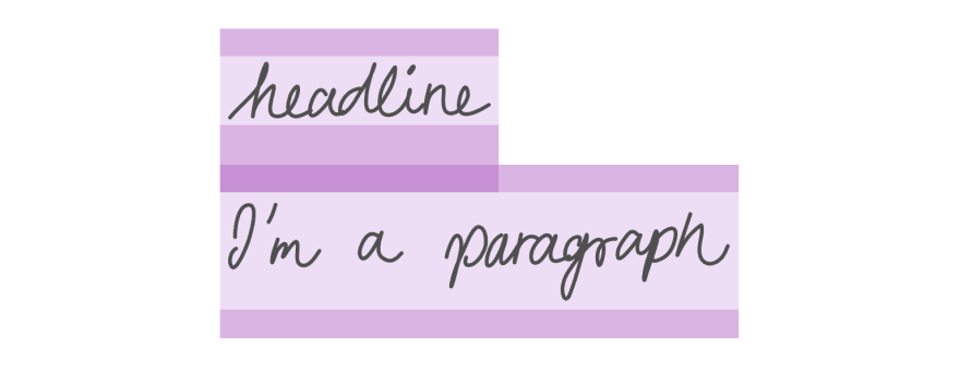
One of the cases I struggled with was headlines. Headlines and text often need a good amount of spacing between them. <h1> comes with a default margin, which never seemed to help me in any way.
margin-top: 0.67em; margin-bottom: 0.67em; 
Usually, I would remove this margin (which seemed arbitrarily to me) and applied my own padding-bottom, so it would fit the design perfectly.
Satisfied with the outcome, I would go on. Eventually, when CMS content got in, I noticed a slightly larger spacing between headline and text. Dammit, these stupid default margins! All the paragraphs have them as well!
margin-top: 1em; margin-bottom: 1em; 
What did I do?
I wanted to maintain the spacing between two paragraphs, but not the first one. So I removed it with p:first-of-type. Now, the spacing would sit fine at least. Sigh.

This approach is against the natural behavior of CSS. Theres a reason these elements have default margins and not paddings. Don't fight it.
Use margins to your advantage!
The key understanding here is to really let sink in what it means that margins can collapse. I read it a lot of times but I never saw the advantage over paddings. But in reality, margins are really powerful and clever! Margins can communicate with each other. They shine when combined. Paddings, on the contrary, are stubborn cats that never change. And sometimes, this is exactly the behavior we want.
This is extremely helpful when building a design system or generally using a component-based approach, e.g. React or Vue.
Imagine a complete component, having padding top and bottom. Now, a second component gets stacked beneath it, containing padding as well. There will be a big gap between the two, too big.
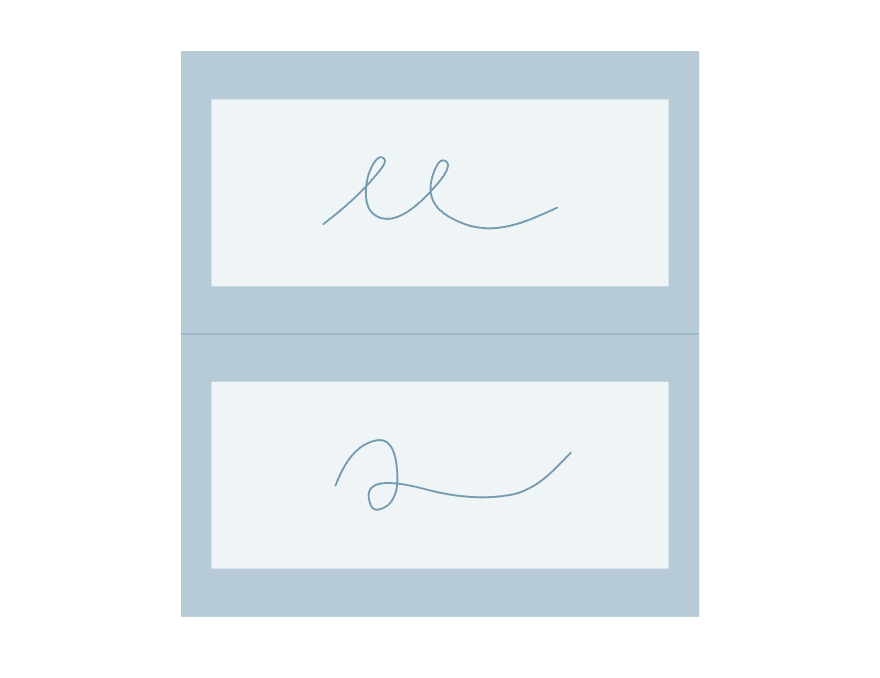
If you use margins instead, only the biggest margin will be applied.
This is true for text layouts as well. Instead of using paddings on typography tags, use margins. If the default margin is too small, overwrite it with a bigger margin. The headings margin-bottom and the paragraphs margin-top wont add up anymore but instead, flow into each other nicely.
Because HTML was invented for academic papers, it was useful to provide some tags with default styling. Even without any CSS, texts with semantic HTML is still readable. So dont get angry with the default browser stylings, we have them for a reason!
Original Link: https://dev.to/franca/don-t-interchange-margin-and-padding-25ki
Dev To
More About this Source Visit Dev To