
An Interest In:
Web News this Week
- April 20, 2024
- April 19, 2024
- April 18, 2024
- April 17, 2024
- April 16, 2024
- April 15, 2024
- April 14, 2024
Some of Our Sources
- Techcrunch
- Team Treehouse
- Smashing Magazine
- Smashing Apps
- Abduzeedo
- You The Designer
- Wal You
- Design Modo
- Android Dissected
- TechPowerUp
Help Webnuz
Referal links:
Adding Storybook to a react project
Storybook is an open source tool that helps developers to see, test and document components in isolation. It can be a very important tool for those who use the famous Atomic Design approach to componentization. And, as we'll see, it's a very easy tool to use and configure.
Here, we'll use it on a react project, put you can set it in any frontend project, independent of the framework that you are using.
Installing Storybook
The first step is to install the Storybook on any project that you like using npx:
npx sb initThis command will initialize the Storybook CLI that will into you code and install the best configuration and run npm run storybook to initialize the tool.
The React component
After the installation, it'll open the storybook app on http://localhost:6006. There you'll that the CLI already installed some examples. However, you can use any that you already have. On my case I used a component(written in TypeScript) that we extended from Material's-UI TextField:
import React from 'react';import { createStyles, withStyles, WithStyles } from '@material-ui/core/styles';import MuiTextField, { StandardTextFieldProps } from '@material-ui/core/TextField';import classnames from 'classnames';const styles = () => createStyles({ inputSmall: { height: '35px !important', }, });export interface TextFieldProps extends Omit<StandardTextFieldProps, 'classes'>, WithStyles<typeof styles> { size?: 'default' | 'small';}const TextField: React.FC<TextFieldProps> = ({ classes, size = 'default', InputProps, ...rest }) => ( <MuiTextField InputProps={{ classes: { input: classnames({ [classes.inputSmall]: size === 'small', }), }, ...InputProps, }} {...rest} />);export default withStyles(styles)(TextField);What is important on this component is that it has a size props and that it exposes the Material-UI TextField props with the InputProps. This will allow us to create dynamic documentation and different stories on the Storybook.
Creating stories
A simple Storybook file start with the export of the metadata of the file that you are creating the story:
import React from 'react';import { Story, Meta } from '@storybook/react/types-6-0';import { TextField, TextFieldProps } from '../atoms';export default { title: 'Atoms/Text Field', component: TextField, argTypes: { label: { name: 'Label', type: { name: 'string', required: false }, defaultValue: 'Fake Label', }, size: { name: 'Size', control: { type: 'select', options: ['default', 'small'], }, defaultValue: 'default', }, },} as Meta;As you can see, since we are using a React component, we start importing React. Then we import the storybook types and library, then the component and its type declaration.
The export default that comes bellow that is the component's metadata. On it, you can see the first field, title, where you can inform a folder structure and the component name. On my case, I'm putting the component inside the 'Atoms' folder as 'Text Field'. On the component field, you see the component declaration. Bellow it, you see and advanced Storybook configuration that let you declare some dynamic fields inside your documentation, as you can see in the image bellow:
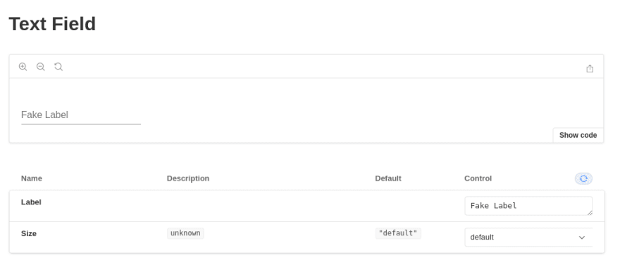
Usually, Storybook will get these fields from your component without the need of you declaring them. However, in the case of this component, I had to declare them. Their declaration is simple. You create an argTypes property inside the metadata object, and inside of it, you declare the name of the props received by the component( in this case, label and size), give them the name you want to have on the Storybook documentation (like name: 'Name here'), a default value, and a type object, with the type of the field (like string, number or select), if the property is required and an array of options, if that makes sense for that field.
After the metadata, we can declare the template and the different stories that component can have:
const Template = (args) => <TextField {...args} />;export const SizeDefault = Template.bind({});SizeDefault.args = { size: 'default',};export const Small = Template.bind({});Small.args = { size: 'small',};Here, on our case, the template is the TextField that receives and spread of the args object. For each different story we export it, binding it to the template and adding the different arguments. On our case, each story receives a label, with the value "Fake Label" that was declared as a default value on the argTypes, and the size that is declared on the templateName.args object.
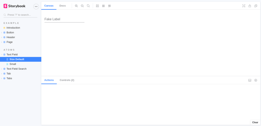
On the image above you can see the different Text Field stories on the left side and the Default story on the center.
The Storybook library has a lot of important uses. With it we can create a documentation that uses the real code of a component, solving the problem of maintaining a documentation that gets old with any update on a project. However, right now, on our current application we are having issues with how to use Storybook on components that does GraphQL queries using Relay fragments.
If you liked the post, have any idea or any thoughts about Storybook, feel free to comment here or contact me.
Original Link: https://dev.to/bosiarquitetura/adding-storybook-to-a-react-project-3mff
Dev To
 An online community for sharing and discovering great ideas, having debates, and making friends
More About this Source Visit Dev To