
An Interest In:
Web News this Week
- March 20, 2024
- March 19, 2024
- March 18, 2024
- March 17, 2024
- March 16, 2024
- March 15, 2024
- March 14, 2024
Some of Our Sources
- BoingBoing
- Techcrunch
- Technology Review
- TutsPlus - Code
- Spoon Graphics
- Smashing Apps
- Vandelay Design
- Android Dissected
- Willems Lab
- Dev To
Help Webnuz
Referal links:
8 Tailwind CSS resources to help your next project takeoff
Let's face it, no matter whether its our first or hundredth time, staring at a blank Tailwind CSS is intimidating. The enormity of the task at hand starts to crash over you as the excitement begins to build. Here are eight resources that I reach for first when I need to move quickly or want inspiration that may prove helpful to you.
At the end of list I will let you know which of the following I add to every Tailwind CSS project, NO MATTER WHAT!
Theme Components
 praveenjuge / kutty
Kutty is a tailwind plugin for building web applications. It has a set of accessible and reusable components that are commonly used in web applications.
Kutty
Kutty is a tailwind plugin for building web applications. It has a set of accessible and reusable components that are commonly used in web applications.
This plugin requires Tailwind CSS 1.6 or later.
Installation
npm i kutty --saveTailwind CSS is not included in this package. Learn how to install tailwind here.
Usage
For CSS
Require the installed plugin directly to your Tailwind config:
// tailwind.config.jsplugins: [require("kutty")],For JS
Place the following script tag before the closing body tag:
<script src="https://cdn.jsdelivr.net/npm/kutty@latest/dist/kutty.min.js"></script>Development
You need Hugo to run the dev server. If you have Homebrew you can do the following:
brew install hugoCheck this Hugo installation page for installing on other systems.
Then clone the repo, install dependencies, and start the server locally.
git clone https://github.com/praveenjuge/kutty.gitcd kuttynpm inpm start estevanmaito / windmill-dashboard
A multi theme, completely accessible, ready for production dashboard.
Windmill Dashboard
A multi theme, completely accessible, with components and pages examples, ready for production dashboard.
- Thoroughly accessible
- Light and dark themes
- Styled with Tailwind CSS
- Various components
- React version
Usage
Clone or download this repo and everything you need is inside the public folder.
Accessibility
This dashboard was developed with a11y in mind since the beginning.
- Every text passes the WCAG Level AA (at least)
- It is completely keyboard navigable
- I actually used NVDA to read my screen during development
Everybody can benefit with good accessibility practices, like the modal, for example (test it live). It uses focus trap techniques to not loose focus when navigating via keyboard and thinking of mobile users with large screen devices, it is placed in the bottom of the screen.
Multi theme
It uses Tailwind CSS for styling, and
Text & Typography Components
jhta / tailwindcss-truncate-multiline
Tailwind CSS plugin to generate truncate multiline utilities
Truncate Multiline Plugin for Tailwind CSS
Installation
npm install tailwindcss-truncate-multiline --saveor
yarn add tailwindcss-truncate-multiline Usage
// tailwind.config.js{ theme: { truncate: { lines: { 3: '3', 5: '5', 8: '8', } } plugins: [ require('tailwindcss-truncate-multiline')(), ],}This plugin generates the following utilities:
.truncate-[key]-lines { 'overflow': 'hidden', 'display': '-webkit-box', '-webkit-line-clamp': [value], '-webkit-box-orient': 'vertical',}Variants:
You can also add variants:
//tailwind.config.js{ ... plugins: [ require('tailwindcss-truncate-multiline')(['responsive', 'hover']), ]} 
A plugin that provides a set of prose classes you can use to add beautiful typographic defaults to any vanilla HTML you don't control (like HTML rendered from Markdown, or pulled from a CMS).
<article class="prose lg:prose-xl"> {{ markdown }}</article>Installation
Install the plugin from npm:
# Using npmnpm install @tailwindcss/typography# Using Yarnyarn add @tailwindcss/typographyThen add the plugin to your tailwind.config.js file:
// tailwind.config.jsmodule.exports = { theme: { // ... }, plugins: [ require('@tailwindcss/typography'), // ... ],}Using a CDN
If you need to pull in these styles via CDN, you can do so using services like UNPKG or jsDeliver:
<!-- From UNPKG --><link rel="stylesheet" href="https://unpkg.com/@tailwindcss/[email protected]/dist/typography.min.css"><!-- From jsDelivr --><link rel="Layout Components
tailwindlabs / tailwindcss-custom-forms
A better base for styling form elements with Tailwind CSS.
Tailwind CSS Custom Forms
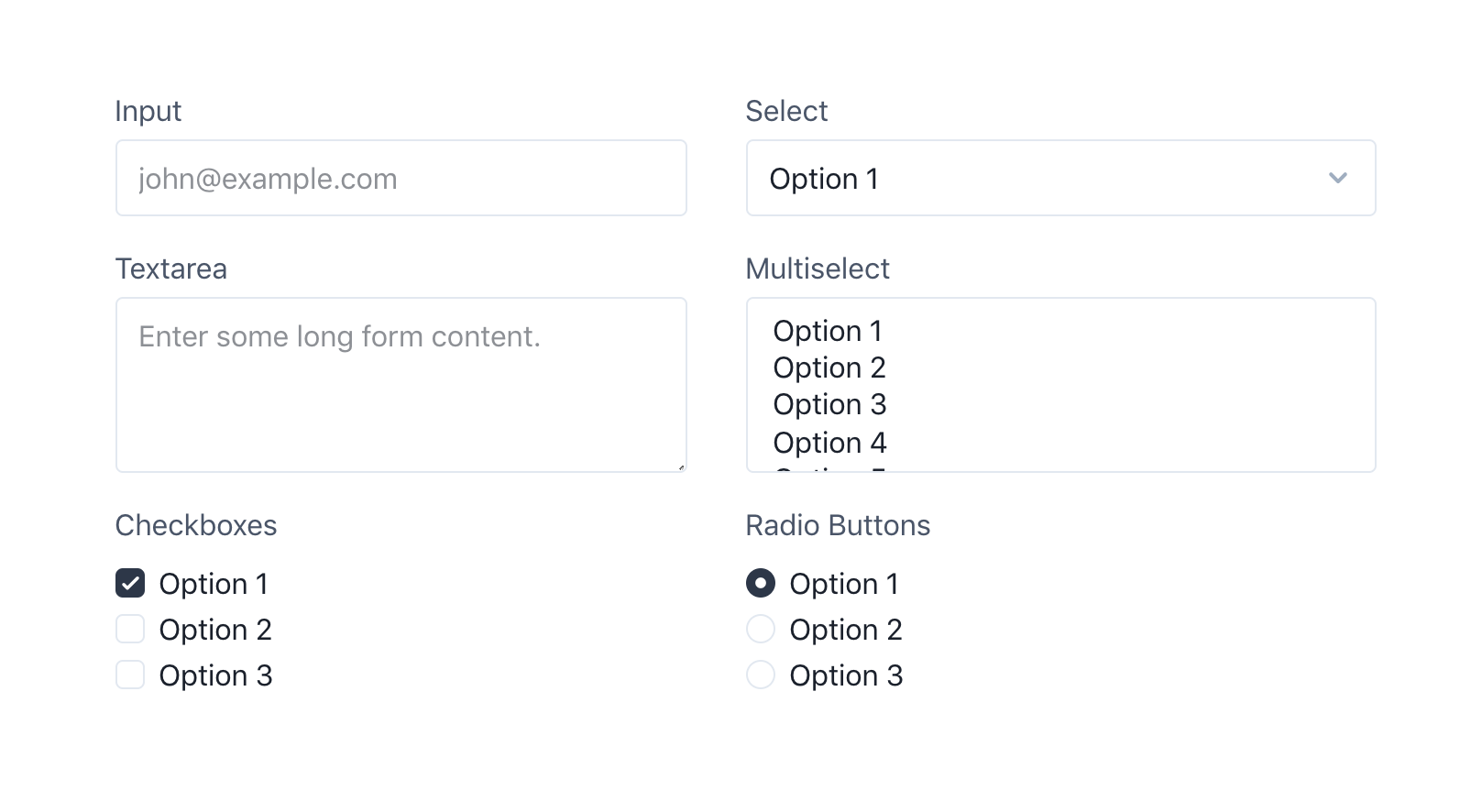
Out of the box, selects, checkboxes, and radios look awful in Tailwind and the only way to make them look better is with custom CSS.
The goal of this project is to provide a better starting point for form elements that is still fairly unopinionated, and easy to customize by adding utilities instead of having to write complicated CSS rules.
Install
- Install the plugin:
# Using npmnpm install @tailwindcss/custom-forms --save-dev# Using Yarnyarn add @tailwindcss/custom-forms -D- Add it to your
tailwind.config.jsfile:
// tailwind.config.jsmodule.exports = { // ... plugins: [ require('@tailwindcss/custom-forms') ]}Documentation
The project is still early but basic documentation can be found here:
Local development
Clone the repository:
git clone https://github.com/tailwindcss/custom-forms.git tailwindcss-custom-formscd tailwindcss-custom-formsInstall the dependencies:
# Using npmnpm install# Using Yarnyarn
Start the development server:
Log1x / tailwindcss-container-sizes
Simple Tailwind plugin to generate container sizes
Tailwind CSS Container Sizes Plugin
Requirements
- Tailwind CSS >= v1.0.0
Installation
Install via Yarn:
$ yarn add tailwindcss-container-sizesUsage
// tailwind.config.js{ theme: { screens: { sm: '640px', md: '768px', lg: '1024px', xl: '1280px', }, container: { center: true, padding: '1.5rem', sizes: {}, // defaults to breakpoint (screens) sizes }, }, plugins: [ require('tailwindcss-container-sizes')(), ],}This plugin generates the following utilities:
.container-sm { max-width: 640px margin-right: auto margin-left: auto padding-right: 1.5rem padding-left: 1.5rem}.container-md { max-width: 768px; margin-right: auto; margin-left: auto; padding-right: 1.5rem; padding-left: 1.5rem}.container-lg { max-width: 1024px; margin-right: auto; Bonus: Developer XP
rogden / tailwind-config-viewer
A local UI tool for visualizing your Tailwind CSS configuration file.
Tailwind Config Viewer

Tailwind Config Viewer is a local UI tool for visualizing your Tailwind CSS configuration file. Keep it open during development to quickly reference custom Tailwind values/classes. Easily navigate between sections of the configuration and copy class names to your clipboard by clicking on them.
Demo using the default Tailwind config
Installation
NPX
Run npx tailwind-config-viewer from within the directory that contains your Tailwind configuration file.
Globally
npm i tailwind-config-viewer -g
Locally
npm i tailwind-config-viewer -D
When installing locally, you can add an entry into the package.json scripts field to run and open the viewer:
"scripts": { "tailwind-config-viewer": "tailwind-config-viewer -o"}Usage
Run the tailwind-config-viewer command from within the directory that contains your Tailwind configuration file.
Commands
serve (default)
The serve command is the default command. Running tailwind-config-viewer is the same as tailwind-config-viewer serve.
Options
| Option | Default | Description |
|---|---|---|
| -p, |
jorenvanhee / tailwindcss-debug-screens
A Tailwind CSS component that shows the currently active screen (responsive breakpoint).
Tailwind CSS Debug Screens
A Tailwind CSS component that shows the currently active screen (responsive breakpoint).

Install
Requires Tailwind v1.0 or higher.
- Install the plugin:
npm install tailwindcss-debug-screens --save-dev- Add it to your
tailwind.config.jsfile:
// tailwind.config.jsmodule.exports = { //... plugins: [ require('tailwindcss-debug-screens'), ]}Usage
Add the class debug-screens to your <body> tag.
<body class="debug-screens">Make sure the class is only present during development. Here's an example of how you could do that in Craft CMS:
<body class="{{ devMode ? 'debug-screens' : '' }}">Customization
You can customize this plugin in the theme.debugScreens section of your tailwind.config.js file.
Ignore screens
To ignore a specific screen (for instance if you use dark mode), add the screen name to the ignore configuration array.
// tailwind.config.jsmoduleOut of all of these great resources, I find Tailwind Debug Screens to be the most helpful, most of the time. In addition to the time you will save by using the plugin, it will also help you create better responsive designs and become more familiar with sizing in Tailwind by sight.
Happy coding!
Original Link: https://dev.to/andrewmcodes/8-tailwind-css-resources-to-help-your-next-project-takeoff-2b92
Dev To
 An online community for sharing and discovering great ideas, having debates, and making friends
More About this Source Visit Dev To