
An Interest In:
Web News this Week
- April 25, 2024
- April 24, 2024
- April 23, 2024
- April 22, 2024
- April 21, 2024
- April 20, 2024
- April 19, 2024
Some of Our Sources
- TutsPlus - Code
- Just Creative
- Pearsonified
- Spoon Graphics
- Smashing Apps
- Vandelay Design
- Inspiredology
- Fudge Graphics
- Stylized Web
- Hashedout
Help Webnuz
Referal links:
Pure CSS Custom Styled Radio Buttons
This is the eighteenth post in a series examining modern CSS solutions to problems I've been solving over the last 13+ years of being a frontend developer. Visit ModernCSS.dev to view the whole series and additional resources.
Using a combination of the following properties, we can create custom, cross-browser, theme-able, scalable radio buttons in pure CSS:
currentColorfor theme-abilityemunits for relative sizingradial-gradientvs.:beforefor the:checkedindicator- CSS grid layout to align the input and label
Radio Button HTML
There are two appropriate ways to layout radio buttons in HTML.
The first wraps the input within the label. This implicitly associates the label with the input that its labeling, and also increases the hit area to select the radio.
<label> <input type="radio" name="radio" /> Radio label text</label>The second is to have the input and label be siblings and use the for attribute set to the value of the radio's id to create the association.
<input type="radio" name="radio" id="radio1" /><label for="radio1">Radio label text</label>Our technique will work with either setup, although we're going to select the wrapping label method to prevent including an extra div.
The base HTML for our demo including classes and two radios - necessary to test :checked vs. un-checked states - is the following:
<label class="radio"> <span class="radio__input"> <input type="radio" name="radio"> <span class="radio__control"></span> </span> <span class="radio__label">Radio 1</span></label><label class="radio"> <span class="radio__input"> <input type="radio" name="radio"> <span class="radio__control"></span> </span> <span class="radio__label">Radio 2</span></label>For groups of radio buttons, it is also necessary to provide the same name attribute.
Here's how the native HTML elements in Chrome appear:

Common Issues with Native Radio Buttons
The primary issue that causes developers to seek a custom styling solution for radio buttons is the variance in their appearance between browsers which is increased when including mobile browsers as well.
As an example, here are radio buttons as shown on Mac versions of Firefox (left), Chrome (middle), and Safari (right):
The second issue is the inability of native radio buttons to scale with font-size alone. Here's this failure demonstrated again in those browsers, same order:

Our solution will accomplish the following goals:
- scale with the
font-sizeprovided to thelabel - gain the same color as provided to the label for ease of theme-ability
- achieve a consistent, cross-browser design style, including
:focusstate - maintain keyboard accessibility
Theme Variable and box-sizing Reset
There are two base CSS rules that must be placed first in our cascade.
First, we create a custom variable called --color which we will use as a simple way to easily theme our radio buttons.
:root { --color: rebeccapurple;}Next, we use the universal selector to reset the box-sizing method used to border-box. This means that padding and border will be included in the calculation of any elements computed final size instead of increasing the computed size beyond any set dimensions.
*,*:before,*:after { box-sizing: border-box;}Label Styles
Our label uses the class of .radio. The base styles we'll include here are the font-size and color. Recall from earlier that the font-size will not yet have an effect on the visual size of the radio input.
.radio { font-size: 2.25rem; color: var(--color);}We're using an abnormally large font-size just to emphasize the visual changes for purposes of the tutorial demo.
Our label is also the layout container for our design, and we're going to set it up to use CSS grid layout to take advantage of grid-gap.
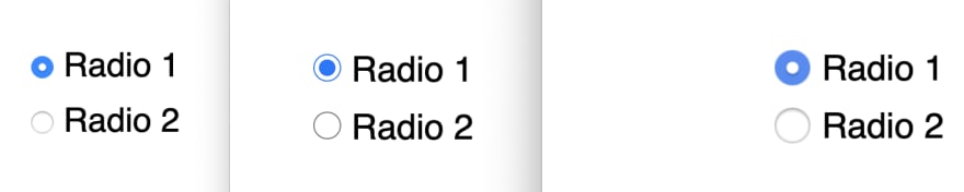
.radio { // ...existing styles display: grid; grid-template-columns: min-content auto; grid-gap: 0.5em;}Here's our progress as captured in Chrome, with Inspector revealing grid lines:

Custom Radio Button Style
Ok, this is the part you came here for!
To prepare for this, we have wrapped our input in span with the class radio__input. Then, we have also added a span as a sibling of the input with the class radio__control.
Order here matters, as we'll see when we style for :checked and :focus.
Step 1: Hide the Native Radio Input
We need to hide the native radio input, but keep it technically accessible to enable proper keyboard interaction and also to maintain access to the :focus state.
To accomplish this, we'll use opacity to visually hide it, and set its width and height to 0 to reduce its impact on the flow of elements.
.radio__input { input { opacity: 0; width: 0; height: 0; }}You may have seen more verbose solutions in the past, but we'll see why this works when we add the custom-styled control.
Step 2: Custom Unchecked Radio Styles
For our custom radio, we'll attach styles to the span of class radio__control that is the sibling following the input.
We'll define it as block element that is sized using em to keep it relative to the font-size applied to the label. We also use em for the border-width value to maintain the relative appearance. Good ole border-radius: 50% finishes the expected appearance by rendering the element as a circle.
.radio__control { display: block; width: 1em; height: 1em; border-radius: 50%; border: 0.1em solid currentColor;}Here's our progress after hiding the native input and defining these base styles for the custom radio control:

Uh - what is happening with that alignment?
Despite defining a width and height of 0, with default behavior of the span it is still being calculated as an element with dimensions.
The quick fix for this is to add display: flex to the .radio__input span that wraps the native input and the custom control:
.radio__input { display: flex;}Flex honors the 0 dimensions, and the custom control pops up and acts like the only element within .radio__input.

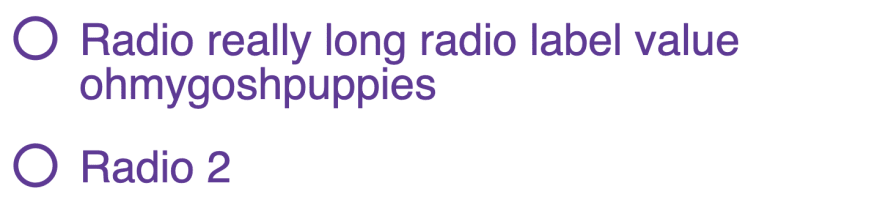
Step 3: Improve Input vs. Label Alignment
If you've worked with grid or flexbox, your instinct right now might be to apply align-items: center to optically tune the alignment of the input in relation to the label text.
But what if the label is long enough to become broken across multiple lines? In that case, alignment along horizontal center may be undesirable.
Instead, let's make adjustments so the input stays horizontally centered in relation to the first line of the label text.
Our first step is to adjust the line-height on the span of class .radio__label.
.radio__label { line-height: 1;}Using the value of 1 is admittedly a quick fix here and may not be desirable if your application has multi-line radio labels more often than not.
Depending on font in use, that may not 100% solve the alignment, in which case you may benefit from the following additional adjustment.
On our custom control, we'll use transform to nudge the element up. This is a bit of a magic number, but as a starting point this value is half the size of the applied border.
.radio__control { // ...existing styles transform: translateY(-0.05em);}And with that our alignment is complete and functional for both single-line and multi-line labels:
Step 4: The :checked State
Our use of opacity: 0 has kept the native radio input accessible for keyboard interaction as well as click/tap interaction.
It has also maintained the ability to detect its :checked state with CSS.
Remember how I mentioned order matters? Thanks to our custom control following the native input, we can use the adjacent sibling combination - + - to style our custom control when the native control is :checked
Option 1: Creating the circle with radial-gradient
We can add a radial-gradient for a classic filled circle appearance:
.radio__input { // ...existing styles input { // ...existing styles &:checked + .radio__control { background: radial-gradient(currentcolor 50%, rgba(255, 0, 0, 0) 50%); } }}You can adjust the stop point for the gradient to your preference.
Note the use of
rgbato define a transparent color instead of the keywordtransparentdue to an issue with usingtransparentin gradients for Safari where its interpreted as "transparent black"
Here's a gif of the result:
It was reported that this method doesn't always render a clean appearance, and sometimes the edges of the circle created by the gradient are noticeably jagged. Also, since this is a
backgroundit will not be visible if the form page is printed with default printer settings which remove CSS backgrounds.
Option 2: Creating the circle with :before
The alternate method is to use :before on the custom control to become child element that renders as a circle.
The advantage of this method is that it is also available to animate.
We first need to change the behavior of the .radio__control wrapping span:
.radio__control { display:grid; place-items: center;}This is the quickest way to align the :before to the horizontal and vertical center of custom control.
Then, we create the :before element, including a transition and using transform hide it with scale(0):
input + .radio__control::before { content: ""; width: .5em; height: .5em; box-shadow: inset .5em .5em currentColor; border-radius: 50%; transition: 180ms transform ease-in-out; transform: scale(0); }Use of box-shadow instead of background-color will enable the state of the radio to be visible when printed (h/t Alvaro Montoro).
Finally, when the input is :checked, we make it visible with scale(1) with a nicely animated result thanks to the transition:
input:checked + .radio__control::before { transform: scale(1);}And here's a gif of the result using an animated :before element:

Step 5: The :focus State
For the :focus state, we're going to use a double box-shadow in order to leverage currentColor but ensure distinction between the base custom radio button and the :focus style.
Again, we'll use the adjacent sibling combinator:
.radio__input { // ...existing styles input { // ...existing styles &:focus + .radio__control { box-shadow: 0 0 0 0.05em #fff, 0 0 0.15em 0.1em currentColor; } }}The order of box-shadow definitions corresponds with their layering, with the first definition being equal to the "top" layer. That means in this rule, we are first creating the appareance of a thin white border, which appears above a feathered out shadow that takes on the value from currentColor.
Here's a gif to demo the :focus appearance:

And with that, the essential styles for a custom radio button are complete!
Experimental: Using :focus-within to Style the Label Text
Since the label is not a sibling of the native input, we can't use the :focus state of the input to style it.
An upcoming pseudo selector is :focus-within, and one feature is that it can apply styles to elements that contain an element which has received focus.
The ModernCSS episode on a pure CSS accessible dropdown navigation menu also covered
:focus-within.
For now, :focus-within requires a polyfill, so the following styles should be considered an enhancement and not relied on as the only way to provide a visual indication of focus.
The first adjustment we'll make is to add a transition and reduce the opacity of the radio__label:
.radio__label { // ...existing styles transition: 180ms all ease-in-out; opacity: 0.8;}Ensure that the reduced opacity still meets appropriate contrast for your color palette.
Then, we'll test for focus by adding a rule for :focus-within on the label (.radio). This means when the native input - which is a child and therefore "within" the label - receives focus, we can style any element within the label while focus is active.
So, we'll slightly bump up the visual size of the label text using scale(), and bring the opacity back up.
.radio { // ...existing styles &:focus-within { .radio__label { transform: scale(1.05); opacity: 1; } }}Use of scale() prevents the resize from impacting the flow of elements and causing any jittering. The transition makes this nice and smooth, as seen in this gif:

Demo
Here is the solution altogether, with the first radio demonstrating the :checked state using radial-gradient and the second demonstrating use of :before:
Original Link: https://dev.to/5t3ph/pure-css-custom-styled-radio-buttons-3dm5
Dev To
 An online community for sharing and discovering great ideas, having debates, and making friends
More About this Source Visit Dev To