
An Interest In:
Web News this Week
- April 18, 2024
- April 17, 2024
- April 16, 2024
- April 15, 2024
- April 14, 2024
- April 13, 2024
- April 12, 2024
Some of Our Sources
- Mashable
- Spoon Graphics
- Smashing Magazine
- Naldz Graphics
- Fudge Graphics
- Reencoded
- Wal You
- Design Modo
- Android Headlines
- Daily Now
Help Webnuz
Referal links:
Develop an Eye for Good Design
Having a good design taste is essential; not gonna say why though. To many designs comes off as talent rather than skill. Truth is, artistic ability is achievable through practices.[Research approves].
Here I am going to share some tips for justifying good design. These will serve as a start to differentiate between good and bad design. Which will eventually lead to developing an eye for good design, I believe.

Target Audience:
- Beginners who don't know much about design
- Developers who doubt their artistic ability

- Devs who got 2-3 min time
Tips:
1. Make sure the text and image in hero section contrast well
For brighter text choose darker image and vice versa.
If, however, text and image both are bright then darken the image with an overlay; maybe cutting off the opacity a bit. Something like this-
2. Highlight call-to-action buttons differently
If you have two or more action buttons in hero section, then make them different visually. Keep primary focus on the main call to action button that you want them to click.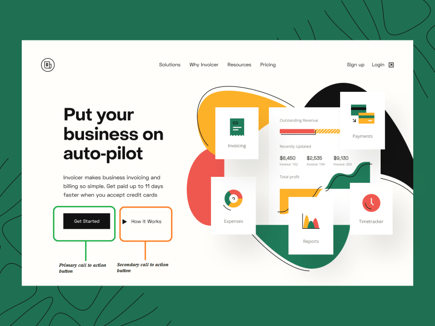
3. Take good care of text alignment
Stick to one alignment throughout the design. If you choose to left align, then stick to it. Switching between alignment causes unnecessary eye moves for the users. Avoid it all costs.
4. Be very very serious with color contrast
I can't emphasize enough how big of a thing this is. Throwing colors randomly isn't about design; a good designer chooses his/her color wisely. You will be fine with two or three colors, one being the base color. Just make sure they contrast well. 
5. K.I.S.S
Seriously just Keep It Simple and Stupid. Don't sacrifice usability for the sake of beauty or being feature-rich.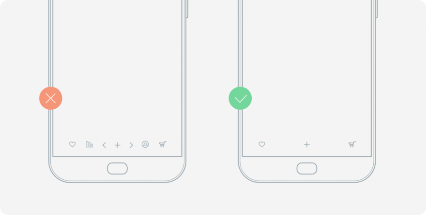
6. Careful with small font-size
If you have to put smaller fonts on a lighter image, increase the font-weight. This will improve the UX. Look how the small text is balanced here-
7. Careful when mixing different fonts
I highly recommend that you don't mix up different fonts if you are a novice. When you need to do so, try decreasing the font-weight of one in contrast to other one. Thus your text don't have to fight for attention from two different universe. Here are some examples that done right-

Finally, you should always be aware of your surroundings. Try to understand if something feels you right, why so?
Design is not some hard and fast rules; it's a process of evolution. See how your smartphone design is evolving. Have a mindset of understanding it. It will take you far, I promise.
photos from unsplash, qulix and dribble(@VladimirGruev, @ValeriaRimkevich).
Original Link: https://dev.to/akdeberg/develop-an-eye-for-good-design-ie2
Dev To
More About this Source Visit Dev To