
An Interest In:
Web News this Week
- April 23, 2024
- April 22, 2024
- April 21, 2024
- April 20, 2024
- April 19, 2024
- April 18, 2024
- April 17, 2024
Some of Our Sources
- Technology Review
- Web Designer Wall
- Joshua Blankenship
- Spoon Graphics
- Smashing Apps
- Web Designer Depot
- Fudge Graphics
- Line 25
- Spyre Studios
- Codrops
Help Webnuz
Referal links:
Different Ways to Center a Div in a Webpage
One of the most common things you might be doing as a web developer is to centre a div on a webpage. So, in this small post, I'm going to discuss 3 different ways to centre a div on a webpage.
Disclaimer: Some of these methods are not optimal, it is just like a test how far my creative mind can go.
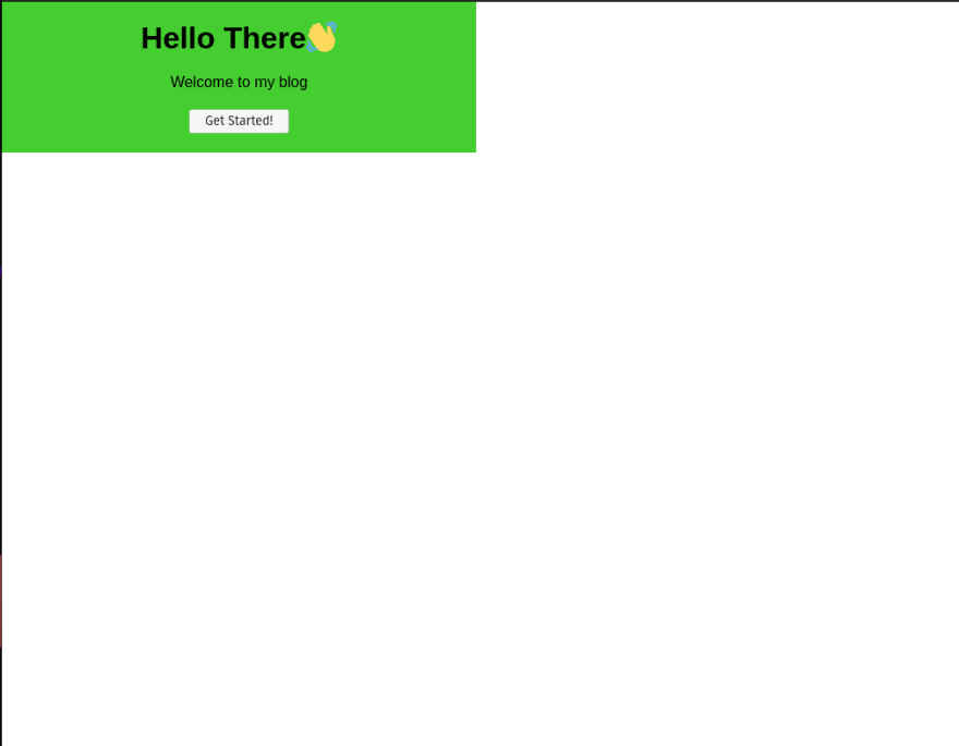
For each and every solution here this will be our starter code. We will be starting with a hypothetical card which welcomes to a blog. (I have used the br tags to just decease a few lines of CSS)
<div class="card-holder"> <div class="card"> <h1>Hello There</h1> <br> <p>Welcome to my blog</p> <br> <button>Get Started!</button> </div><div>*{ margin: 0; padding: 0; box-sizing: border-box; }.card-holder{ width: 100vw; min-height: 100vh;}.card{ background: #45CE30; padding: 20px; width: 80%; max-width: 500px; text-align: center; font-family: Arial;}The CSS written here is simply resetting the margin and padding for all elements. Setting the box-sizing to "border-box" makes it easier to deal with CSS as it includes all the margins and padding of an element within its width. After that, I set the div with class card-holder to take full available width and height of the viewport. This will be helpful; for positioning the inner div. Finally, there are some styles applied to the card giving it a background and some padding, then I specified width and max-width so that it doesn't look that big in big screens. Then I have aligned all the text to the center, and given them a font family of Arial.
After all this adjustment, our card will look somewhat like this.
The result we are trying to achieve:
1. The Flexbox way:
I generally use the flexbox way to centre a div on a webpage. For this, we need to modify the CSS of the outer div(i.e. the card-holder) to display it as flex and then we need to justify-content and align-items to be in the "center". So the code changes for that:
.card-holder{ /* other base styles go here */ display: flex; justify-content: center; align-items: center;}After these changes, the card will be centred.
2. Absolute positioning:
For this, we need to position of the parent element to be relative. Setting this would let us position the child element as absolute. Then we can shift the child element by 50% from top and 50% from left. So, at this stage, the CSS will look like:
.card-holder{ /* other base styles go here */ position: relative;}.card{ /* other base style */ position: absolute; top: 50%; left: 50%;}But, after all this, the div won't be centred. It will look like:
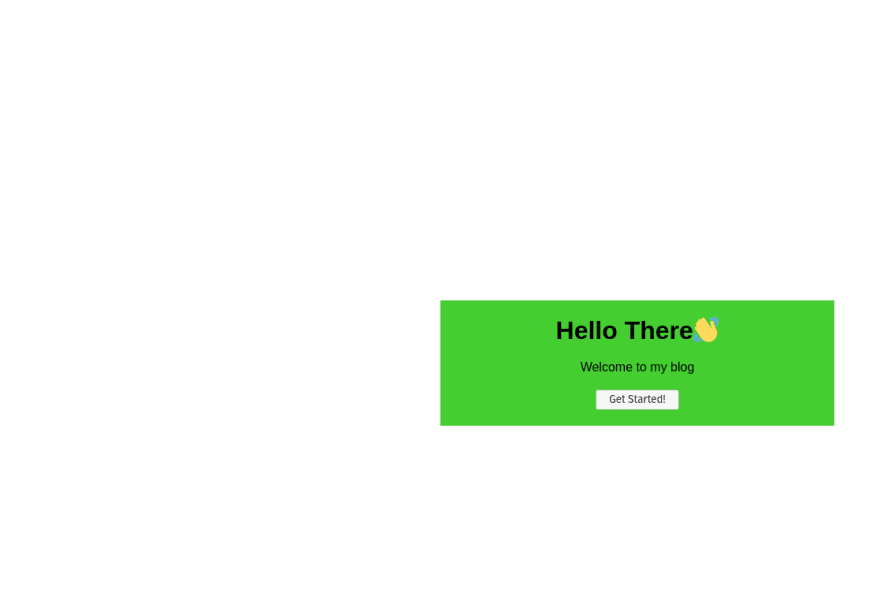
If you look minutely, you will notice that the top left corner of our card is centred in the page. So, we need to move the card now. One of the easiest ways to move the card irrespective of its size is to use the transform CSS property. Now, there are many things we can set with this CSS transform property, one of which is translate, which moves this element without changing other elements surrounding it. One of the best thing about this transform translate is that it can receive percentage values and these percentages are calculated according to the width and the height of the element on which we are applying this style.
So, setting the transform translateX and translateY to -50% each will make the card to move to left and up making its centre to come to the position where its top left corner was before. So that line of code looks like:
.card{ /* other base style */ position: absolute; top: 50%; left: 50%; transform: translateX(-50%) translateY(-50%);}3. Using Grid Template and Positioning:
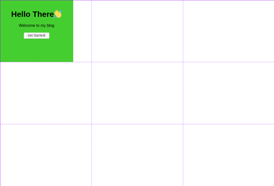
When CSS grids and flexboxes came, they were a game-changer. They were introduced to save web developers from the hassles of using the "then-popular" floats and clearing floats. Using grid one can create almost any layout.
So our concept will be to declare a 3X3 grid and place our card in the middle grid. For that, we need to make the card-holder display as a grid and then we need to template that grid with three rows and 3 columns. For that the CSS required will be like:
.card-holder{ /* other base styles go here */ display: grid; grid-template-columns: repeat(3, 1fr); grid-template-rows: repeat(3, 1fr);}Now after doing this, you might not see any changes other than the change of height and width of the card. But if you use the dev tools you will be able to see the grid created like this:
Now, we need to get our card to the center grid. For that, we can use grid-row and grid-column properties to select between which grid lines should our grid item stay. The grid-line numbers look somewhat like this:

So, if you have a proper look at the line numbers then you will instantly notice that we need to place our card at grid line number 1 to 2 in the column and as well as in the row. So, that code will look like:
.card{ /* other base style */ grid-row: 2/3; grid-column: 2/3;}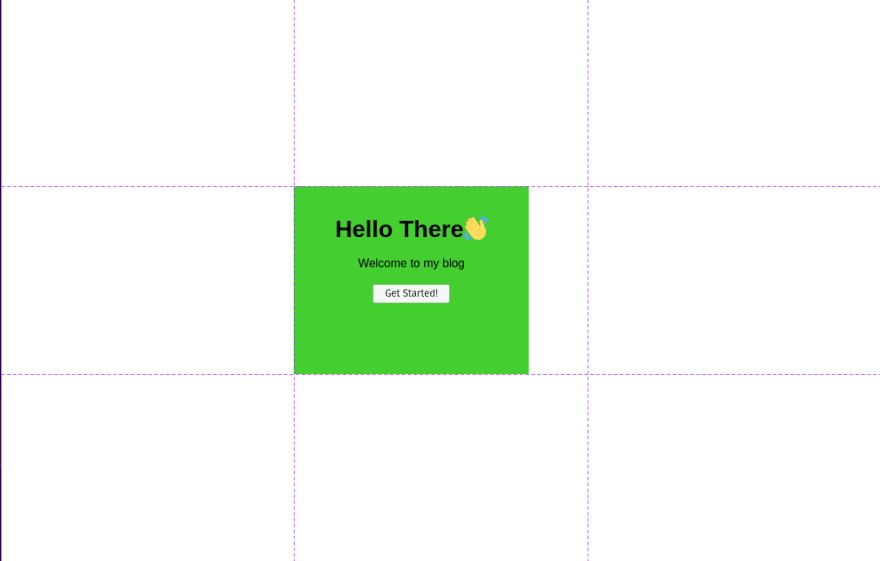
Now, at this point, you will see that this div is not properly centered. For that, we can use: margin: 0 auto; to center the card. But still, after that, the content inside the card won't be vertically aligned.
For this, we need to change the HTML to have the content of the card in another div. Then we need to divide our card into 3 columns and place the div inside the card in the middle column. So the HTML and CSS changes look like:
<body> <div class="card-holder"> <div class="card"> <div> <h1>Hello There</h1> <br> <p>Welcome to my blog</p> <br> <button>Get Started!</button> </div> </div> <div></body> .card{ /* other default style */ grid-row: 2/3; grid-column: 2/3; margin: 0 auto; display: grid; grid-template-rows: 1fr 6fr 1fr; } .card div{ grid-row: 2/3; }
Now this method, will need some tinkering for smaller screen sizes, which can be done easily with media query and setting the grid-template-columns in .card-holder to be something like "1fr 5fr 1fr". In my case Setting it like this made it look like this on mobile devices:
To achieve this I used this piece of code:
@media (max-width: 768px){ .card-holder{ grid-template-columns: 1fr 6fr 1fr; } .card{ padding: 20px; } }Some more tinkering might be needed for squarer devices. So this method is not all reliable.
Honorable mention 1: The very first approach I tried
In this approach, I just thought to set the margin of the card to "auto" thinking that setting the margin auto on horizontal centres it, then it will do the same for vertical margin. But alas, the case was not like that. Setting vertical margin to 0 defaults them to 0
Honorable mention 2: If you are just centering a text and you need nothing else
In this case, our HTML looks somewhat like this:
<body> <div class="card-holder"> <h1>Hello World!</h1> <div></body>And our initial CSS for card-holder and the h1 looks like:
.card-holder{ width: 100vw; min-height: 100vh; } h1{ font-size: 4rem; font-family: Arial, Helvetica, sans-serif; }This will look like this:

Now we can change this with just two lines of CSS in h1:
h1{ font-size: 4rem; font-family: Arial, Helvetica, sans-serif; text-align: center; line-height: 100vh;}This will look like:

Final Verdict
This was just a fun post just testing my CSS skills. If it was a practical project I would have used method 1 for centering the div. If you know any other methods please comment down below and let me know.
Original Link: https://dev.to/ayushmanbthakur/different-ways-to-center-a-div-in-a-webpage-5enn
Dev To
 An online community for sharing and discovering great ideas, having debates, and making friends
More About this Source Visit Dev To