
An Interest In:
Web News this Week
- March 21, 2024
- March 20, 2024
- March 19, 2024
- March 18, 2024
- March 17, 2024
- March 16, 2024
- March 15, 2024
Some of Our Sources
- Web Designer Wall
- Team Treehouse
- Abduzeedo
- Naldz Graphics
- 24 Ways
- Design Modo
- Android Headlines
- Daily Now
- Dev To
- The Verge
Help Webnuz
Referal links:
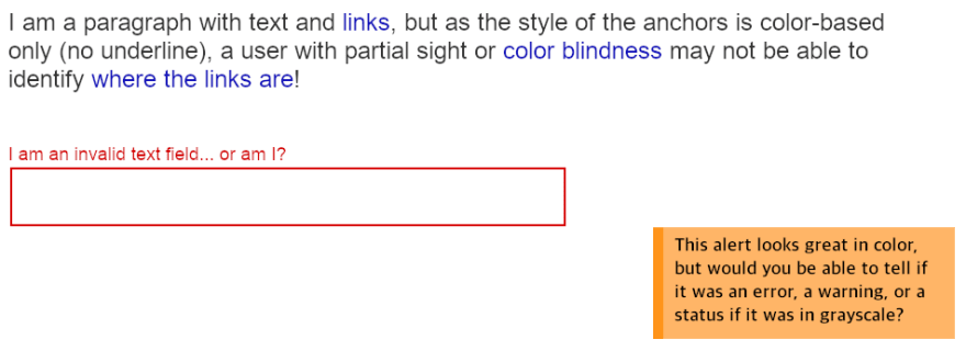
Do not just use color to convey information
Using colors to emphasize information is great. They help distinguish the content and make it easier to identify while making it more stylish for the users. But it needs to be a booster something that supports and enhances the current content, and not something that provides all the information.
People suffering from partial sight, color blindness, or visual deficiencies, may have problems differentiating certain colors. If all the information is color-based, then they won't be able to access it.
Let's illustrate this by taking the last example from the previous post:
Mouse over this pie chart to see it in grayscaleThat is a pie chart with more-or-less easy to distinguish colors but, when you mouseover, it turns into a grayscale mess.
While graphs may be more of an edge case, there are many other elements and components that we use every day and could potentially have a similar issue. For example:
- Alert/Toast messages: if their type is color-coded, they may be difficult to distinguish unless they specify what they are.
- Required/invalid fields: specifying the status/requirement of a field should be more descriptive than just color: what went wrong? what can be done to fix the issue?
- Links: they need to pop among the surrounding text... even if everything was in grayscale.
There are different techniques to solve these problems. All of them based on the idea of having something more than just color to emphasize the content:
- Add a visual indicator or icon. Like with a pseudo-element:
a.external-link::after { content: ""; display: inline-block; width: 1em; height: 1em; background: url(external.png); background-size: cover;}- Add a text indicator. Following a similar pattern as the icon above.
- Add a background pattern. For example, in graphs.
- Add another type of visual indicator. Like an underline for links:
a, a:link { text-decoration: underline;}a:hover { text-decoration: none;}- Combine some of the above...

Let's see another classic example of this with a possible solution: a stock ticker. If the value is up, the numbers are displayed in green, and if the value is down, they are displayed in red. Which may not be a good thing for users with partial sight or colorblindness:

We need to communicate textually or visually what each color means. In this case, an arrow up or down would do. We can do that by adding a pseudo-element before the price:
.price.negative::before { content: "";}.price.positive::before { content: "";}And the result:

Adding the up/down visual indicator provides an extra reinforcement for what the change in value was, and makes the content more accessible.
Do not just use color to convey information.
Original Link: https://dev.to/alvaromontoro/don-t-use-color-to-convey-content-2ai1
Dev To
More About this Source Visit Dev To