
An Interest In:
Web News this Week
- March 20, 2024
- March 19, 2024
- March 18, 2024
- March 17, 2024
- March 16, 2024
- March 15, 2024
- March 14, 2024
Some of Our Sources
- Abduzeedo
- Creative Curio
- Naldz Graphics
- My Ink Blog
- Web Design Ledger
- CSS Globe
- Stylized Web
- Freelance Switch
- Willems Lab
- Hashedout
Help Webnuz
Referal links:
How to create a component library using Storybook and Create React App
In this post we will look at how we can use Storybook to create a component library using Create React App (CRA). In the end, we will create a simple button with some variations.
Setup
First we create the project using CRA. In this post, we will be using yarn but if you prefer to use npm, all commands should work as well so do feel free. In the CRA command below be sure to add the flag --use-npm to initialize as an npm project.
npx create-react-app component-libThe next step is to add storybook to our project.
npx -p @storybook/cli sb initYou should see these new yarn scripts added to your package.json:
"scripts": { ... "storybook": "start-storybook -p 9009 -s public", "build-storybook": "build-storybook -s public"}Note: at this time of writing the version of Storybook used is 5.3.
By default, Storybook will read all files in your src/ directory that follows the .stories.js suffix (see .storybook/main.js)
stories: ['../src/**/*.stories.js'],For the purpose of this post, we will keep it simple and place all our stories in the src/stories folder.
To run story book and you will be presented with the following dashboard:
yarn storybook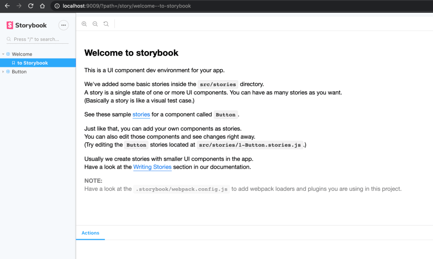
Storybook comes out of the box with demo buttons from their demo projects but we will be creating our own in the next step.
Creating your own component
Now we will create a simple button component with a few variations as examples so we can create different stories for each.
// src/components/Button.jsimport React from 'react';import './button.css';const colors = { default: 'default', primary: 'primary', secondary: 'secondary',};const Button = ({ children, onClick, color, disabled }) => { const className = colors[color] ? `button ${colors[color]}` : 'button'; return ( <button className={className} onClick={onClick} disabled={disabled}> {children} </button> );};export default Button;The styles for the component is defined below. Feel free to use your preferred method of styling your components. In this case we're just using plain CSS for simplicity's sake.
/* src/components/button.css */.button { font-family: 'Roboto', 'Helvetica', 'Arial', sans-serif; padding: 6px 16px; font-size: 12px; min-width: 64px; box-sizing: border-box; font-weight: 500; line-height: 1.75; letter-spacing: 2px; cursor: pointer; border-radius: 4px; box-shadow: 0px 8px 15px rgba(0, 0, 0, 0.1);}.button[disabled] { cursor: default; pointer-events: none; color: rgba(0, 0, 0, 0.26); box-shadow: none; background-color: rgba(0, 0, 0, 0.12);}.primary { color: #fff; background-color: #1976d2;}.secondary { color: #fff; background-color: #dc004e;}We create the following stories for each variation of our Button component.
// src/stories/Button.stories.jsexport const Primary = () => ( <Button color="primary" onClick={action('clicked')}> Primary Button </Button>);export const Secondary = () => ( <Button color="secondary" onClick={action('clicked')}> Secondary Button </Button>);export const Disabled = () => ( <Button color="secondary" onClick={action('clicked')} disabled={true}> Disabled Button </Button>);export const WithEmojis = () => ( <Button onClick={action('clicked')}> <span role="img" aria-label="so cool"> With Emojis </span> </Button>);We should see the following in Storybook:

Building and exporting as a static app
Now that we have created our component library consisting of a single Button component. We now will think about building and exporting it. All we have to do is run the other yarn script:
"build-storybook": "build-storybook -s public"Running the following will create the static Storybook files in the storybook-static directory.
yarn build-storybookThis can then be deployed as a static web app. In a follow-up post I will go through instructions how to do this.
For now we can test deploying this using the npm library http-server using the following command:
npx http-server storybook-staticClosing notes
We have gone through creating a simple React component library using Storybook and CRA. Storybook provides us the tools to make it straightforward to achieve this. We are just touching the surface and Storybook provides much more though add-ons, testing and more. See more information here. In a follow up post I will go through publishing deploying the static site and publishing our Button component as a library to a public npm registry so we can use it in other React apps so stay tuned.
Thanks for following and reading.
Original Link: https://dev.to/jericopingul/how-to-create-a-component-library-using-storybook-and-create-react-app-44ne
Dev To
 An online community for sharing and discovering great ideas, having debates, and making friends
More About this Source Visit Dev To