
Some of Our Sources
- Slashdot
- BoingBoing
- Engadget
- Simplebits
- TutsPlus - Code
- Pearsonified
- Abduzeedo
- Web Designer Depot
- Crazy Leaf Design
- Codrops
Help Webnuz
Referal links:
CSS Animation: the basic concept and more..
Css Animation is a great way to improve user experience, add personality to a website. Sensing the movements of objects appears to be a fundamental job for our visual system. We can capitalize on that to build an engaging website. But always remember, animations should enhance the user experience and not be distracting.
In this post, we'll walk through the basic concept of creating animation with css. We're going to discuss css properties, pseudo-classes, the @keyframes(pronounced at-keyframes) rule and how browsers render css.
This post is beginner inclined. So if you're new to css, do follow along, there's a lot you can learn. Enough of the intro, let's get to it.

css properties, pseudo-classes and css transition property
A basic example of css animation could be the use of pseudo-classes to change the state of an element. What are pseudo-classes?
Pseudo-classes: They are keywords combined with a CSS selector to add an effect to existing elements based on their states. An element will remain in a fixed position unless it is acted upon, which is where pseudo-class comes in. It adds trigger to elements.
| Basic css | Css with pseudo class |
|---|---|
 |  |
Pseudo-classes includes :hover, :visited, :focus, :active, :checked, :not(). There are over 40 pseudo-classes, you can check them out on MDN.
With pseudo-classes, we can create simple to advance interface ranging from "changing width of element" to "form validation". Yes form validation, the :valid pseudo-class can be used to validate forms. We wouldn't be going there though.
In the pen above, hover, active, focus pseudo-classes were used to change the width, border and color/background of their respective elements. Notice the abrupt change in the state of the element, we will use the transitions properties to create better transformation.
CSS Transitions: CSS transition allows us to change property values smoothly, over a given duration. It is a shorthand syntax for transition-property, transition-duration, transition-timing-function(optional), and transition-delay(optional).
Note transition shorthand:
div { transition: [property] [duration] [timing-function] [delay];}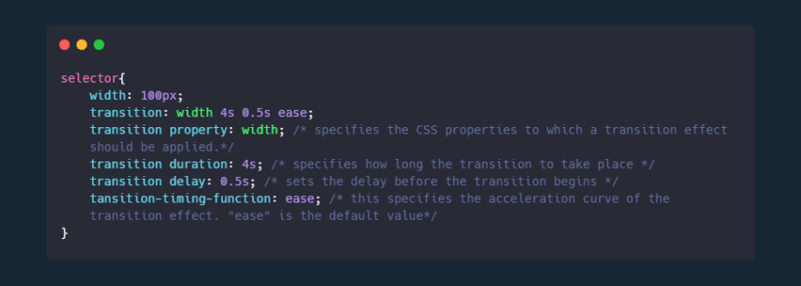
Transition-property: This is used to specify the css property we want to change or transform. e.g transition-property: width;, transition-property: background-color; or better still transition-property: all; which will apply to all possible property.
Transition-duration: This is the duration it takes for the transition to occur.
Before we get to transition-timing-function, let's apply transitions to our previous code.
Now our animation looks much better.
The transition-timing-function: This is used to define the acceleration curve. The values are grouped into keyword and function values.
The keyword values include ease (default), ease-out, ease-in, linear, ease-in-out, step-start, step-end.
The function values are steps(n, jumpterm) and cubic-bezier(p1, p2, p3, p4).
steps(n, jumpterm): This is more like an extension from the step-start and step-end keyword value. It takes two parameter 'n', 'jumpterm'. The n is the number of times we want the jumpterm to occur. Jumpterm refers to how the jump should take place. Apparently step-start and step-end means steps(1, jump-start) steps(1, jump-end) respectively. There's also jump-both and jump-none;
cubic-bezier(p1, p2, p3, p4): This is used to create advance acceleration curve. We can create our own dynamic acceleration curve with this value. Where the p1 and p3 values must be in the range of 0 to 1. There are tonnes of cubic-bezier generator online to manipulate our acceleration.
How does browsers render CSS
Okay sorry for the intermission, you might be wondering why we have to talk about this. Understanding how web browsers render CSS is important in creating a smooth and better animation.
This is a visual example of why this is important. On hover, the red box transition affected the other element on the page while the blue one does not. The blue box which obviously has a better animation uses the css transform property(full details later).
When a webpage is loaded, the browser goes through four steps to render css.
Style: After the browser figures where our CSS file is located in the HTML file, it scans through the CSS and figures out which rules to apply to which element. This is done through the CSS Object Model (CSSOM), it is much like the DOM tree but for CSS rather than HTML. The CSSOM, together with the DOM then builds the render tree, which is in turn used by the browser to layout and paint the web page.
Layout: With the render tree created, the browser creates the layout of each element in the render tree. The browser figures out the size and position of each element on the page. Properties such as width and height are applied during the layout stage
Paint: With the information about the size and position known, the browser brings on it artistic prowess. It shows the information to the users by applying paints and colours to the screen. Css properties such as border, color, box-shadow, text are applied during the Paint stage.
Composite: This is where the elements are combined together and rendered to the screen.
In summary, this means that if you animate a css property in the layout stage, the browser needs to recreate the entire layout, repaint and composite the element for each calculation. Same goes for properties in the paint stage. This ends up creating a poor quality of animation and webpage.
In other words, it is advisable to try as much to animate properties in the composite stage. Example of that are the transform and opacity properties. Properties in the composite stage do not have to recreate layout and repaint which means less calculation and better animation experience.
Basically, all our previous code has been bad practise since we can just use the transform property that has lot of perks to it. You can check out which stage css properties are triggered in browser on css trigger.
Transforming and Transitioning
A better way to move or change the position of an element is using the transform property. Just like in previous practises, we need to apply transition property to avoid abrupt change. This helps us create nice animation and better user interaction.
The transform property applies a 2D or 3D transformation to an element but we're only focusing on 2D in this post.
This property allows us to rotate, scale, move, skew elements. The property has values which takes one or two parameter. They include:
Scale(x,y): The scale value allows us to increase or decrease the size of an element. It has two parameters which is x and y e.g
transform: scale(2,4)which means it will scale two times on the x-axis and four times on the y-axis. Apart from scaling on the x and y axis, we can also scale on the x or y axis individually. e.g.transform: scaleX(2),transform: scaleY(0.5). x is horizontal, y is verticalRotate(x,y): The rotate value provides the ability to rotate an element from 0 to 360 degrees. Using a positive value will rotate an element clockwise, and using a negative value will rotate the element counterclockwise. You can rotate more than a full rotation with numbers greater than 360, such as 720deg, for two full rotations. Rotation can also be done individually on the X-axis and Y-axis. e.g.
transform: rotate(360deg),transform: rotate(1turn),transform: rotateX(20deg),transform: rotateY(30deg)Translate(x,y): The translate value moves an element through the x and y axis. Using
translateXvalue will change the position of an element on the horizontal axis while thetranslateYvalue will change the position of an element on the vertical axis. e.g.transform: translate(20px, 40px),transform: translateX(50%),transform: translateY(10em).Skew(x,y): The skew value gives a slant shape to the element based on the values for the x and y axis. e.g. transform: skew(20px, 40px), transform: skewX(50%), transform: skewY(5em).
Note: When using the properties, always take note of the units.
The transform properties can be manipulated together to create shapes.
Transform-origin: With transform origin, transformation even gets better. The transform-origin property allows us to change the origin of transformation. By default, transformation starts from the center which translate as transform-orign: 50% 50%; or transform-origin: center;. 0% 0% is the same value as top left, 0% 100% is the same as left bottom, and 100% 100% is the same value as bottom right.

@Keyframes rule and the animation property
So far we've created some animation that requires pseudo-classes. With the keyframes function and animations property, we don't have to specify the state of an element. All we have to do is apply the animation properties on our element, then define @keyframes rules that specify our css style at different stage. Alright let's start with the animation properties.
The animation property just like transform and transition has sub-properties. The animation properties are added to the CSS selectors (or elements) we want to animate.
animation-name: The name of the animation. This is used as the @keyframes name when we define it.animation-duration: The duration of the animation, in seconds (e.g. 3s) or milliseconds (e.g. 500ms).animation-timing-function: specifies the speed curve of an animation. It works just the same as the transition-timing-function.animation-delay: It specifies a delay before an animation starts, in seconds or milliseconds.animation-iteration-count: This specifies the number of times an animation should repeat. e.ganimation-iteration-count: 2;,animation-iteration-count: infinite;.animation-direction: This property defines whether the animation should play forward, backward, or in alternate cycles. e.ganimation-direction: reverse;,animation-direction: normal;(the default value which is forward direction),animation-direction: alternate(it alternates between the forward and reverse direction).animation-fill-mode: This property is used to specify the state or mode of the element after animating. e.ganimation-fill-mode: forwards;which means the element should remain in the final stage or state.animation-play-state: This property allows us to pause and resume the animation sequence. e.ganimation-play-state: pause;,animation-play-state: play;. This property is defined on a pseudo-class or in javascript.
/*Shorthand syntax*/div{animation: [animation-name] [animation-duration] [animation-timing-function] [animation-delay] [animation-iteration-count] [animation-direction]/*Individual syntax*/animation-name: myAnimation;animation-duration: 2s;animation-timing-function: ease /*options: linear, ease-in, ease-out, ease-in-out, cubic-bezier */animation-delay: 1s;animation-iteration-count: infinite;animation-direction: normal; /*options: alternate, reverse, alternate-reverse */animation-fill-mode: forwards; /*options: none, backwards */}Now that we've specified our animation properties, we'll have to define the stages and css to complement the animation. This is done with the @keyframes rule.
@Keyframes rule: The @keyframes defines the css of the animation at different stages. Each stages can be specified with percentage(%) or using "from" and "to" which represent 0% and 100% respectively. The @keyframes rule is also given a name which is the value of the animation-name property specified on the element we want to animate.
@keyframes myAnimation {0% { css property: value }50% { css property: value }100% { css property: value }}@keyframes anotherAnimation {from { css property: value }to { css property: value }}div{ animation: bounceAnimation 1s ease-out infinite alternate;/*animation: [animation-name] [animation duration] [animation-timing-function] [animation-iteration-count] [animation-direction]*/}@keyframes bounceAnimation{ 0%{ transform: translateX(0px) scale(1); } 100%{ transform: translateX(300px) scale(2); } }With the @keyframes rule and animation properties, we can create simple to complex animation without javascript or pseudo-class.
Project
In this section, we're going to apply the @keyframes and animation property to build a simple animated website. Just to illustrate "how-to apply animation to a website".
.paragraph1 { animation: paragraph1 2s ease-out;}.paragraph2 { animation: paragraph2 2s ease-out forwards;}a{ opacity: 0; animation: anchor 2s linear 2s forwards;}@keyframes header { 0% { transform: translateY(-100px); } 100% { transform: translateY(0px); }}@keyframes paragraph1 { 0% { opacity: 0; transform: translateX(-200px); } 100% { opacity: 1; transform: translateX(0px); }}@keyframes paragraph2 { 0% { transform: translateX(200px); } 100% { transform: translateX(0px); }}On the page, there are four animated element, two paragraphs, a header and a button. At 0% and 100%, transform property was added to the paragraph's @keyframes to slide them to their original position. The button also faded in with opacity property.
Conclusion
Yeah that's it, the basics of css animation. The animation property and @keyframes is very resourceful, the possible animations you can create are endless but always remember to put the users interest at heart.
If you will be having a lot or complex animation on your website, you can check out animate.style which is a css library for building efficient animation.
You can check out all the css on my codepen collection
Thank you for taking the time to read this post. If you've found this useful, please give it a or , share and comment.
Further reading resources
MDN
Css library
CSS GPU Animation: Doing It Right
Css animation for beginners
Original Link: https://dev.to/petrepan_/css-animation-the-basic-concept-and-more-2aki
Dev To
 An online community for sharing and discovering great ideas, having debates, and making friends
More About this Source Visit Dev To