
Some of Our Sources
- Techcrunch
- Web Designer Wall
- Team Treehouse
- The Logo Smith
- Inspiredology
- Web Designer Depot
- Naldz Graphics
- Freelance Switch
- Android Dissected
- Dev To
Help Webnuz
Referal links:
REALISTIC CSS ART HACKS
The secrets of creating realistic CSS art, it's simple I promise!
I am going to show you how easy it is to make Realistic CSS Art using a simple worked example. CSS Art can be a really fun way to practice your CSS skills and knowledge so I definitely recommend having a go!
CHOOSING AN OBJECT
When selecting the object you want to draw you don't want the shape to be too complex. You need to break the object down into a few simple shapes, these simple shapes will be your divs.

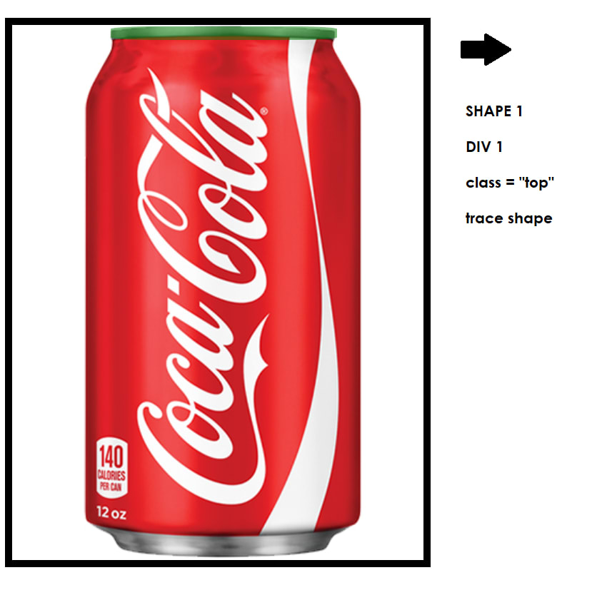
TRACE YOUR IMAGE
After you have decided on the object and how you are going to break it down, it's time to start coding. To make your life 100% easier I recommend creating a container for all your divs and setting the object you are drawing as your background image so you can "trace" it. This makes positions and getting proportions correct much easier. Putting them in a container will also help with positioning.
.container { width: 700px; /* size of container */ height: 700px; background-image: url(https://cdn.huntoffice.co.uk/images/D/can-of-coke.jpg); /* insert image to trace */ background-size: 700px; /* you may need to play around with the sizing to fit container */ background-repeat: no-repeat; border: 10px solid black; /* so you can see your canavas */ position: relative; /* important for positioning*/}CREATING YOUR SHAPED DIVS
Trace each shape by setting each div to have a random background color and opacity 0.5. This way you can see what you are doing. See below.
.top { /* size */ width: 55%; height: 2.5%; /* position */ position: absolute; left: 24%; top: 0.3%; /* shape */ border-radius: 20%; /* to help you trace - will remove */ background-color: green; opacity: 0.5; }There are numerous ways you can get the shape you are looking for. I have linked some resources that will easily teach you how to create different shapes.
Simple shapes that can be made with CSS/one div
https://css-tricks.com/the-shapes-of-css/Clip Path
https://bennettfeely.com/clippy/Border Radius
https://codepen.io/pmk/pen/zGGXKW
Below I have completed the shapes for the coke can using the above resources.
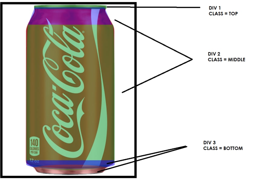
.top { /* size */ width: 55%; height: 2.5%; /* position */ position: absolute; left: 24%; top: 0.3%; /* shape */ border-radius: 20%; /* to help you trace - will remove */ background-color: green; opacity: 0.5; }.middle:before { content: ""; /* size */ width: 95%; height: 12%; /* position */ position: absolute; left: 2%; top: -12%; /* shape */ clip-path: polygon(8% 0%, 91% 0%, 100% 100%, 0% 100%); /* to help you trace - will remove */ background: blue; opacity: 0.8;}.middle { /* size */ width: 67%; height: 85%; /* position */ position: absolute; left: 18%; top: 9.5vh; /* shape */ border-radius: 2% 2% 50% 50% / 49% 50% 7% 7%; /* to help you trace - will remove */ background: rgb(16, 162, 53); opacity: 0.5;}.base { /* size */ width: 67%; height: 5%; /* position */ position: absolute; left: 5.4vw; top: 91%; /* shape */ border-radius: 0% 1% 50% 50% / 49% 50% 57% 57%; /* to help you trace - will remove */ background: blue; opacity: 0.5;}.base:before { content: ""; /* size */ width: 90%; height: 110%; /* position */ position: absolute; left: 5%; top: 50%; /* shape */ border-radius: 50%; clip-path: polygon(0 0, 100% 1%, 90% 100%, 10% 100%); /* to help you trace - will remove */ background: red; opacity: 0.5;}PICKING THE RIGHT COLORS

I have a very simple yet effective hack to get the right colors for your image - yes an image color picker:
https://imagecolorpicker.com/en/
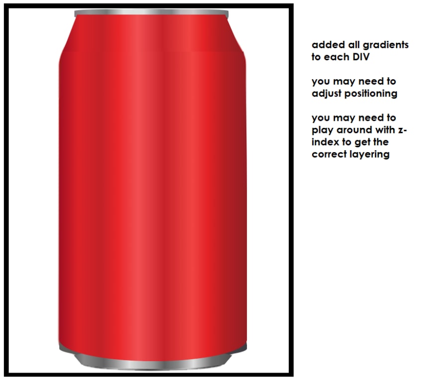
As you can see from the main Coca-Cola image we are working (above) there is a slight gradient (like with most objects). Getting this gradient correct is key to making the object looking real! Use the image color tool I linked above and this CSS Gradient Generator to get the perfect gradient.
To recap - using the color picking tool individually select each color in the gradient from the original image and then add it to the gradient generator to create the perfect color in CSS. Add this code to your shaped divs and viola!
example:
.middle { /* size */ width: 67%; height: 85%; /* position */ position: absolute; left: 18%; top: 9.5vh; z-index: 6; /* shape */ border-radius: 2% 2% 50% 50% / 49% 50% 7% 7%; /* color */ background: linear-gradient(90deg, rgba(162,16,33,1) 0%, rgba(219,33,40,1) 10%, rgba(194,33,39,1) 22%, rgba(232,37,41,1) 31%, rgba(241,79,82,1) 42%, rgba(199,34,41,1) 56%, rgba(240,68,66,1) 71%, rgba(227,34,37,1) 79%, rgba(179,30,34,1) 88%, rgba(148,30,36,1) 100%);}BRINGING THE IMAGE TO LIFE USING SHADOWS/BORDERS
Adding borders and shading using box-shadow will really bring your image to life making it look more 3D. I suggest using this site to generate box shadows quickly:
https://www.cssmatic.com/box-shadow

Here I have added shadows and borders and as you can see the shape looks more defined and 3D.
Now you can go ahead and add whatever details you like, for me, I just added an SVG logo on top and this worked quite effectively. Once you have the shape you could also play around with different colors to make different soft drinks!
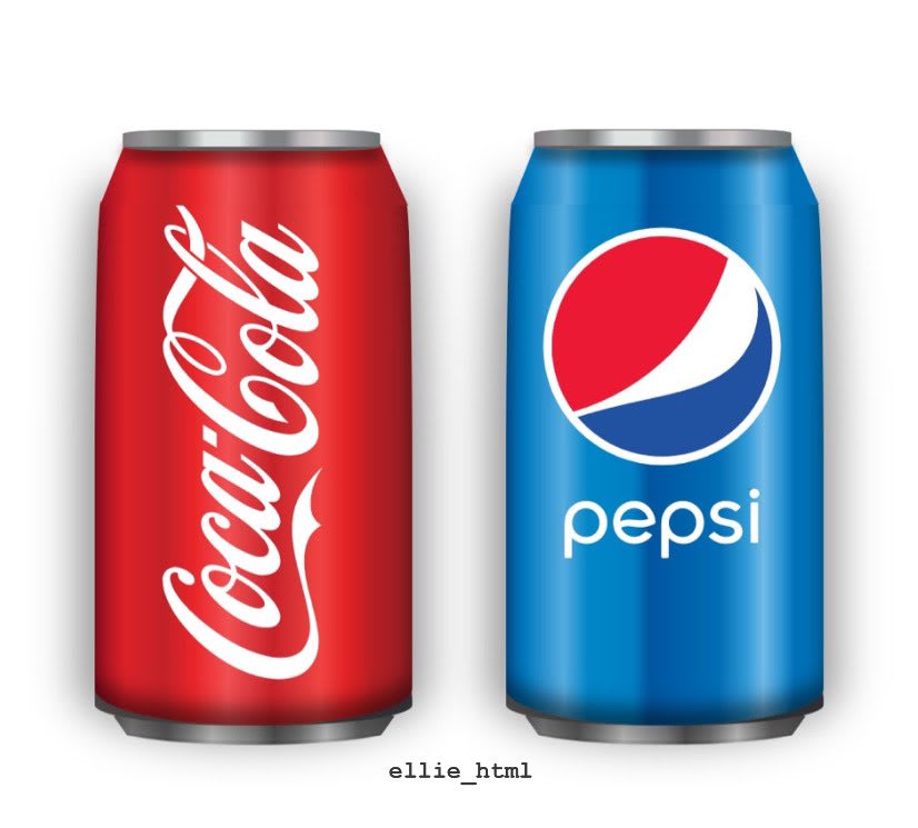
FINAL OUTCOME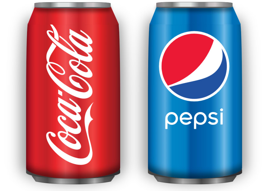
Hopefully, I have explained how I break it down so you can make your own CSSobjects. I honestly love doing this and it has 100% helped improved my everyday CSS skills.
 @ellie_html
 #100DaysOfCode R2 DAY 8 -
Pure CSS Coke and Pepsi cans -
Another CSS drawing because I find it so fun! Have also been practicing some website layouts trying to ensure my code is efficient and understandable!16:04 PM - 26 May 2020
105
1159
Disclaimer: Please be aware I am not an expert and I just do this for fun. This is a very simple example for the purpose of this tutorial. If you need any help or would like to see a more complicated object break down, please let me know on Twitter - @ellie_html
Original Link: https://dev.to/elliehtml/realistic-css-art-hacks-27pk
Dev To
 An online community for sharing and discovering great ideas, having debates, and making friends
More About this Source Visit Dev To