
An Interest In:
Web News this Week
- April 1, 2024
- March 31, 2024
- March 30, 2024
- March 29, 2024
- March 28, 2024
- March 27, 2024
- March 26, 2024
Some of Our Sources
View All SourcesHelp Webnuz
Referal links:
Flexbox diehards: Here's some concrete examples of when CSS grid is just better
This blog post introduces several new terms you may be unfamiliar with: griddazzle, gridify, getting "griddy" with it, etc. I recommend using context clues for these definitions.
I'll be honest, I was a flexbox diehard myself a while after CSS Grid took hold of page layouts. Even after taking Wes Bos' CSS Grid course (still the best resource hands-down if you're new to Grid!), I just didn't see the need to change my ways. Sure, flexbox sometimes needs an extra <div> or two to get layouts working... but hey, if it ain't broke, why fix it?
Still, I slowly forced myself to implement CSS Grid in some choice areas of my websites. Now, after a year of experimenting and getting increasingly Griddy with it, I've found some neat corners of CSS where flexbox struggles by comparison.
Posts comparing flexbox to Grid sometimes use simplified examples that don't get to the heart of flexbox's flaws. So, to convince all you flexers out there to join the dark side, here's some concrete examples of when CSS Grid really is alot simpler in my own experience.
1. When layouts have some reordering to do
Let's consider a common scenario: you have a 2 column layout for desktop / laptop users, and you want it to wrap nicely to a single column for narrow screens.
Taking a quick glance at your team's mockups, you fly into your usual flex rhythm and end up here:
<div class="outer-container"> <div>...column 1 content</div> <div>...column 2 content</div></div><style> .outer-container { /* create flexbox with a single row */ display: flex; justify-content: space-between; } @media (max-width: 800px) { .outer-container { /* wrap columns on top of each other for mobile */ flex-direction: column; /* alternatively, you can remove the flexbox entirely and let the columns wrap naturally */ display: block; } }</style>Easy peasy! For a lot of use cases, this should work just fine.
But sometimes, your design team my have other ideas. Let's consider the layout below, with both a desktop and mobile mockup to implement:
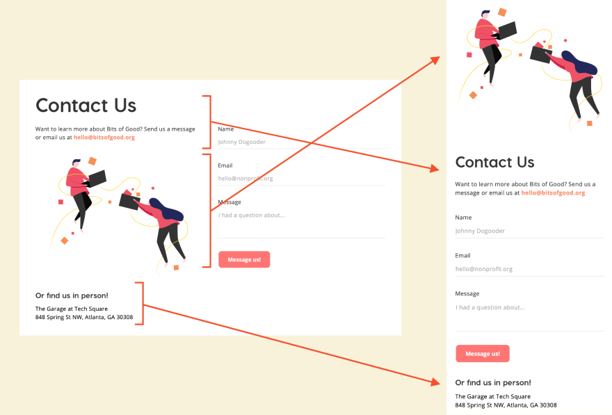
Well, that's a lot less fun. Not only should we reverse the ordering of our header and image, but we also need to move the final element of the first column (the "find us in person" address) to the end of our second column. This is definitely a nail in our flexbox coffin
Time to gridazzle
Fear not! CSS grid has an elegant solution to the problem: grid template areas
With this tool, we can assign each HTML element a unique "area" in our layout. then, we let our grid container decide where to slap each area into our final layout. It's a lot like paint-by-numbers, but gridified.
Here's a sample of how we could implement the above layout:
<!-- First, put all our elements on the page. --><!-- Notice we don't need wrapper <div>s for each column anymore! --><div class="outer-container"> <h1>Contact Us</h1> <p class="tagline-text">Want to learn more...</p> <img src="/static/contact-us.jpg" alt="People flying around with laptops" /> <div class="address-container">...</div> <form>...</form></div><style> .outer-container { display: grid; /* use template-areas to define the structure of our 2 column page */ /* col 1 | col 2 */ grid-template-areas: "header header" /* row 1 (just the header h1) */ "tagline form" /* row 2 (tagline text, start of form) */ "image form" /* row 3 (image, form continues) */ "address form"; /* row 4 (address, end of form) */ } /* assign each element to a unique area on our grid */ h1 { grid-area: header; } p.tagline-text { grid-area: tagline; } img { grid-area: image; } form { grid-area: form; } .address-container { grid-area: address; } @media (max-width: 800px) { .outer-container { /* rearrange our grid on mobile, now using a 1 column layout */ grid-template-areas: "image" "header" "tagline" "form" "address"; } }</style>Nice! Not only can we define the positioning of elements however we want, but we even have an expressive explanation of the layout in our CSS using area names.
Of course, we'll need a few finishing touches to get all the spacing right (height of each row in our 2 column grid, spacing between the columns, etc.). So, if you're curious how the entire mockup was accomplished, you can check out a production-ready implementation on our GitHub repo for bitsofgood.org
Accessibility note: CSS grid changes the visual order of elements on the page, but not the actual order of elements in the DOM. So, when we wrap our address-container to the bottom on mobile, it still appears above the form element in the underlying HTML. This shouldn't be much of an issue in our case, but before you start reordering text boxes on our own site, make sure this won't confuse screen readers!
2. When you want things kind of centered
I've run into this a few times trying to make a nice container of "cards," dynamically wrapping to a new row depending on the screen width. This conundrum is awkward to explain with words, so let's understand the problem visually:

Okay, so our container of cards should always remain centered on the page (notice the white space on either side of our card grid). However, each row of our container should start at the leftmost side and continue to the right (aka flex-start). That means we can't simply use justify-content: center here! That would center the item in the last row relative to the other rows, which breaks our illusion of a "grid."
Oh, and we also want constant "gap" between each card, as well as a constant width for each card.
If you've attempted this layout before, you can probably predict the @media query adjustments we'll need. Here's a sample implementation, assuming we'll never need more than 3 columns. Click "edit on CodePen" if you wish to squoosh that browser window.
Why this implementation is bad
- We need a
@mediaquery to adjust our container width for each change in column-count. This requires some wacky mental math based on a) the width of each card, and b) the margin between elements. Adjusting the width of a card by even1px, we'll need to run all these calculations again! And no, we can't usecalc()in a media query - This doesn't consider screen sizes below the width of a single card. We could add yet another
@mediaquery to change this, but as we'll see soon, CSS Grid can remove this need entirely!
Time to gridificate
Now, let's see a sample implementation of the same layout with CSS grid:
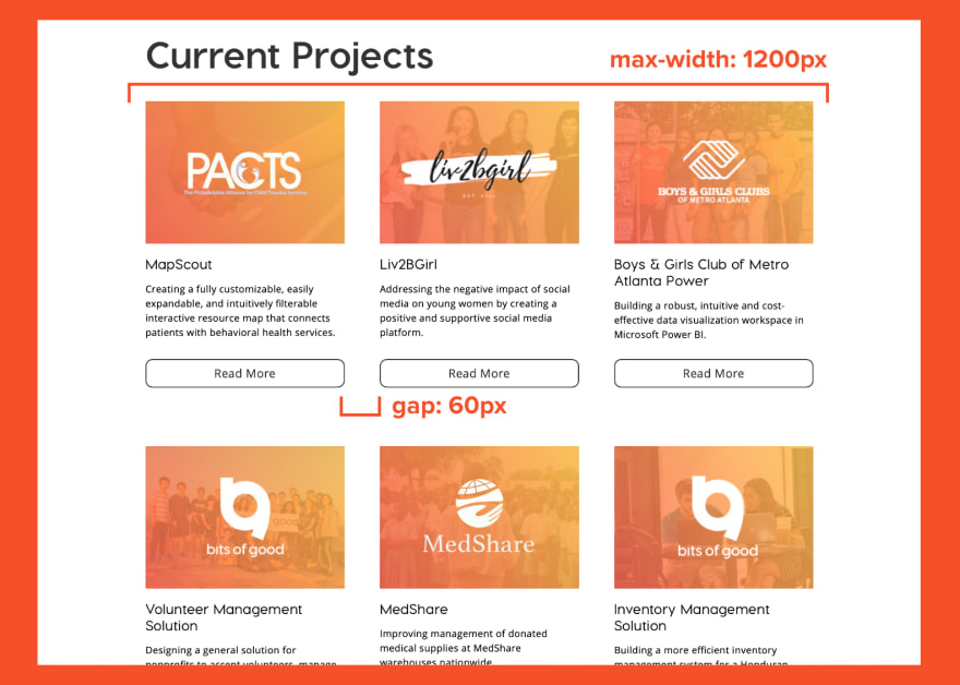
.container-of-cards { display: grid; /* set our column widths with wrapping in place */ grid-template-columns: repeat(auto-fill, 340px); gap: 60px; /* center our columns relative to the container */ justify-content: center; /* add a max-width to prevent more than 3 columns */ max-width: 1200px; margin: auto;}.card { height: 120px; /* no need to specify the width or margins! CSS grid does it all for us. */}Some big takeaways here...
grid-template-columnslets us create as many columns as we can fit in a given container. In our case, we want to create columns340pxwide, andauto-fillour container with however many cards we have (wrapping to a new row as necessary).justify-contentworks a bit differently in Grid land. Rather than changing the alignment within each row a-la Flexbox, it actually adjusts the alignment of the entire Grid container relative to the page; exactly what we wanted! As an FYI, Grid uses a separate property calledjustify-itemsto align items within a row.Grid can assign the
gapbetween items in our container, essentially applying margins between each element. This is an absolute godsend that's worth explaining in its own section!
Considering screen widths below 340px
As mentioned previously, flexbox usually needs an extra @media query to shrink our layout for smaller screen sizes. Thankfully, CSS offers yet another magical operator for this: minmax
.container-of-cards { grid-template-columns: repeat(auto-fill, minmax(max-content, 340px)); ...}Breaking this down: the first parameter represents the minimum width each grid item can have, and the second represents the maximum width we should try to reach. In our case, we want cards to be 340px wide if possible, but shrink to 100% the width of the screen for layouts < 340px wide. In Grid land, we use max-content to represent this minimum.
2.5 When you want that "gap"
This is a frustrating one: we want to apply a constant margin between each element in a row, but not a margin at the start and end of the row.
Here's an example of the problem, taken from the Bits of Good projects page:
With our old-guild flex knowledge, we might end up with this rough layout:
<div class="outer-container"> <div class="card">...card 1 content</div> <div class="card">...card 2 content</div> ...</div><style> .card { width: 340px; /* add margins to either side of each card, totalling to a 60px "gap" */ margin: 30px; } ...</style>This almost gets us where we want, but we end up with this awkward margin on either side of the flexbox. With a header in place, our layout gets a little out-of-wack.
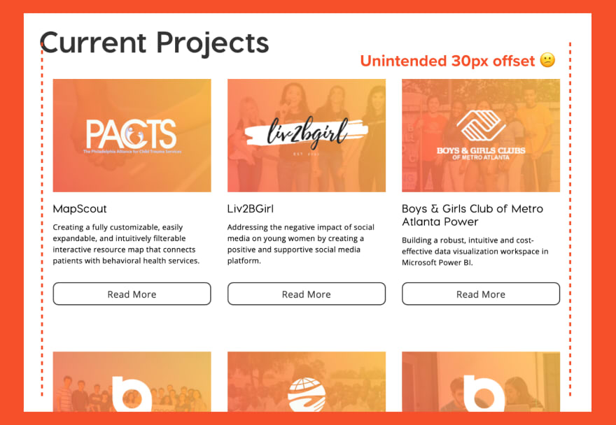
If there are other sections on our page following the max-width: 1200px rule, this margin issue will get even more obvious!
We have a few options to remedy this...
- Swallow up that offset with some negative margins on either side of our
outer-container. This is an okay band-aid to our issue, but it's not a super readable solution. For example, what if we want a margin around our grid of cards for mobile layouts, and no margin for wider layouts? We could write this asmargin: -30px->margin: 0, but that's not super readable / doesn't spark joy in some devs' opinions. - Scrap the margin and use
margin-right: 60pxon every card. This requires somenth-childacrobatics to remove the margin on the last item in each row, which only gets worse as the number of columns changes
...Or, we can just use Grid! As we saw in our last solution, Grid allows you to define the gap between elements from the parent container. You can even define a separate gap between rows and columns.
.container-of-cards { display: grid; /* gap between rows */ row-gap: 60px; /* gap between columns in a row */ column-gap: 120px; /* same card setup as our last example */ grid-template-columns: repeat(auto-fill, minmax(max-content, 340px));}3. When you want that collage effect
This is a hallmark CSS Grid feature you've probably seen by now, but it's definitely worth repeating.
Say you're making a photo gallery of some kind. Instead of making rows of cards with uniform widths and heights, you want to add some snazzy dynamics to emphasize your favorite pics
Here's one of my favorite examples of this end goal:

I could attempt this layout with flexbox... but I don't think 1000 lines of div adjustments and @media queries is very productive. In any case, you'd probably shoot down your designer's dreams entirely in a pre-Grid society.
You can see the completed Pen to absorb all the Griddy goodness. The biggest takeaway I want to pull out here is Grid's concept of "span:"
.container { /* make a gridified container with 4 columns, each 25% of the container width (denoted by fr / fractional units) */ grid-template-columns: repeat(4, 1fr); /* don't specify how many rows (let everything auto-wrap) */}img.thicc { /* let this image span 2 columns (wider than it is tall), starting at the first column */ grid-column: 1 / span 2; grid-row: 1;}img.tall { grid-column: 2; /* let this image span 2 rows (taller than it is wide), starting at the third row */ grid-row: 3 / span 2;}Some big takeaways here...
- Grid lets you specify column widths using "factional units," or
frs. These are basically identify toflexunits, except the container is charge of specifying them. This saves a lot of trouble when you want every element to obey a common unit. - You can allow each element on the grid to follow the specified rows and columns with no modification (each will span 1 column, 1 row by default), or...
- You can add some
spanstyling for spicy dynamics . This gives us a neat collage effect.
There are countless examples of Grid-heavy layouts to expand your realm of stylesheet possibilities. This collection of Pens is a great place to start!
Thanks for reading!
I hope this post got your gears turning on applying Grid to your own applications. I will confess, adopting Grid tends to break layouts on IE 11, so make an informed decision before applying this to production applications!
Also, expect some more posts from me over the next few months. I finally graduated college, which I have... mixed feelings about to say the least. Now, I'm trying to pump out quarantine-ridden content before I start my first adult job.
My current schedule: a new post every other Tuesday at 1 PM EST. No set topics; just anything in web development that I wish I knew sooner
So, drop a follow if this helped you! More to come soon.
Original Link: https://dev.to/bholmesdev/flexbox-diehards-here-s-some-concrete-examples-of-when-css-grid-is-just-better-n7k
Dev To
 An online community for sharing and discovering great ideas, having debates, and making friends
More About this Source Visit Dev To