
An Interest In:
Web News this Week
- April 14, 2024
- April 13, 2024
- April 12, 2024
- April 11, 2024
- April 10, 2024
- April 9, 2024
- April 8, 2024
Some of Our Sources
- Slashdot
- Web Designer Wall
- Pearsonified
- Naldz Graphics
- Noupe
- Web Design Ledger
- 24 Ways
- CSS Tricks
- Android Dissected
- Android Headlines
Help Webnuz
Referal links:
May 22, 2020 12:42 pm GMT
Original Link: https://dev.to/svetloslav15/build-sidebar-for-your-next-react-project-with-react-sidebar-ui-20ik
How to build Sidebar for your next React Project with react-sidebar-ui
I was wondering to add a sidebar to one of my project so first I searched if there are any already built components and I did't find any that I liked. So I decided to build one and after that I published it like a npm package in order other people to contribute and use it.
Here I will explain how to use it and I will be thankful if you give a star in github. There is a link to the repo at the bottom of the page.
Install
npm install --save react-sidebar-uiUsage
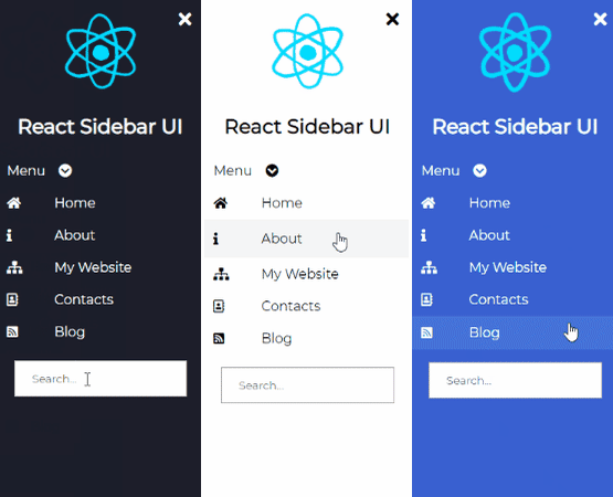
import React from 'react'import {Sidebar, InputItem, DropdownItem, Icon, Item, Logo, LogoText} from 'react-sidebar-ui'import 'react-sidebar-ui/dist/index.css';const App = () => { return ( <div> <Sidebar bgColor='black' isCollapsed={false}> <Logo image='https://media2.giphy.com/media/eNAsjO55tPbgaor7ma/source.gif' imageName='react logo'/> <LogoText>React Sidebar UI</LogoText> <DropdownItem values={['First', 'Second', 'Third']} bgColor={'black'}> Menu </DropdownItem> <Item bgColor='black'> <Icon><i className="fas fa-home"/></Icon> Home </Item> <Item bgColor='black'> <Icon><i className="fas fa-info"/></Icon> About </Item> <Item bgColor='black'> <Icon><i className="fas fa-sitemap"/></Icon> My Website </Item> <Item bgColor='black'> <Icon><i className="far fa-address-book"/></Icon> Contacts </Item> <Item bgColor='black'> <Icon><i className="fas fa-rss-square"/></Icon> Blog </Item> <InputItem type='text' placeholder={'Search...'}/> </Sidebar> </div> )};You should import FontAwesome in order to use the icons.
Props
Common props you may want to specify include:
Sidebar
bgColor- change the color of the sidebar it can beblack,light,blue,purple,aqua,peachisCollapsed- add start position of the sidebar if it will be collapsed or notclasses- add your custom classes if you want to add custom style to the component
DropdownItem
bgColor- change the color of the sidebar it can beblack,light,blue,purple,aqua,peachvalues- items that will be displayedclasses- add your custom classes if you want to add custom style to the component
Item
bgColor- change the color of the sidebar it can beblack,light,blue,purple,aqua,peachclasses- add your custom classes if you want to add custom style to the component
Logo
image- url to the imageimageText- alt tag of the imageclasses- add your custom classes if you want to add custom style to the component
InputItem
type- type of the input fieldplaceholder- placeholder of the input fieldclasses- add your custom classes if you want to add custom style to the component
Contribute
Contributions are always welcome! Any moderation, feature/pull requests are welcome if you want to contribute!
 Svetloslav15 / react-sidebar-ui
The Sidebar Component for React.js
react-sidebar-ui
Sidebar component for React projects with customizable design
Install
npm install --save react-sidebar-uiUsage
import React from 'react'import {Sidebar, InputItem, DropdownItem, Icon, Item, Logo, LogoText} from 'react-sidebar-ui'import 'react-sidebar-ui/dist/index.css'const App = () => { return ( <div> <Sidebar bgColor='black' isCollapsed={false}> <Logo image='https://media2.giphy.com/media/eNAsjO55tPbgaor7ma/source.gif' imageName='react logo'/> <LogoText>React Sidebar UI</LogoText> <DropdownItem values={['First', 'Second', 'Third']} bgColor={'black'}> Menu </DropdownItem> <Item bgColor='black'> <Icon><i className="fas fa-home"/></Icon> Home </Item> <Item bgColorOriginal Link: https://dev.to/svetloslav15/build-sidebar-for-your-next-react-project-with-react-sidebar-ui-20ik
Share this article:
Tweet

View Full Article
Dev To
 An online community for sharing and discovering great ideas, having debates, and making friends
More About this Source Visit Dev To