
Some of Our Sources
- Mashable
- Technology Review
- Smashing Magazine
- TutsPlus - Design
- You The Designer
- Naldz Graphics
- Noupe
- Web Design Ledger
- Wal You
- Codrops
Help Webnuz
Referal links:
Web Design Basics
On a recent social app I worked on with my peers, we were a bit chewed out for our rather bright colors and design. Described as "hard on the eyes" and "inconsistent", I have been reflecting. What makes a good website? Looking at the most popular social media apps like Facebook and Twitter, maybe it is the color blue? So let's get to the basics.
Font
Ah, typography. Since reading is a huge part of user interaction online, it is arguably the most important part of web design. Choosing a font might seem pretty straightforward, but lets touch on a few things. First, Sans Serif.  Sans Serif fonts (left T in picture) are contemporary fonts without decorative finishes. They are easier to read online than the flashy stuff. If you think being creative with a loopy font will make you stick out, think again. Ultimately, you should be putting the user first. The average person spends about 40 hours a week online, but if your website is an eyesore, they'll be clicking away.
Which brings me to my next point: font size. Body fonts should be at least 16px, but of course some fonts may appear smaller even at the same size. This is a good place to start, however, leaving adjustments up to you; keep in mind that reading something on your phone should be as readable as the text in a well-printed book. Secondary font can be smaller, but I don't recommend going lower than 13px.
Color
This is my favorite one. You probably already know what colors not to pick, like bright, neon colors that are hard on the eyes. But did you know colors can actually invoke feelings? Color Psychology is immensely interesting. The way people react to color is closely interwoven with subconsciousness. Maybe you had an accident and now find you dislike the color red? Or how you might associate one shade of green with illness and another with nature. (Try this website for picking color straight from an image to avoid shooting in the dark)
Studies have shown that the younger a person is, the more likely they will prefer more saturated colors, while older people prefer less saturated, lighter colors. I find this particularly fascinating when considering major brands.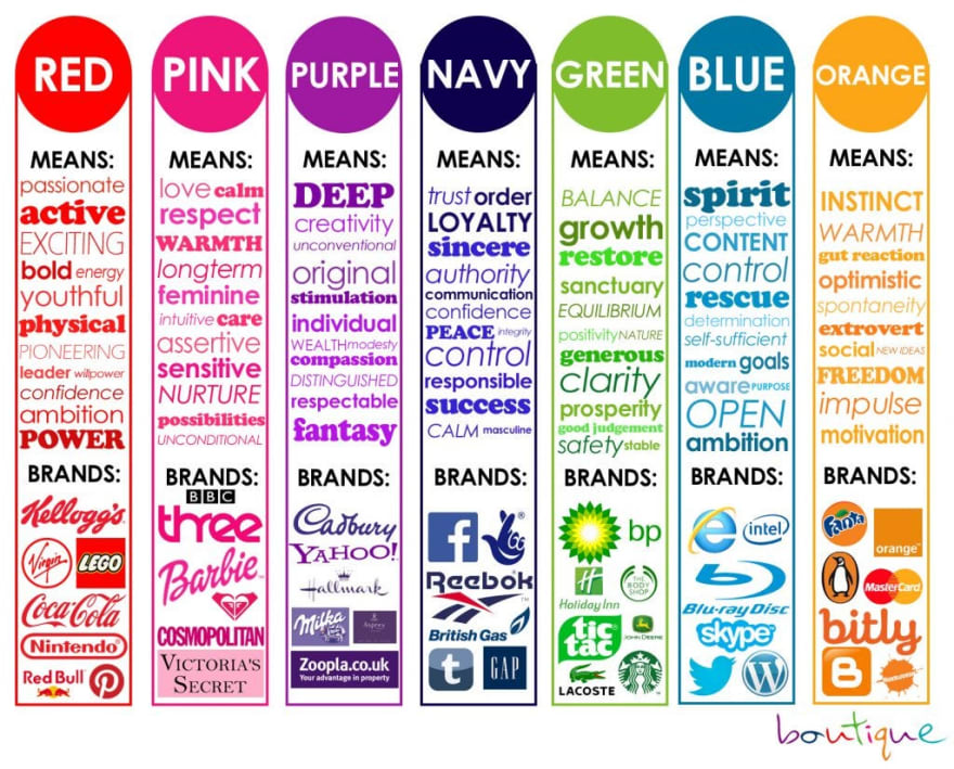 Of course, there's no need to stick to one color. Complementary colors create balance and harmony. Using contrasting colors for text and background make it easier to read. Even white space can be effective for giving a website a sleek, modern look.
"F" Pattern
Most people read from left to right. However, when it comes to the internet, it's more likely that people are "scanning" rather than "reading". Because of this reading behavior, it's good practice to build your website in a visual hierarchy: conventionally, the "F" shape. Most of what people see is in the top left of the screen; the right side is rarely "seen". Work with their natural disposition and display information in order of importance: Left to right, and top to bottom.
And that's the basics! Remember these principles when you get started and you should have a pleasing site! If you like laughing at bad design like I do, check out Crappy Design on Reddit!
Original Link: https://dev.to/harleypadua/web-design-basics-537p
Dev To
More About this Source Visit Dev To