
An Interest In:
Web News this Week
- April 22, 2024
- April 21, 2024
- April 20, 2024
- April 19, 2024
- April 18, 2024
- April 17, 2024
- April 16, 2024
Some of Our Sources
- TutsPlus - Code
- Web Designer Wall
- Team Treehouse
- The Logo Smith
- Smashing Apps
- Naldz Graphics
- My Ink Blog
- Android Dissected
- Android Headlines
- TechPowerUp
Help Webnuz
Referal links:
Creating practical Instagram-like galleries and horizontal lists with CSS scroll snapping
What's the difference between carousels and horizontally scrollable lists? Is it the gestures, snapping, or the number of visible items? They are very similar, especially on touch devices.
I looked at the Instagram iOS app to learn more and noticed 3 different elements you can scroll horizontally.
I set out to build these 3 elements based on the same code, mainly CSS. Heres what I learned.
Three scrollable elements
Free-scrolling horizontal lists
A horizontal list that overflows its boundaries. You can freely scroll left and right. Netflix and Spotify use it everywhere on mobile, Instagram uses it for its stories.
It uses a bit of old school CSS, like overflow-x, and is improved with more experimental rules.
Snapping horizontal lists

The same as free-scrolling horizontal lists, but the nearest item in the list snaps into place. Like the Suggested for You section in the Instagram app.
Here we have to add some newer CSS, like scroll-snapping. On older browsers, it degrades gracefully to the first version . This makes it a very practical solution to use in production.
A gallery

This is similar to snapping horizontal lists, but displaying one item at a time. An example is the Instagram Gallery. There's a row of dots below, one for each image, to indicate there are more images and which image we are currently viewing.
The code is also identical to the second one. However, we don't need the gap and padding plus we add a few lines of JavaScript using the IntersectionObserver to show which dot corresponds to the currently visible image.
Building the 3 different versions
Free-scrolling horizontal lists
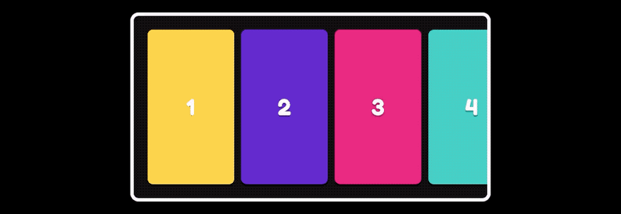
We make a horizontal list with the list-items in a horizontal row by using flex-box and we allow the list to scroll horizontally.
The list-items get an explicit size and a gap in between.
We set padding, larger than the gap, so we can see when we've scrolled to the beginning or end of the list.
.list { display: flex; padding: 20px; overflow-x: scroll;}.item { height: 224px; width: 125px; flex-shrink: 0;}.item:not(:last-child) { margin-right: 10px; }You can see it here:
It works, but we can improve it:
Contain overscrolling
For some browsers, a swipe left is like using the back button. Try it out by forcefully scrolling to the beginning of the list. We can prevent this by setting the overscroll-behavior to contain.
Hide the scrollbar
We can hide the scrollbar initially by setting overflow-x to auto. However, when you start scrolling it will appear again. We can set the scrollbar-width to none to completely hide it. At the time of writing, this only works in Firefox, so we add the following mess of unstandardized bastard CSS to hide it in other browsers:
.list { -ms-overflow-style: none; }.list::-webkit-scrollbar { display: none; }Looks much better, but if you feel this hurts accessibility or your CSS-purist-heart, you can leave it out and use overflow-x: auto instead.
Momentum scrolling
In iOS it lacks the standard momentum scrolling. We can tell the browser to scroll use momentum scrolling by setting the non-standard: -webkit-overflow-scrolling: touch;.
Prevent vertical scrolling
We can scroll the page vertically while interacting with the list. We can disable this for touchscreen users by adding touch-action: pan-x to the list. However, if your list covers the entire viewport, this will prevent the user from scrolling vertically. Best use it with caution!
List padding
There's something weird going on with the padding of the .list. It's on the start, but it has disappeared in the end . To be honest, I have no idea why this occurs. There's a hacky fix though: an absolutely positioned (pseudo) element with a width of the padding peaking out of the scrolling items.
It's ugly and it doesn't make any sense! How does this even work? However, it is important that there is a padding, so it's clear that we've scrolled to the end of the list. With pain in our hearts, we'll add it.
So now the CSS looks like this:
.list { display: flex; padding: 20px; overflow-x: scroll; overscroll-behavior: contain; scrollbar-width: none; touch-action: pan-x; -ms-overflow-style: none; -webkit-overflow-scrolling: touch;}.list::-webkit-scrollbar { display: none; }.item { height: 224px; width: 125px; flex-shrink: 0;}.item:not(:last-child) { margin-right: 10px; }/* hacky fix for padding at the end of the list */.item:last-child { position: relative;}.item:last-child::after { position: absolute; left: 100%; height: 1px; width: 20px; display: block; content: "";}And it looks like this:
Snapping Horizontal lists
Next we add scroll snapping. First, we tell the list to always stop scrolling at a horizontal snapping point.
.list { scroll-snap-type: x mandatory;}And to the list-items we add scroll-snap-align: start;, which means we snap to the start: on the left if you are using English or another left to right language*.
If we look at Suggested for You on Instagram, the previous item is always peaking out a little bit. Turns out we can set the scroll padding on: scroll-padding-inline-start: 20px;. (Note: I added scroll-padding-left, since Safari lacks support for inline-start at the moment.)
It is possible to swipe more items with one swipe. This is not possible on Instagram. We can add scroll-snap-stop: always; to the list-items, but browser support is is still spotty for now.
Thats it!
*) On the right for the RTL homies out there
Instagram-like gallery
If we make the list-items as wide as the scrolling area, and remove the padding and gap, it looks and behaves pretty much like the Instagram gallery. Except for the little indicator dots. Without the dots it will look like this:
We want to have these indicator dots, though. They are there for 3 reasons:
- Indicate that there is more to see, so it is clear a user can swipe to the next item.
- Indicate which image is currently visible.
- Indicate we have scrolled to the first or last item.
The easiest way is to let the browser take care of determining which item is visible by using the IntersectionObserver.
We make a list of dots, each dot corresponds to an image. When an item is visible (intersecting) in the list, we get that items index and set the indicator dot with the corresponding index to active.
This is what it will look like, see the comments in the code above each section for an explanation of each step.
// references to DOM elementsconst list = document.querySelector('.list');const items = Array.from(document.querySelectorAll('.item'));const indicators = Array.from(document.querySelectorAll('.indicator'));// create an observer with the list as intersection rootconst observer = new IntersectionObserver(onIntersectionObserved, { root: list, threshold: 0.6});// observe each itemitems.forEach(item => { observer.observe(item);});// when the observer detects an entry changing // (item entering or exiting list)// and the entry is intersecting// get the intersecting items index// set the correct indicator to activefunction onIntersectionObserved(entries) { entries.forEach(entry => { if (entry.isIntersecting) { const intersectingIndex = items.indexOf(entry.target); activateIndicator(intersectingIndex); } });}// toggle an `active` class on the indicatorsfunction activateIndicator(index) { indicators.forEach((indicator, i) => { indicator.classList.toggle('active', i === index); });}Heres how it looks
A note on threshold
We set the threshold to 0.6. This means that if 60% of the item is visible, it counts as intersecting.
If we set it to 1, we only count a completely visible item as intersecting. This would work fine with scroll snapping enabled, but doesnt work as well with free-scrolling on older browsers without support for scroll snapping (perhaps with an IntersectionObserver polyfill).
When we lower the threshold to somewhere below 1, we count a partly visible item as intersecting. If its 0.5 or below, multiple items could be intersecting. So 0.6 seems like a reasonable value.
Conclusion
The bad
Since this uses native scrolling it is not possible to adjust the way the movement feels, we cant control the stickiness of the snapping or the decay of the scroll motion. This is decided by the browser. If theres a need to have control over this, I would choose a more JavaScript-heavy solution. Finally, it's definitely not the most pretty CSS with a hack and a few non-standard properties.
The good
The small amount of code is pretty awesome. And the way it gracefully degrades in older browsers makes this a pretty solid technique in my opinion.
I don't know the constraints which led to the decision to not use native scrolling for the Instagram gallery on their website, but I feel native scroll snapping feels more natural.
What about desktop?
While horizontal scrolling feels very natural on touch devices, it is a little awkward and unintuitive on desktop. Buttons to move to the left and right help, the Instagram website does this as well.
Happy hacking, and let me know if you would use this technique in production.
Bonus tip: if you want to use the indicators as navigation, scrollIntoView({ behavior: 'smooth', inline: 'start' }) is a good place to start!
Original Link: https://dev.to/joostkiens/creating-practical-instagram-like-galleries-and-horizontal-lists-with-css-scroll-snapping-580e
Dev To
 An online community for sharing and discovering great ideas, having debates, and making friends
More About this Source Visit Dev To