
An Interest In:
Web News this Week
- March 27, 2024
- March 26, 2024
- March 25, 2024
- March 24, 2024
- March 23, 2024
- March 22, 2024
- March 21, 2024
Some of Our Sources
- Web Designer Wall
- Just Creative
- The Logo Smith
- You The Designer
- Creative Curio
- Fuel Your Creativity
- Stylized Web
- CSS Tricks
- Willems Lab
- Hashedout
Help Webnuz
Referal links:
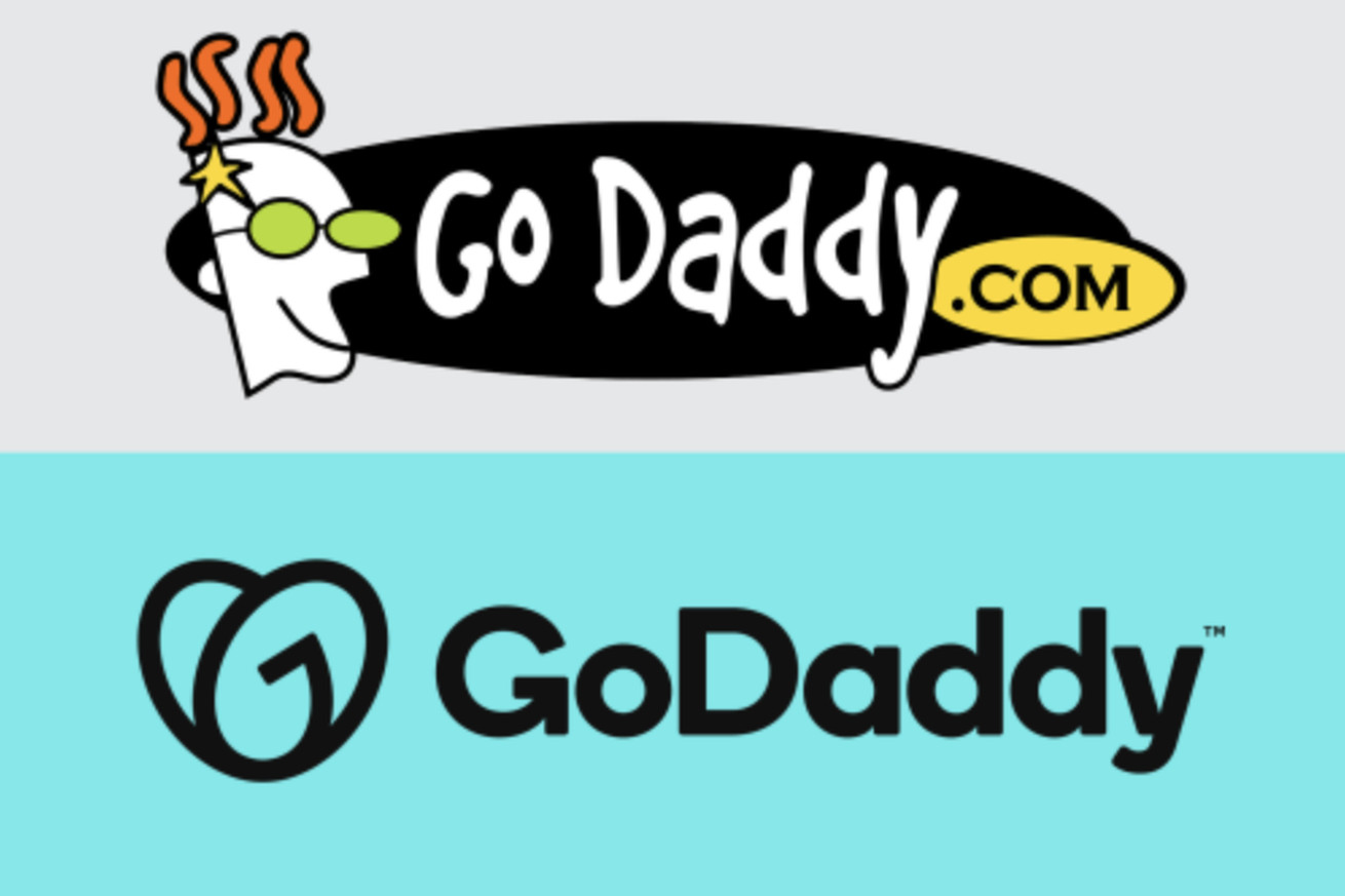
GoDaddys new logo is a flattening of the personality-driven days of the early web
GoDaddy via FastCompany
Web services company GoDaddy has unveiled its new logo: a generic, sans-serif type accompanied by a heart shape that looks like an upside-down version of the Airbnb logo. At first glance, I thought the other half of the heart opposite of the “G” was a poorly shaped “D” as initials for GoDaddy, but it’s actually supposed to be an “O” so the logo spells out “GO.” That’s very confusing, but the company says the logo, designed in collaboration with branding firms Lippincott and Codo, is supposed to evoke a sense of the entrepreneurial spirit.
Aman Bhutani, the company’s CEO, told Fast Company that he sees the logo as “a young girl who’s a little bit of a bandit—with a ponytail and a patch over her eye—who wants to grow up and be somebody.”...
Original Link: https://www.theverge.com/2020/1/14/21065443/godaddy-logo-redesign-rebrand-website-domain
The Verge
More About this Source Visit The Verge