
Some of Our Sources
- Techcrunch
- Technology Review
- Joshua Blankenship
- Pearsonified
- Smashing Magazine
- CSS Globe
- Line 25
- Wal You
- Web Resource Source
- Android Dissected
Help Webnuz
Referal links:
Quick Tips: CSS Transforms and Transitions
Whether you enjoy CSS animations or not, learning how to work with CSS transforms and transitions can help the overall user experience on your websites.
Let's look at how to get started.
Transforms
The transform property in CSS gives you the ability to transform elements in 2D or 3D. The most common transforms used to change elements are rotate, skew, translate, and scale.
Rotate
The syntax:
.rotate:hover { transform: rotate(10deg); /* transform: rotateY(90deg); */ /* transform: rotateX(-90deg); */}When rotating an element you can rotate on both the X and Y axis or only the X or Y axis. You can also rotate positive or negative degrees.
Skew
The syntax:
.skew:hover{ transform: skew(-10deg)/* transform: skew(-10deg, 20deg); *//* transform: skewX(-10deg); *//* transform: skewY(20deg); */}This property skews an element on the 2D plane.
There is a shorthand that uses either one value or two.
You can also write out specifically if you want to skew on the X or Y axis.
The skew property tilts the element either to the right or the left
Translate
The syntax:
.translate:hover { /* transform: translate(100px); */ /* transform: translateX(100px); */ transform: translateY(100px);}If you want to move an element on the web you use the translate property. This property moves an element left and right, up and down or both.
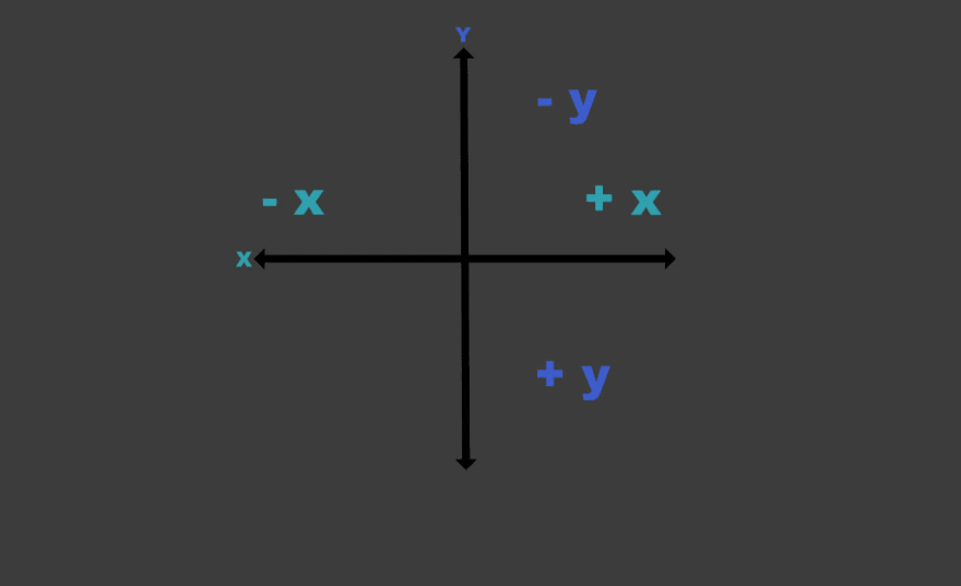
Note: if you want to move an element up you use a negative number on the Y axis. This can be confusing when you are first beginning to animate on the web.
Scale
The syntax:
.scale:hover { /* transform: scale(1.2); */ /* transform: scale(1.2, 0.5); */ /* transform: scaleX(2); */ transform: scaleY(0.5);}The scale property scales an element up or down depending on the value. A value greater than one scales the element up. A value below scales it down. You can technically use a negative number but it leads to some weird transforms. It doesn't scale the element but actually flips it vertically.
Transition
All of the above examples also had a transition property on it.
Whereas transforms move or change the appearance of an element, transitions make the element smoothly and gradually change from one state to another.
Without the transition property in the examples above the transforms I used would be immediate and jumpy. You can comment out the transition property on the img element to see what I mean.
The transition property is a shorthand property used to represent up to four transition-related longhand properties
- transition-property
- transition-duration
- transition-timing-function
- transition-delay
Transition-property
This property specifies the name or names of the CSS properties you are applying the transition too. You can also use the key word all if you have multiple properties that the transition will be added too.
img { transition-property: transform;}or
img { transition-property: all;}Transition-duration
This property specifies the duration over which transitions should occur.
So if you specific 1s (1 second) then the transition to the element will happen over 1 second.
img { transition-duration: 1s; /* seconds */}or
img { transition-duration: 200ms; /* milliseconds */}Transition-timing-function
This property can greatly change the look of your animation. It applies built in eases such as ease-in or you can define a cubic-bezier for a more custom ease.
If you want to play around with cubic-bezier's this is a great site.
You can also play around with the various eases on MDN.
img { transition-timing-function: ease-in; }img { transition-timing-function: steps(6, end);}img { transition-timing-function: cubic-bezier(.17,.67,1,.29);}Transition-delay
With this property you can specify a delay between when a property is changed and the transition actually begins.
img { transition-delay: 0.5s; /* seconds */}
or
img { transition-delay: 300ms; /* milliseconds */}Short-hand transition
You could write each individual property out like above or you can use the transition short-hand instead. It would look something like this. First, define the transition property, then the duration, timing function and finally any delays you might want.
img { transition: all 0.5s ease-in 1s;}Combined
You can transform each property separating or you can make even more exciting animations by combining the transform properties.
Here is an example where I combine all of the transforms plus a transition into a single animation on hover.
As far as our websites go, you can combine these properties to create playful animations or direct users attention to specific areas of a site.
One common use case is to add a hover effect to a button. In this example I have a transition on the button and I am combining the transforms, translate and scale, to bring more attention to the button when it is hovered.
Now go out and try some animations yourself and if you do I'd love to see what you create!
Original Link: https://dev.to/coffeecraftcode/quick-tips-css-transforms-and-transitions-5b0f
Dev To
 An online community for sharing and discovering great ideas, having debates, and making friends
More About this Source Visit Dev To