An Interest In:
Web News this Week
- March 31, 2024
- March 30, 2024
- March 29, 2024
- March 28, 2024
- March 27, 2024
- March 26, 2024
- March 25, 2024
Bite Sized Basics: Box Sizing
I originally posted this on https://cssfromscratch.com
If theres ever one really important thing to remember when writing CSS is that everything is a box. Regardless of how it looks visuallyits still a box.
Take the above example: its visually a circle, by proxy of border-radius, but its still a box, as far as the browser is concerned.
Padding and borders
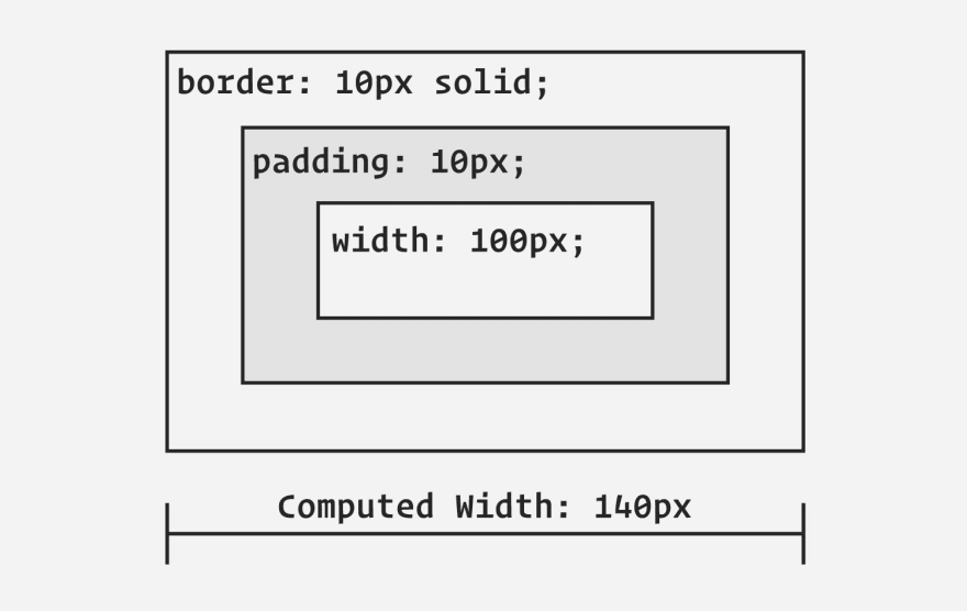
When we add padding and borders to an element, by default, their values will be added to the computed width and height. This can be confusingespecially when you are first starting out.
.box { width: 100px; padding: 10px; border: 10px solid;}What happens here is your .boxs computed width is actually calculated as 140px. This is how the box model works, out of the box (pun intended), and is expected behaviour. Most of the time though, its preferable for this not to be the case, so we add this little snippet of CSS:
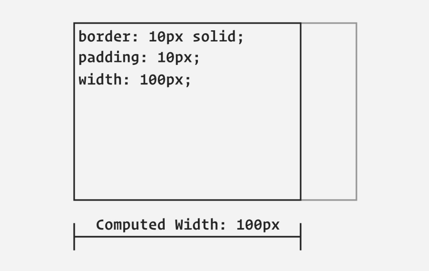
.box { box-sizing: border-box;}This completely transforms the browsers calculation because what it does is say Take the dimensions that I specified and also account for the padding and border, too. What you get as a result, is a box that instead of being 140px wide, is now 100px wide, just like you specified!
The box-sizing rule is usually added as a global selector to a reset, or default normalising styles, so to set a more complete example, this is how our box CSS now looks:
/* Reset rule */*, *::before, *::after { box-sizing: border-box;}/* Box component */.box { width: 100px; padding: 10px; border: 10px solid;}What this now does is instead of just targeting the .box, it targets every element on the page and any pseudo-elements.
Wrapping up
You can read more on box sizing over on MDN, where there is some very good documentation.
Setting box-sizing: border-box is such a life saverespecially for responsive design. This is so much the case that we even have International box-sizing Awareness Day on February 1st, every year.
Anyway: sign up for updates on Product Hunt, subscribe to the RSS feed or follow @cssfromscratch on Twitter to keep in the loop.
Original Link: https://dev.to/hankchizljaw/bite-sized-basics-box-sizing-4al2
Dev To
 An online community for sharing and discovering great ideas, having debates, and making friends
More About this Source Visit Dev To


