
An Interest In:
Web News this Week
- April 15, 2024
- April 14, 2024
- April 13, 2024
- April 12, 2024
- April 11, 2024
- April 10, 2024
- April 9, 2024
Some of Our Sources
- Pearsonified
- Six Revisions
- Abduzeedo
- TutsPlus - Design
- Vandelay Design
- Inspiredology
- Web Design Ledger
- Reencoded
- CSS Tricks
- Dev To
Help Webnuz
Referal links:
CSS Shapes
This article includes examples of styling different shapes on CSS.
Border-Radius Property
The border-radius property is an important concept to understand before styling any CSS figures. It allows rounding corners of HTML elements. The curve for each angle is determined by one or two radii defining its shape a circle or an ellipse. The radius extends to the entire background, even if the element has no borders.
The border-radius property allows rounding all corners of HTML elements at the same time. If you set two values for the border-radius property, the first value will round the upper left and lower right corners, and the second one will round the upper right and lower left corners. You can use px, em, % or other units to set values.
By using the border-top-left-radius, border-top-right-radius, border-bottom-left-radius, and border-bottom-right-radius properties, you can round each corner in its own way.
The values separated by the slash (/) symbol define the horizontal and vertical radii.
Below are some examples of shapes with different border radii.
.shape1 { border-radius: 15px; }.shape2 { border-top-left-radius: 15px; }.shape3 { border-top-right-radius: 15px; }.shape4 { border-bottom-left-radius: 15px; }.shape5 { border-bottom-right-radius: 15px; }.shape6 { border-radius: 0 0 15px 15px; }.shape7 { border-radius: 15px 15px 0 0; }.shape8 { border-radius: 0 10px 20px; }.shape9 { border-radius: 10px 20px; }.shape10 { border-radius: 10px/20px; }.shape11 { border-radius: 5px 10px 15px 30px/30px 15px 10px 5px; }.shape12 { border-radius: 10px 20px 30px 40px/30px; }.shape { display: inline-block; width: 100px; height: 100px; border: 5px solid #32557f;}There are online instruments to play with different border radii: Link 1, Link 2.
Circle
A circle is the simplest CSS shape. Apply the border-radius: 50%; property to an element with identical width and height, and youll get a circle.
.circle { background: #32557f; width: 200px; height: 200px; border-radius: 50%; }
Ovals/Ellipses
Ovals are made in the same way as circles. The only difference is that ovals width should be different from its height.
.ellipse { background: #32557f; width: 200px; height: 100px; border-radius: 50%;}
Half-Ellipses
To make half-ellipses, use sets of values separated by the slash (/) symbol to define the horizontal and vertical radii. If you put 50% before the slash symbol, you will get a vertical half-ellipse. And if you put 50% after the slash symbol, youll get a horizontal half-ellipse. Combinations of 0 and 100% values define the direction of your half-ellipse. See the examples below.
.half-ellipse1 { border-radius: 50% / 100% 100% 0 0; }.half-ellipse2 { border-radius: 50% / 0 0 100% 100%; }.half-ellipse3 { border-radius: 100% 0 0 100% / 50%; }.half-ellipse4 { border-radius: 0 100% 100% 0 / 50%; }.half-ellipse { background: #32557f; width: 150px; height: 75px;}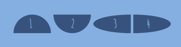
Triangles
CSS triangles are useful to create arrows, for example, in a select element or inside buttons.
To make a triangle, create a box with zero width and height.
.triangle { width: 0; height: 0;}The actual width and height of the arrow are determined by the width of the border. In an up arrow, for example, the bottom border is colored while the left and right are transparent, which forms the triangle.
.triangle .triangle-up { border-left: 50px solid transparent; border-right: 50px solid transparent; border-bottom: 100px solid #32557f;}.triangle .triangle-down { border-left: 50px solid transparent; border-right: 50px solid transparent; border-top: 100px solid #32557f;}.triangle .triangle-left { border-top: 50px solid transparent; border-right: 100px solid #32557f; border-bottom: 50px solid transparent;}.triangle .triangle-right { border-top: 50px solid transparent; border-left: 100px solid #32557f; border-bottom: 50px solid transparent;}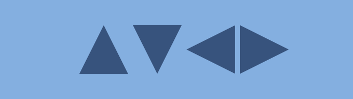
To make a right triangle (a right-angled triangle), make the top or bottom colored and leave the right or left border transparent.
.triangle .triangle-top-left { border-top: 100px solid #32557f; border-right: 100px solid transparent;}.triangle .triangle-top-right { border-top: 100px solid #32557f; border-left: 100px solid transparent;}.triangle .triangle-bottom-left { border-bottom: 100px solid #32557f; border-right: 100px solid transparent;}.triangle .triangle-bottom-right { border-bottom: 100px solid #32557f; border-left: 100px solid transparent;}
Arrows
To create a simple arrow without a tail, make a box with a width and height, border, as well as zero left and top borders.
.arrow { width: 15px; height: 15px; border: 2px solid #32557f; border-left: 0; border-top: 0;}To make an up arrow, add the transform: rotate(225deg); property, and to make a down arrow, add the transform: rotate(45deg); property to rotate the arrow to 225 and 45 degrees respectively.
.arrow-up { transform: rotate(225deg); }.arrow-down { transform: rotate(45deg); }
You can also make a curved arrow with a tail:
.arrow-curved { position: relative; width: 0; height: 0; border-top: 9px solid transparent; border-right: 9px solid #32557f; transform: rotate(10deg); &:after { content: ""; position: absolute; border: 0 solid transparent; border-top: 3px solid #32557f; border-radius: 20px 0 0 0; top: -12px; left: -9px; width: 12px; height: 12px; transform: rotate(45deg); }}
And below is an example of how to create an arrow-pointer:
.arrow-pointer { width: 250px; height: 50px; background: #32557f; position: relative; &:after { content: ''; position: absolute; left: 0; bottom: 0; width: 0; height: 0; border-left: 25px solid #7eb4e2; border-top: 25px solid transparent; border-bottom: 25px solid transparent; } &:before { content: ''; position: absolute; right: -25px; bottom: 0; width: 0; height: 0; border-left: 25px solid #32557f; border-top: 25px solid transparent; border-bottom: 25px solid transparent; }}
You can find more shapes examples on sharkcoder.com
Original Link: https://dev.to/sharkcoder/css-shapes-244j
Dev To
 An online community for sharing and discovering great ideas, having debates, and making friends
More About this Source Visit Dev To