
An Interest In:
Web News this Week
- March 30, 2024
- March 29, 2024
- March 28, 2024
- March 27, 2024
- March 26, 2024
- March 25, 2024
- March 24, 2024
Some of Our Sources
- TutsPlus - Code
- Just Creative
- Pearsonified
- Vandelay Design
- Creative Curio
- Inspiredology
- Noupe
- My Ink Blog
- Codrops
- Willems Lab
Help Webnuz
Referal links:
August 15, 2019 01:53 pm GMT
Original Link: https://dev.to/ladybug/flexbox-cheat-sheets-5h55
Flexbox Cheat Sheets
In our first CSS episode, we discussed the foundations. In this special bonus episode, we continued the conversation by covering some more in-depth areas of CSS, like layouts with Grid and Flexbox, animations, media queries, naming conventions, pre-processors, and frameworks.
Here are some Flexbox cheat sheets to go along with the episode!
Shoutout to Emma for making these!
.ltag__user__id__123155 .follow-action-button { background-color: #FFFFFF !important; color: #9878FF !important; border-color: #9878FF !important; } 
 EmmaWedekind
  emmawedekind
  https://www.emmawedekind.com
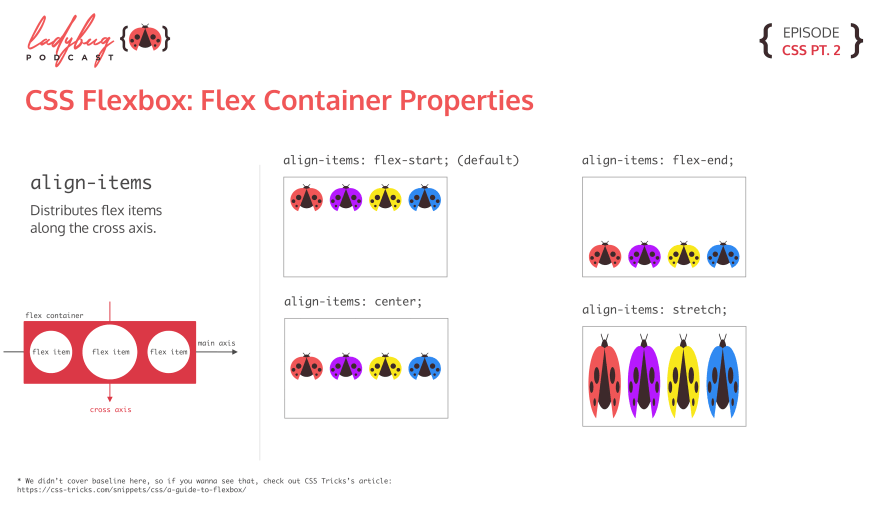
 Align Items
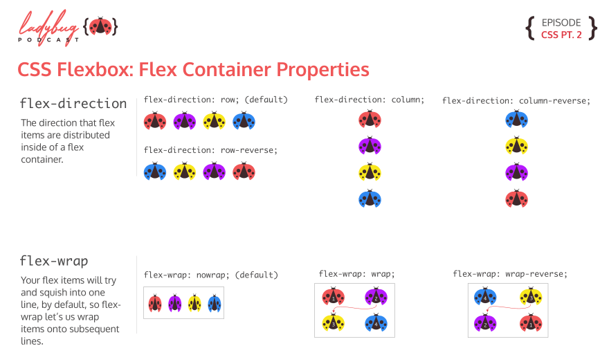
Flex Direction and Flex Wrap
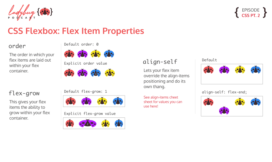
Flex Items
Justify Content

You can also check out our CSS cheat sheets here:

You can listen to the full episode wherever you listen to podcasts!
Original Link: https://dev.to/ladybug/flexbox-cheat-sheets-5h55
Share this article:
Tweet

View Full Article
Dev To
 An online community for sharing and discovering great ideas, having debates, and making friends
More About this Source Visit Dev To