An Interest In:
Web News this Week
- April 1, 2024
- March 31, 2024
- March 30, 2024
- March 29, 2024
- March 28, 2024
- March 27, 2024
- March 26, 2024
How to make responsiveness super simple with CSS Variables
 Click the image to get to the free full-length CSS Variables course.
If you havent heard of CSS Variables before, its a new feature of CSS which gives you the power of variables in your stylesheet, without having to do any setup.
In essence, CSS Variables allow you to skip the old way of setting styles:
h1 { font-size: 30px; }navbar > a { font-size: 30px; }in favour of this:
:root { --base-font-size: 30px; }h1 { font-size: var(--base-font-size); }navbar > a { font-size: var(--base-font-size); }While the syntax might seem a bit weird, this gives you the obvious benefit of being able to change the font sizes across your entire app through only changing the--base-font-size variable.
If you want to learn CSS Variables properly, please check out my free and interactive CSS Variables course on Scrimba:
 The course contains eight interactive screencasts.
Now lets see how this new technology can make your life easier when building responsive websites.
The setup
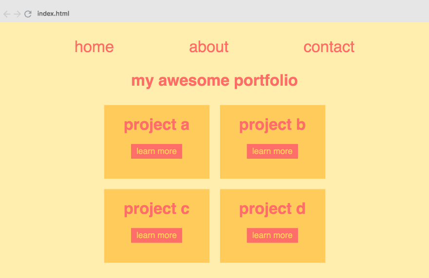
Were going to add responsiveness to a portfolio website which looks like this:
It looks nice when viewed on your desktop. However, as you can see on the left image below, this layout doesnt work well on mobile.
 How it looks on mobile initially.
On the right image, weve changed a few things on the styles to make it work better on mobile. Heres what we have done:
- Rearranged the grid so that its stacked vertically instead of across two columns.
- Moved the entire layout a bit more up
- Scaled the fonts down
In order to do this, we needed to change the following CSS:
h1 { font-size: 30px; }#navbar { margin: 30px 0; }#navbar a { font-size: 30px; }.grid { margin: 30px 0; grid-template-columns: 200px 200px; }More specifically, we needed to make the following adjustments inside of a media query:
- Reduce font size of the
h1to 20px - Reduce the margin above and below the
#navbarto 15px - Reduce the font size inside the
#navbarto 20px - Reduce the margin above the
.gridto 15px - Change the
.gridfrom from two-columns to one-column
Note: There is, of course, much more CSS in this application, even within these selectors. However, for the sake of this tutorial, Ive stripped away everything which we arent changing in the media query. Check out this Scrimba playground to get the entire code.
The oldway
Doing all of this would be possible without CSS Variables. But it would require an unnecessary amount of code, as most of the bullet points above would need their own selector inside the media query, like this:
@media all and (max-width: 450px) { navbar { margin: 15px 0; } navbar a { font-size: 20px; } h1 { font-size: 20px; } .grid { margin: 15px 0; grid-template-columns: 200px; }}The newway
Now lets see how this can be solved with CSS Variables. To begin with, well rather store the values which we are reusing or changing inside variables:
:root { --base-font-size: 30px; --columns: 200px 200px; --base-margin: 30px; }And then well simply use these variables across the app:#navbar { margin: var(--base-margin) 0; }#navbar a { font-size: var(--base-font-size); }h1 { font-size: var(--base-font-size); }.grid { margin: var(--base-margin) 0; grid-template-columns: var(--columns); }Once we have this setup, we can simply change the values of the variables inside the media query:
@media all and (max-width: 450px) { :root { --columns: 200px; --base-margin: 15px; --base-font-size: 20px; }This is much cleaner than what we had before. Were only targeting the:root, as opposed to specifying all the selectors.
Weve reduced our media query from four selectors down to one and from thirteen lines down to four.
And this is just a simple example. Imagine a full-blown website where, for example, the --base-margin control most of the free spacing around the app. Its a lot easier to just flip the value of it, as opposed to filling your media query up with complex selectors.
To sum up, CSS Variables are definitely the future of responsiveness. If you want to learn this technology once and for all, Id recommend that you check out my free course on the subject on Scrimba.
Youll become a CSS Variables master in no time:)
Thanks for reading! Im Per Borgen, front-end developer and co-founder of Scrimba. Feel free to reach out to me via Twitter if you have any questions or comments.
Original Link: https://dev.to/perborgen/how-to-make-responsiveness-super-simple-with-css-variables-1gnm
Dev To
 An online community for sharing and discovering great ideas, having debates, and making friends
More About this Source Visit Dev To


