
An Interest In:
Web News this Week
- March 30, 2024
- March 29, 2024
- March 28, 2024
- March 27, 2024
- March 26, 2024
- March 25, 2024
- March 24, 2024
Some of Our Sources
- Techcrunch
- Web Designer Wall
- Team Treehouse
- Just Creative
- Abduzeedo
- 24 Ways
- Wal You
- Web Resource Source
- Android Dissected
- Dev To
Help Webnuz
Referal links:
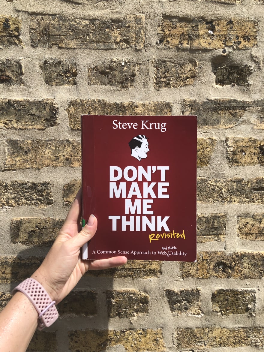
Book Review: Don't Make Me Think!
Steve Krug is basically the godfather of usability testing and user research. When I started taking over user research for my team, our UX Designer suggested reading his book Rocket Surgery Made Easy, to get familiar with the principles in testing. The book breaks it down so anyone can do it, provides scripts and schedules, and makes suggestions on how to introduce it to your team to build it into your flow. He wrote it as a follow up to this book, Don't Make Me Think!, which is a basic outline of designing with accessibility and usability in mind.
I feel like this book should be a must-read for anyone in development, engineering, or design, but what does my opinion really count for? Who knew that designing web forms was so complex? There's a lot of value in both books, so I'll share some of my notes from Don't Make Me Think here.
What is usability?
Book definition: A person of average (or even below average) ability and experience can figure out how to use the thing to accomplish something without it being more trouble than it's worth.
Desi definition: The thing should be used mindlessly for most users.
Even if a user finds a product difficult, they're likely to stick with it for the "devil you know" philosophy: will the competition be less frustrating? Or will it be worse?
Since users are creatures of habit and will continue to struggle through with a product they're familiar with, what's the value or benefit in making products usable?
- Making a product easier for users to find what they're looking for benefits both the user, and you: they find what they want, you appear reliable and helpful, benefitting from repeated use and potential word of mouth marketing
- A usable site or product allows them to understand everything you offer, rather than what they just latch onto or look for, potentially bringing them more value and you more sales
- You can steer them where you want them to go, not just where they want to go
- A usable product helps users feel smarter and more in control, which will bring them back and empower them. People want to feel smart and will repeatedly use products that help them feel that way
With that in mind, how do people learn how to use products, and how do they use them in practice?
- We don't read pages, we scan them. (This was especially true of how I read this book - the way it's laid out is super scan-friendly, with only the most important content on each page, broken down into bullet points, bolded text, and other visual signals.)
- We don't make optimal choices - we "satisfice". If something is "good enough," we'll settle for it.
- We don't figure out how things work. We muddle through - even if there is a tutorial, people aren't likely to watch or read it. They're more likely to just forge forward, clicking buttons and hoping for the best. They'll want to rely on their intuition (because they believe they are smart) vs. instructions.
What usability rules can we put in place for ease of use?
- Keep the noise down (only include the most relevant information, and if necessary, link out for anyone interested to learn more)
- Break pages into clearly defined areas - this helps support scanning. Use short paragraphs, lists, bold and larger headings, omit needless words especially fluff - a lot of marketing copy can be "fluffy" and easily (and ruthlessly) edited. Think about Coco Chanel's philosophy: Before you leave the house, look in the mirror and take one thing off.
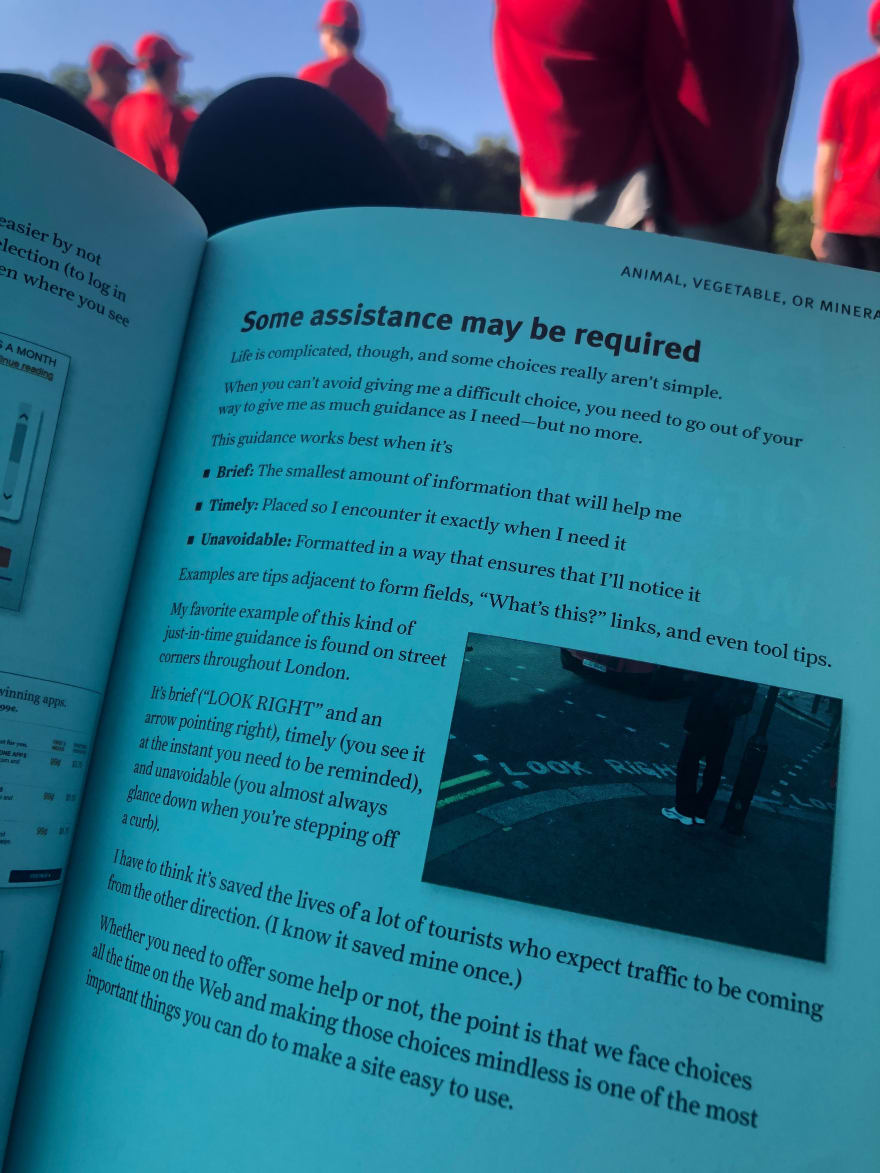
- When providing guidance, it should be brief, timely, and well-placed. Break things into trees rather than presenting all choices at once, and when building, make an outline of all possible choices or thoughts the user might run into in the flow. (Does that sound familiar? )
- Don't drain the reservoir of goodwill. There are a few things that users will forgive - clicking the wrong link, a broken image, confusing text - but if the reservoir is empty, they'll give up and leave. Do some user testing to see where that line is for your product and users
There are four questions users need to be answered right away:
"What is this? What do they have here? What can I do here? Why should I be here and not somewhere else?"
You can gather data from your own website and use that to determine the right questions (i.e., "do people like radio buttons" vs. "do radio buttons in this instance and this context provide a good experience for most users"). The idea behind usability is to make using the product mindless for most users.
The original book was published in 2000, and in 2014, an updated version with suggestions on mobile design was released. Don't Make Me Think is great not only because the easy way he breaks principles down, but also because it's full of real-life, relatable examples. One of the most illuminating sections is where Steve talks about why he doesn't use a particular website on his phone and his workarounds for it (getting an alert from that website, Googling the news item, and finding a different news service to read from.) In this update, he talks about the philosophy of "mobile first" design (and why that's not always the fix for mobile usability issues) and responsive design.
Four Things to Do Right Now for Accessibility Improvement
- Fix the usability problems that confuse everyone
- Read an article the way your users read it (with screen readers, on mobile, in an RSS reader, etc.)
- Read a book
- Go for the low-hanging fruit. Several easy fixes: adding
alttags to images, using the approriatehtags to indicate importance, or reading one of Lindsey's articles on this topic!

Near the end of the book, he invokes Dr. Seuss. The Lorax is a character who "speaks for the trees," and Steve suggests that we become the Lorax for our users. Often, management and business analysts are disconnected from the user and look at the "bottom line," using that information to plan road maps. In order to speak for your users, learn how to interpret user needs and wants into business jargon to influence or persuade stakeholders and decision makers to show why it will be beneficial to them. This could be through demonstrating ROI, or running a usability test so you have data. (Analysts LOVE data.) You could also trunk test them - it might be a good way to demonstrate usability principles!
My takeaways
- Ask support. Your support team is your first line of defense and interaction with users. They know pain points, expectations, and common usability and accessibility issues
- Navigation is important - if it's missing or if users think it's missing, your website is unusable
- Determine what tradeoffs are worth it. Is it worth sticking to your branding of making links look like regular text with no discernable difference and possibly having users not find what they're looking for? Or is that a concession you can make?
- Know your user. Do usability testing if possible, but if not, again... talk to your support team
- Follow best practices and standards - don't reinvent the submit button. If users are familiar with an interface, design in a way they're familiar with
- Delight your users. What is delight? Can you define it? Can a product be delightful in every way?
- Make products accessible in ways users actually use the product. If your longform article on using braille in taxis can't be found by screen readers, it might not matter how many visits you get
- Be the Lorax. Beyond being an advocate for users with management, advocate with your team, as well. If something is being developed in a way that users will struggle with, bring it up, and try to talk through a different way of building it
Aside from all the really helpful and useful information, it's an easy read - sensibly designed, quick, compact. Steve writes with an informal, casual tone, and breaks down principles and concepts in "obvious" ways. This book (and Rocket Surgery Made Easy) are invaluable resources and the principles in them can help at all stages of the product process, and are worth a read! (_And if they say they don't have time, just send them this post )
Further reading mentioned in the book:
- Letting Go of the Words
- Forms That Work: Designing Web Forms for Usability
- A Web For Everyone: Designing Accessible User Experiences
- Web Accessibility: Web Standards and Regulatory Compliance
- It's Our Research
- The User Experience Team of One
- Influence: The Psychology of Persuasion, How to Get People to Do Stuff
- Evil by Design
- Corporate Culture in Internet Time
- You say potato, I say focus group
- xkcd.com
Original Link: https://dev.to/desi/book-review-don-t-make-me-think-329k
Dev To
More About this Source Visit Dev To