
An Interest In:
Web News this Week
- April 24, 2024
- April 23, 2024
- April 22, 2024
- April 21, 2024
- April 20, 2024
- April 19, 2024
- April 18, 2024
Some of Our Sources
- Mashable
- Simplebits
- Just Creative
- The Logo Smith
- Creative Curio
- FanExtra - PSD
- Wal You
- Spyre Studios
- The Verge
- TechPowerUp
Help Webnuz
Referal links:
How to Make Icons

Always wanted to learn what it takes to create your own icon, but never knew exactly where to start? Well, with this article, that's going to change. You'll learn what an icon is and get answers to the most common questions and problems that come up. Along the way, you'll discover that the process isn't as hard as you might once have thought.
Oh, and before I forget, if you want to expand your icon library, you can always head over to Envato Elements where you'll find a great collection of vector icon packs just waiting to be picked up.
1. What
Are Icons?
If there’s one truly
important thing that school managed to teach me, it’s that whenever you find
yourself tackling a new concept, you should always put in the time and thoroughly
carry out the research, so that you can have a full understanding of what it
ultimately stands for.
So, being the
creature of habit that I am, I’m going to instill in you that same method of
problem solving, starting with the most basic of questions: “What is an icon?”
Well, according to
Google, the word originates from the Greek eikόn (image) and is commonly
defined today as a:
“devotional painting of Christ or another holy figure,
typically executed on wood and used ceremonially in the Byzantine and other
Eastern Churches”.
While this isn’t
exactly the type of icon that we creatives tend to think off, it
might be the first thing that some people visualize when you tell them
that you earn your living doing “icon design”.
Don’t get me
wrong, I have nothing against the art of painting icons, which is in itself a
beautiful yet hard craft, but we’re talking about a whole different use of the
hands and imagination here.
From a more
modern, digital perspective, an “icon” is defined as:
“a symbol or graphic representation
on a screen of a program, option, or window”.
Whether you’re using a Mac or a PC, an iPhone or an Android device,
every single one of them has a user interface based on icons of different
shapes, colors, and sizes.
2. Why
Do We Use Icons?
Historically, the
first ever set of computer icons was conceptualized almost 37 years ago (more
exactly in 1981), when a computer
scientist by the name of David Canfield Smith joined forces with designer
Norman Lloyd Cox while working on the GUI
(Graphical User Interface) of the Xerox
Star 8010. Their task was to ease the user’s interaction with the machine,
which they creatively overcame by introducing familiar graphic symbols meant to
reflect real-life objects to which the user could relate.
Since back in the
day computers were mostly used within work environments, they quickly realized
that they could find inspiration by looking at the most common objects found
within an office, thus bringing the “office metaphor” to life.
This laid the foundation for building the first ever common visual
language for the digital age, which has shaped not only the way GUIs look but
also how they function.
Ease of
Interaction
Fast forward
to today, and while they’ve definitely seen some changes in terms of form, their core
function has remained pretty much identical, since they continue to serve the
same purpose that they were originally designed for, and that is easing our
interaction with the different pieces and types of software.

And honestly, should we even be surprised? Imagine having to use a piece of software that has
a GUI based entirely on the use of keywords. I just did, and believe me, it
quickly turned into a little nightmare.
Language Barrier Breakers
Icons behave as universal visual symbols that break free of the language barrier, due
to the fact that they manage to portray images that can be easily understood by
users who come from different sides of the planet.
Instead of having
to figure out ways of conveying the same meaning to speakers of two different languages, you can easily find a commonly accepted symbol that does the job for you.
Of course, there will occasionally be some depictions that might require users to go through a process of memorizing a symbol in order to add it to
their lingo. Usually, this will happen in the case of new concepts or
technologies with which they need to get familiar with.
Faster Thought
Triggers
Compared to words,
images have the ability to stimulate our eyes significantly faster and for a
longer time span. This in turn means that the user will not only decipher the
meaning behind an icon faster, but the overall expected engagement time will be far
smaller.
Imagine having some complex software with a lot of tools and functions. Now, what would it look like if all the tools were illustrated using labels, i.e. text instead of symbols? While you might manage to figure out the position of some of them, it would quickly become a visual overload which would eventually make you hate that piece of software.
Believe it or not, there's a real reason why we moved away from command-line interfaces, and it mostly has to do with aesthetics and ease of interaction.
Eye
Candy
Going beyond the
idea of functionality, icons behave as visual triggers meant not only to
portray an idea faster but also to do so in a manner that is pleasing to the eye.
For example, I
like to think of a device’s screen as being one of those shelves that I usually
stroll past when I do my shopping at the local mini market. If the
products are wrapped in a colorful, eye-catching manner, then my attention is
immediately drawn to them, even though sometimes I don’t even need that product—I’m just interested in seeing what it contains.
The same can be said about icons, since the better they look, the more
compelled the user will be to stare at them and then engage in interaction, which sometimes is exactly what we want them to do.
3. How
to Make an Icon
Okay, so up to this point we’ve talked about what icons are and why we use them. Now it’s time
to get a sense of what it takes to make one.
3.1. The
Research Phase
Every
time you start working on a new icon-based project, there are a few key aspects
that you need to figure out before you go through the actual process of
building the icons.
I call this the “research phase” since that’s basically all that you’re going to be doing. You're going to spend a few minutes or hours, depending on the time and patience that you have, looking for answers to a few basic questions.

How Many
Size Variations Do You Need?
The first question
that you should always ask yourself has to do with the number of size variations that you need
to create for a specific icon.
Do you need one
icon, two, or maybe more?
If, for some reason, you end up working on a single-size project, then this part should be pretty easy to go over. On the other hand, if you need to provide multiple sizes, then you might find yourself in a pickle, especially if you’re doing client work but don’t have a clear brief indicating the required values.

Luckily for us, most of these values have already become industry “standards”,
which means that you don’t have to waste time playing with numbers in order to
figure out what works and what doesn’t.
If you know where the icons will be
used, you can usually find the required sizing values by doing a simple Google
search.
Small Icons:
- 12 x 12 px
- 16 x 16 px
- 24 x 24 px
- 32 x 32 px
- 48 x 48 px
Medium Icons:
- 64 x 64 px
- 96 x 96 px
- 128 x 128 px
- 256 x 256 px
Large Icons:
- 512 x 512 px
- 1024 x 1024 px
Quick tip: if you take a closer look at the above size values, you'll quickly notice that most of them are actually created by doubling the previous number: 12 > 24 > 48 > 96; 16 > 32 > 64 > 128 > 256 > 512 > 1024.
In some cases, such as for mobile apps, you can find detailed guidelines straight from the OS manufacturers that are meant to help you out:
What Will
Your Base Size Be?
When working on multiple-size projects, I strongly recommend you always start from the smallest addressable size possible.
This will become your base size, which you will later on use in order to make all the other required ones. The reason has to do with the pixel-perfect nature of your shapes, which will break down if you build big and then try to get the smaller variations by resizing them.
When it comes to choosing a value for the actual base size, it all depends on the project’s requirements, but the general rule is that you should always go as small as possible.
For example, if I need to create three variations (16 x 16 px, 32 x 32 px, and
64 x 64 px), I’ll always make sure to
start with the 16 x 16 px as my base size, and then create the
other ones by doubling it up.
What Are
the Subject’s Main Defining Features?
Once we’ve figured
out the sizing problem, we need to take a couple of moments and break down the
concept that we’re going to be illustrating. For me personally, this step is a
must since it allows me to identify and isolate its main traits.
You can easily do
this by grabbing a piece of paper or by opening up a text document, and then
gradually writing down short observations (keywords) that have to do with its
shape, size, colors, composing elements/features, etc.
While some tend to spend less time on this part of the research, adding
that extra minute can prove to be extremely helpful, especially if you’re just
starting out, since it will make things easier when it comes to getting a “feel”
of the subject.
What Style Do You Use?
At this point, we can
and should start thinking of the “style”, or in other words the look that our
icons will end up embracing.
Back in the day, things
were quite different, since the style of the first icons was dictated by the
limited display technology. That in turn ended up shaping the way these visual symbols looked, but also laid the
foundation for the first ever style, which used shapes defined by bold, hard lines
for the outer sections and thinner ones for the inner details.
Today, that pixel barrier
has long been crossed, allowing us to grow and create new styles, which
are constantly evolving and changing.

The most popular styles are:
- pixel art
- flat
- material
- line art
- isometric
- glyph
- skeuomorphic
- dimensional
- hand-drawn
- animated
Personally, when
it comes to choosing a look for my future icons, I usually end up going to
Dribbble.com, where I tend to spend a few minutes analyzing the current trends.
As I scroll up and down, I quickly manage to get an idea of what I would like
to do, and then I try to stick to that.
That being said, I strongly recommend you get a good idea of what you’re aiming for from the start, since otherwise you might find yourself losing a
lot of time by going back and forth through different styles.
Oh, and another
thing, please don’t become that designer who sees something good and then fully copies another person’s work, putting it out there as
being their own. While some people recommend this approach in order to learn
and grow, that’s what it should ultimately be, an exercise where you try to
figure out how some things are done.
If copying is all
that you end up doing, then you might never reach that point where you
develop a personal style, which is what sets a good icon designer apart from the
rest.
If you want to find out more about this subject, I strongly recommend
you read my 10 Styles That Have Changed the Face of Icon Design article, which will break down the main existing styles and their traits.
How to Find Inspiration
Depending on the
nature of the project that you’re taking on, whether it’s a personal one or
client work, you’ll ultimately find yourself in need of some inspiration. This
phase is pretty entangled with the selecting a style one, since this is where
you start laying the foundation for your future icons.
So how do you go
about getting that feeling of being inspired?
Well, the best way
to get your creative juices flowing is to create what is commonly known as a “mood
board” (or inspiration board).
As the name
suggests, a mood board is a collection, or more exactly a collage of image-based ideas, ranging from color palettes to photos, illustrations, textures,
typography, etc. It helps you get a direction for what you would ultimately like
your product to feel like.
As a designer, you’re
constantly bookmarking stuff that grabs your attention, but
sometimes it’s kind of hard to keep track of all of them, especially when you
need to view them all at once.
This is where tools
like Pinterest and Instagram come in handy, since they allow you to create mood
boards at a click of a button.
Another
alternative, which I know a lot of people tend to use, is to download the
image selection that you’ve made, and then create the mood board directly
within your graphics suite.
If you’re using a
single-monitor setup then this might work better for you, but if you’re on team
double, you might consider using the first approach.
When it comes to
the actual images themselves, I usually rely on one of the following resources:
Sometimes, you’ll
find yourself in that situation where you have a more complicated subject that
you might need help with in order to figure out the symbol used for it. When
this happens, I usually go to The Noun Project or Iconfinder and do a simple
search, which always brings up a large selection of images that help me
understand the subject better.
At this point, you should have covered all of the above questions, which means
that we are now ready to move on to the next phase.
3.2. The
Building Phase
So, you’ve figured
out your base size, decided on the size variations, and even set up a little
mood board, which brings us to the second phase of the process.
Now, regardless of the software that you’re using—Adobe Illustrator, Adobe Photoshop,
Affinity Designer, Sketch, etc.—this next part is pretty much the same, since you can apply the concepts to any of the existing graphics
suites.
The same can be
said about the different operating systems, since whether you’re a Mac or Windows user, you'll be able to achieve the same result by following the same process.
That being said,
let’s see what it takes to start building your icon.
Make It Pixel Perfect
At this point, most of the programs already come preconfigured to help
you create your icons with pixel perfection in mind.
If this is your first time hearing about this idea, then I strongly
recommend you take a couple of moments and go through my How to Create Pixel-Perfect Artwork article, which should bring you up to speed.
Now, assuming you’ve
finished reading the above article, the question is whether or not we should put in the time and adapt to this more rigorous workflow.
Well, personally I’ve been using it for more than five years now, and no
matter how much more time it might end up eating, I still believe it’s all worth
it. If you take a look at how things were originally done back in the early
years of this craft, when resolution was a problem, you’ll notice that icons
were built using pixel grids, not random sized shapes.
Set Up a Proper Project File
The first step to
creating your own icon, or icon pack, is to set up a new project file. Simple,
right? Well, not really, since if you’re just starting out, there are a couple
of things that you should be aware of.
The
Profile
First, you should
always make sure that your document’s profile is set to Web, since icons are
usually used in the digital medium.
This is actually important, since different profiles will have different
color systems (Web uses RGB, while Print uses CMYK), which
might result in unwanted color representations when viewed by other people.
The Measuring
Units
Next, we have the
measuring units used to describe the width,
height, corner radius, stroke weight, and spacing used for the different
composing shapes.
By default, the units should always be set to Pixel as long as you make
sure that the document is intended to be used for the web.
We use pixels instead of something else since it's the universally agreed-upon unit used to measure any digital product.
The Number of Artboards
Once you’ve set your
document’s profile and units, you need to figure out if you’re going to be
using one larger Artboard or multiple smaller ones.
My advice is to
always try to take the second route, since it will make things a lot easier
when it comes to exporting the icons.
Going beyond that, having multiple Artboards means you can more easily focus
on one asset at a time, as you gradually build your pack.
Use
Layers
Whether you’re
creating a single icon, or an entire pack, you should always try and use a
couple of layers in order to separate your assets from your reference grids.

By doing so, you
can easily build your icons without having to worry that you’ll move or group the
underlying grids by mistake.
Going beyond that, it will help you out during the exporting process,
since you’ll want to be able to hide your grids.
Use
Reference Grids
By definition, a "reference grid" is a visual tool consisting of geometric guidelines meant
to help you achieve size consistency throughout your icons.
It can be as simple
as two squares stacked on top of one another, or you can use something a little
more complex. Personally, I prefer to go with the more basic one since it does
the job better than expected.

Normally, I start
out by creating the main reference surface using the exact same width and height values as my underlying Artboard. Then I add a slightly
smaller one called the active drawing
area, which is where I’m going to be
positioning all of my asset’s composing shapes.
This will give me
an all-around protective padding, which I always include in order to make sure
that the icons don’t get clipped once they get delivered and used later on by
the client.
When working on multiple icons, my golden rule is to decide whether or
not I’m going to fill in both the width
and height of the active drawing area or just one of them, depending on the style that I’m
going for. Once I figure this out, I’ll take that rule and apply it to all my other assets,
thus achieving the consistency that I’m aiming for.
4. The Do's
and Don'ts of Creating Icons
Once you’ve finished setting up your project file, layers, and reference
grids, all that remains is to start working on the actual icons. Now, depending
on the style that you’re going for, there are a couple of things that you
should be aware of.
Keep It
Simple
When we start
learning something new, we always have that desire to create at a higher
level, since we tend to look at what other people are doing and think, “Well, that can’t be that hard.”
While I don't doubt your ability to put together something completely amazing, I
actually recommend you start by doing simple designs at first, so that you can gradually
build your skills in a more organic manner.
Beyond that, sometimes simple is just better since the idea is to
portray a subject—whether it’s an object, a function, or an idea—in a way that any user can instantly understand.
Start With Basic Shapes
If you're having a hard time working on a project, the best idea is to take a step back and then focus on laying down the subject's basic shapes. Whether you're using rectangles, circles, or both, try to loosen up and see how you can build your icon by focusing on its main composing sections.
Once you've laid down your foundation, you can then start adjusting the main building blocks and gradually add details to them until you reach the desired form.
Focus on
Colors
A lot of the time, I see incredible work put out there by random creatives who put a lot of
attention into their compositions, but for some reason fail
when it comes to colors. Believe it or not, a color palette can make or break your
beautiful artwork, which is why I believe it’s important that you take the
time and learn all that you can about color theory.
If you’re feeling
lazy, or simply don’t have the time to start reading books about this subject, then
just look up some icons (some good ones), and try and analyze the way their
creator used colors in order to bring them to life.
Sometimes, learning by looking at another one’s example can fire up the
memory muscles a lot faster, teaching your mind which colors work and which don’t.
Avoid
Using Text Within Your Icons
This one is kind
of a no-brainer, since the whole idea behind an icon is to eliminate the need
for written letters, which should be replaced by symbols.
Of course, there will always be those few situations when you actually need to use letters in order to distinguish one icon from another. The best example is when you need to put together a document-themed icon pack, where you need to illustrate a PNG file, a JPEG, and an SVG. Since the shape of the document needs to remain identical, your best approach to do this would be to add a little label to the center of each document in order to let the user know which one is which.
You can find a more detailed list by reading my 10 Top Tips for
Creating Awesome Icons, which should bring more light to this subject.
Some styles, such as line icons, require a little more attention when it comes to the actual building process. From path overlapping to stroke positioning, I've covered all the different nooks and crannies that you need to be aware of when creating these sorts of icons.
5. Common Problems
Next, we're going to quickly go through some of the most common problems that you'll have to deal with when working on a new icon.
Shape
Rotation
This is probably
the most annoying one when it comes to working on a pixel-perfect icon, since anytime you rotate a shape, it will instantly snap off the
underlying Pixel Grid. When this happens, the shape’s width and height values
will turn into decimal values, which is usually indicated by the software's transform
panel.

While you might
think that this isn’t such a big issue, you’ll shortly find out that it
actually is, since if you need to align the shape to the edge of another one, you simply won’t be able to.
Depending on the
complexity of the shape, most times you can fix the problem by individually
selecting its anchors/nodes, and then snapping them back into place to the
nearest gridline intersection.
Personally, I tend to stay away from rotated shapes and only use them when I really have to, making sure to do my best to snap them back to the Pixel Grid.
Creating Size Variations
So you've managed to create the base size for your icon, but how about adding multiple size variations based on it?
Well, the process itself is fairly simple, since most of the time all you have to do is double the size of your current icon using a 200% increment.
For example, if you have an icon that is 64 x 64 px, you can easily create the next size variation by doubling its width and height values, so 128 x 128 px.
You can find out more about this particular process by reading my article How to Scale Icons Correctly in Adobe Illustrator, which presents concepts that can be used in most graphics suites.
6. How to Export Your Icon
We've gone through the main steps required in order to create an icon, so now let's take a couple of moments and talk about what we need to be aware of when exporting it.
This last part of the process, while it might seem complicated, is actually really simple.
Choose the Right Format
The first thing that you need to do is figure out what file format you're going to be using to save your final design.
Normally, when creating icons, you'll want to export them using a transparent background, so that they can be used on a colored surface. This feature is supported by the following raster file formats:
Out of all of them, you will usually end up using PNG because it offers complete compatibility, using a very small footprint when it comes to size. This means that it can basically be used anywhere, whether it's a website, a desktop application, a mobile app, a Word document, etc.
SVG is turning out to become another popular format for the web because it's a scalable format that you can adjust on the fly and resize without any loss of quality.
Save Them Individually
When it comes to the process itself, it varies from tool to tool. Some come with dedicated exporting tools, while others still rely on more traditional methods.
No matter which software you use, the key objective is to always make sure to save each and every icon as its own individual file, naming them when possible.
Expand Your Icon-Building Skills!
Now that we've reached the end of the article, I want to leave you with a few hand-picked tutorials that should get you up and running in no time!
 Graphic Design10 Illustrator Tools Every Designer Should Be Using
 Adobe IllustratorLayers vs. Artboards: Comparing the Methods for Exporting Icon Packs
 Icon DesignQuick Tip: Exporting Icons Using Slices in Adobe Illustrator
 Icon DesignComparing the Two Methods for Creating Line Icons: Offset Paths vs. Strokes
 Icon DesignQuick Tip: How to Create a Stylised Strawberry Icon in Adobe Illustrator
 Adobe IllustratorHow to Create a Computer Peripherals Icon Set in Adobe Illustrator
 Icon DesignHow to Create 10 Common Icons and Their Variations in Adobe Illustrator
 Icon DesignHow to Create a Stylish Accessories Icon Pack in Adobe Illustrator
 WinterHow to Create a Set of Snowflake Icons in Adobe Illustrator
 Affinity DesignerHow to Create an Icon in Affinity Designer
 Icon DesignHow to Create a Set of Science Icons in Affinity Designer
 Emoticon DesignThe History of Emoticons and Emojis
 Affinity DesignerHow to Create a Set of Office Icons in Affinity Designer
 Affinity DesignerHow to Create a Back to School Icon in Affinity Designer
 Icon DesignHow to Create an Abstract Icon Set in Adobe Illustrator
 Icon DesignHow to Create an Oreo-Inspired Icon in Adobe Illustrator
 Affinity DesignerTransitioning From Adobe Illustrator to Affinity Designer
 HalloweenHow to Create a Set of Halloween Icons in Adobe Illustrator
 Adobe IllustratorHow to Create a Set of Sexuality Icons in Adobe Illustrator
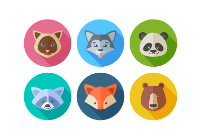 Icon DesignHow to Create a Set of Flat Animal Icons in Adobe Illustrator
 Icon DesignHow to Create a Cactus Plants Icon Pack
 Icon DesignHow to Create a Transport-Themed Icon Pack in Adobe Illustrator
 Icon DesignHow to Create a Set of Dental Care Icons in Adobe Illustrator
 Fan ArtHow to Create a Star Wars Themed Icon Pack in Adobe Illustrator
 Icon DesignHow to Create a New York Stamp Icon Set in Adobe Illustrator
 Flat DesignHow to Create Flat Design Easter Icons in Adobe Illustrator
 Icon DesignHow to Design a Set of Circus Icons in Adobe Illustrator
 Flat DesignHow to Create a Set of Flat Clock Icons in Adobe Illustrator
 Icon DesignHow to Create a "Share the Love" Icon Pack in Adobe Illustrator
 Adobe XDHow to Create a Cloud Icon in Adobe XD
 Affinity DesignerHow to Design Flat Icons in Affinity Designer: Introduction
 Affinity DesignerHow to Design Flat Icons in Affinity Designer: Discount Badge and Hanger Icons
 SketchWhat Is Sketch and Who Is It For?
 Adobe XDNew Course: Icon Design With Adobe XD
 AnimationNew Course: Animating Icons With Adobe Illustrator and After Effects
 SketchNew Course: Up and Running With Sketch
Original Link: https://design.tutsplus.com/articles/how-to-make-icons--cms-32202
TutsPlus - Design
 TutsPlus+ is a blog/Photoshop site made to house and showcase some of the best Photoshop tutorials around.
More About this Source Visit TutsPlus - Design