How to Create Layouts for a Fashion Magazine in Adobe InDesign
What You'll Be Creating
Open up the pages of any high-end magazine and you can find some really outstanding design work. The interior layouts of fashion titles can be particularly awe-inspiring. Designers are becoming more experimental with typography, irregular grids and unusual image choices to create magazine layouts that look as gorgeous as the covers.
In this tutorial you’ll learn how to design your own three-spread layout for a magazine feature using Adobe InDesign. We’ll look at how to prepare a grid, work with Masters to create visual uniformity across the pages, and how to select colors, images and typefaces to create a professional-standard design.
We’ll take you through the process gradually, step by step, so this tutorial is suitable for beginners to InDesign.
Let’s get started!
1. Create Your Magazine Document and Grid
Step 1
Open InDesign and select New Document from the Welcome window or go to File > New > Document.
In the New Document window, keep Intent as Print. Set the No. of Pages to 6. Keep Facing Pages checked.
From the Page Size drop-down menu select Custom... to open the Custom Page Size window. We’re going to be using the same dimensions as we did for this Magazine Cover tutorial, which uses a standard US magazine page size. This is 8 3/8 inches by 10 7/8 inches, though we’ll be working in millimeters throughout.
Type ‘US Magazine’ into the text box at the top of the window and set the Width to 213 mm and the Height to 276.5 mm (this equates to 8 3/8 in by 10 7/8 in). Click Add and then OK.
Step 2
Back in the New Document window, set the Top, Bottom and Inside Margins to 10 mm. Click the chain icon to the right of the margin values to break the chain. Type 6 mm into the Outside Margin value box. This is so that we allow a bit more space on the inside edge of the page, to accommodate for binding.
You should also include a Bleed of 3 mm on all sides except the Inside, where it won’t be needed. Set the Inside Bleed to 0 mm.
Click OK.
Step 3
You will notice that the first page of your document begins on a right-hand single page. However, we want to create the layout for three two-page spreads. If you’re creating a whole magazine in one document, you can simply treat Page 1 as the first page of your whole magazine, e.g. a page for contents or perhaps for an advertisement.
For now, though, we want to be able to shuffle Page 2 of the document upwards, so that it sits next to Page 1, forming a full spread.
Open the Pages panel (Window > Pages) and then open the panel’s drop-down menu, accessible from the top-right corner of the panel. Click once on Allow Document Pages to Shuffle to uncheck the option.
Back in the Pages panel, you can now grab individual pages and move them around more freely, connecting them to other pages without the restraints of the normal shuffle mode.
Grab the Page 2 page icon and connect it to the right-hand side of Page 1. Repeat with the process with the other pages until you have a set of three two-page spreads, as shown.
Step 4
Even though experimenting with typography is encouraged for dynamic, exciting magazine layouts, you should always set up some sort of grid to allow text to appear consistent across the spreads of your magazine. This will give the layouts a professional, clean look.
Let’s create a simple grid on the Master spread, as this will then be applied automatically to all the pages in your document.
Return to the Pages panel and double-click on one of the A-Master page icons to bring up the Master on screen.
If the rulers are not shown by default go to View > Show Rulers. Drag a Guide down from the top ruler to 37 mm, allowing it to sit on the left-hand page. Drag a second guide down to 254 mm.
From the left-hand ruler, drag a vertical guide out to 13 mm and then drag a second out to 195 mm.
These guides will form the top, bottom and outer edges of your columns of text.
Let’s mark out the center point of the document. The center point will actually be slightly off center, as the outside margin is narrower than the inside margin. But this is absolutely fine; all your content will appear centered once printed and bound.
Go to Layout > Margins & Columns and set the Number of Columns to 2 and the Gutter to 0 mm. Click OK.
Drag out another vertical guide from the left-hand ruler to 94 mm and drag a second to 115 mm.
Finally, drag your mouse over the whole of the left page to select all the guides and go to Edit > Copy, Edit > Paste. Manoeuvre this pasted set of guides into a mirrored position on the right page of the Master spread.
2. Customize the Master(s)
You should place any content you will want to show up on every page of your document on a Master page. So things like running headers and page numbers should be placed here, to make creating the rest of your layouts fuss-free.
Step 1
Select the Zoom Tool (Z) from the Tools panel and click and drag over the bottom left-hand corner of the left page of the Master spread.
Using the Type Tool (T) create a small text frame, positioning it just below the bottom margin. Place your cursor in the text frame and go to Type > Insert Special Character > Markers > Current Page Number.
Highlight the ‘A’ character and adjust the Font, from the Character Formatting Controls panel running along the top of the screen, to Adobe Garamond Pro, Semibold Italic, and Size to 10 pt.
Select the text frame using the Selection Tool (V, Escape) and Edit > Copy, Edit > Paste. Manoeuvre the pasted frame to the bottom-right corner of the right page of the Master and adjust the alignment of the text to Align Right.
Step 2
You can also add running headers to the Master spread.
Use the Type Tool (T) to create two text frames, one at the top left-hand corner of the left page for the ‘Name of Magazine’. Set the Font as before to Adobe Garamond Pro, Size 10 pt. Set the weight to Semibold.
Position the other text frame centrally at the top of the left page, typing in the ‘Issue No.’, and setting the Font to Adobe Garamond Pro, Semibold Italic, and Size 10 pt. Set the text to Align Center.
Create a third text frame, positioning it at the top-right corner of the right-hand page of the Master. This is the perfect place to put in the name of your article. Here, it’s ‘days of denim dreaming’. Set the Font to Adobe Garamond Pro, Semibold Italic, and Size 10 pt. Set the text to Align Right.
We’re going to build up the magazine layout using just three colours: [Black], [Paper] and a new grey-blue swatch. Open the Swatches panel (Window > Color > Swatches) and click on the New Swatch icon. Add a new CMYK Swatch, C=56 M=41 Y=37 K=20.
Set the article title in this new swatch.
Step 3
Some of the pages in your magazine layout might include dark images or background colors, and dark text will disappear against these. Let's solve that right now.
Return to the Pages panel and hold Shift and select both pages of the A-Master. Drag them down to the Create New Page icon at the bottom of the panel. A second Master spread, a B-Master, will be created.
Ensure the B-Master is brought up on screen, then drag your mouse across the whole of the spread, selecting all the text frames. Adjust the Font Color of all the text on the spread to [Paper]. Delete the ‘Issue No.’ text frame.
Step 4
To ensure that the text on your Master pages will be brought to the front of your design, you can sit the content of the Masters on the same layer as the main text of your layouts.
Open the Layers panel (Window > Layers) and double-click the default Layer 1name. Rename the layer as Typography and click OK.
3. Introduce Borders on Your Layouts
To give your magazine that extra professional look, you should introduce borders around the pages. This helps to frame your content, making it look really elegant.
Step 1
Remaining in the Layers panel, first Lock the Typography layer. Then click the New Layer icon at the bottom of the panel. Rename the layer as Border.
Grab the Border layer and move it to sit below the Typography layer.
Step 2
Remaining on the Border layer, bring up the first spread, Pages 1–2, of your document on screen.
Select the Rectangle Tool (M) and drag to create a frame that extends across the whole of Page 1, resting the edges on the trim edge of the document.
Set the Fill Color to [None] and Stroke to [Black], and increase the Weight of the Stroke to 4 mm.
Select the frame and Edit > Copy and Edit > Paste. Position the pasted frame in a mirrored position on Page 2.
Step 3
Drag your mouse across the whole of the spread to select both of the black frames and Edit > Copy.
Navigate down to Pages 3–4, and Edit > Paste in Place. Alter the Stroke Color to [Paper].
Repeat again for Pages 5–6, setting the Stroke Color to [Paper].
4. Get Playful with Color and Images
Now we can get started with the fun stuff!
Step 1
Return to the Layers panel and Lock the Border layer. Create a new layer, renaming it Image.
Grab the new layer and move it to sit below the Border layer.
Step 2
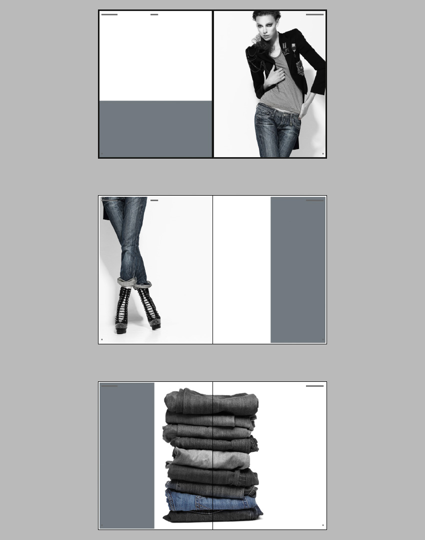
You want to select an image that will look strong and dramatic when placed across an entire page. For this fashion feature, I’ve chosen an image of a stylish woman wearing jeans.
The original image is in full color. But for added edge, I post-edited the photo in Adobe Photoshop. To imitate the look of the image here, where only the jeans are pulled out in color, use the Lasso Tool (L) to select the area of the jeans only. Copy and Paste the selection, so it stands apart on a separate layer.
Apply a Channel Mixer Adjustment Layer in Monochrome to the original photo only, keeping the jeans pulled out in color.
Step 3
Return to InDesign and bring up Page 2 of the document on screen.
Select the Rectangle Frame Tool (F) and drag to create a frame that extends across the whole of the page.
Go to File > Place and select your chosen image. Click Open. Arrange the image in the frame until you are happy with the scale.
Step 4
Select the Rectangle Tool (M) and drag to create a frame 216 mm in Width and 110 mm in Height. Place this at the bottom of Page 1 in the position shown.
Step 5
Navigate down to Page 3 of your document. As before, create an image frame the Width and Height of the page, extending to the Bleed, and File > Place. Select the same image as before.
Double-click inside the frame to select the image directly and Control-Click (Mac OS) or Right-Click (Windows) > Transform > Flip Horizontal. This time enlarge the scale of the image, and focus on the lower half of the photo, bringing the jeans and shoes into the frame. Leave a decent space to the right of the image to allow some space for text.
Step 6
Select the Rectangle Tool (M) and drag to create a frame that extends from the top to the bottom of Page 4. Rest the right edge on the far right bleed, and extend the Width until it meets at the center point of Page 4.
You’ll notice that the article title at the top right corner of Page 4 is now no longer visible and the page number doesn’t look very clear, now it’s set against a dark background. To solve this, simply go the Pages panel and drag the right-hand page icon of the B-Master, dropping it onto the Page 4 page icon in the panel.
While you’re there, you can also apply the B-Master to Page 5 of the document.
Step 7
Select the grey frame you’ve just created and Edit > Copy. Navigate further down to Page 5 of the document and Edit > Paste. Move the pasted frame to the left side of the page, as shown.
Step 8
Use the Rectangle Frame Tool (F) to create a new large image frame. Position it centrally on the Pages 5–6 spread.
As I did with the first image earlier, I then used Photoshop to pull out one of the pairs of jeans in color, with the rest of the stack set in monochrome.
Step 9
The white border’s cutting through the center of the image, which doesn’t look great. So, return to the Layers panel and Unlock the Border layer. Pull back the inside edges of each border to the center of the page, so you still have a white border around the colored background on the left-hand page.
Great work! This is how your magazine feature looks at the moment:
Now all we need to do is add some text!
5. Typography for Your Magazine Layouts
Step 1
Go to the Layers panel and Lock the Image layer. Unlock the Typography layer.
Step 2
We’ve already used Adobe Garamond Pro for the running headers and page numbers, so we can continue to use this for the main text of the article. However, you can introduce one, or even two, more typeface(s) to use for a more exciting title, and to use across the document for quotes and other decorative text elements.
Futura Std is a clean, minimal font which will give an extra stylish, modern edge to a fashion magazine layout. But any sans serif with an optional condensed weight would be a good pick too.
To add a fun touch, you can also install Sail, which has a more playful feel.
Navigate to Page 1 of your document and use the Type Tool (T) to create a text frame 214 mm in Width and 94 mm in Height. Type ‘Days of (paragraph break) Denim’ and set the Font to Futura Std Light Condensed, and the text to All Caps.
Highlight ‘Days of’ alone and set the Size to 122 pt. Increase the Tracking, from the Character Formatting Controls panel at the top of the screen, to 230.
Highlight ‘Denim’ alone and increase the Size to 135 pt, Leading to 160 pt and Tracking to 430. Set the text to Align Right and alter the Font Color to the grey‑blue swatch, C=56 M=41 Y=37 K=20.
Position the text frame just above the center of the page, as shown.
Step 3
Introduce a second smaller text frame (about 75 mm in Width) on Page 1, positioning it centrally towards the bottom of the page. Here you can type in a short summary of the article, setting the Font to Futura Std Light Condensed, Size 14 pt, All Caps, Font Color to [Paper] and text alignment to Justified (All Lines).
Set the ‘Name’ of the article’s author below the summary, in Adobe Garamond Pro.
Step 4
Create a third text frame on Page 1, about 170 mm in Width. Position it centrally on the page, at the top of the grey frame.
Type ‘Dreaming’ and set the Font to Sail, Size 112 pt, and Font Colour to [Paper]. With the Selection Tool (V, Escape) active, hover your cursor over the bottom right corner of the frame and rotate it upwards a little to give the text a slight slant.
Step 5
Navigate down to the second spread of the document, focussing on Page 3.
Use the Type Tool (T) to create a square text frame, and position it between the guides marking out the right-hand half of the page. Rest the top edge of the frame on the top horizontal guide, as shown below.
Type an introductory sub-title of four five-character words. Here, I’ve gone for ‘Basic Smart Rough Chic?’, positioning each word on a new line.
Set the Font to Futura Std Light Condensed, Size 50 pt, Leading 70 pt, All Caps and Justify All Lines. Increase the Tracking to 600 and highlight individual parts of the text, setting them in a different color, C=56 M=41 Y=37 K=20.
Step 6
Pull out a guide from the left-hand ruler to the center of the text frame, and the center of the column section.
Select the Type Tool (T) and create a new text frame, 37.5 mm in Width and 115.5 mm in Height. Align the left edge of this new text frame with the left edge of the sub-title text frame, and rest the bottom edge against the bottom horizontal guide.
You can start to feed in the text of your article into this text frame. If you don’t have any text yet, you can go to Type > Fill with Placeholder Text. Set the Font to Adobe Garamond Pro, Size 11 pt.
You can also pull out the first letter of the article in a Drop Cap, using the options available in the Character Formatting Controls panel. Set the Drop Cap Number of Lines to 3, and adjust the Font of the first character to Futura Std Medium Condensed and the Color to C=56 M=41 Y=37 K=20.
Step 7
Create another text frame at the same dimensions as the tall text frame you just created. Position to the right of the first frame, resting against the guide on the far right, as shown.
Click on the white box at the bottom right corner of the first frame, before clicking in the second frame, allowing the text to flow into it.
Continue to create new text frames at the same dimensions, positioning them in pairs on the opposite page of the spread, using the guides to help you. Repeat the process above, threading the text into the frames as you go. Adjust the color of some of the text to [Paper] if you need to contrast it against the dark background.
Continue onto the next spread, Pages 5–6, positioning the text frames around the image of the stacked jeans as shown.
Step 8
Return to Page 4 of the document, on the second spread. You can add in some pulled-out quotations to give a bit more depth to the design.
Use the Type Tool (T) to create a text frame the width of two columns, just like the sub-heading text frame. Type in a quote and set the Font to Futura Std light Condensed, Size 15 pt, Font Color to C=56 M=41 Y=37 K=20 and Justify All Lines. Set the Tracking to 300.
Open the Story panel (Window > Type & Tables > Story) and check the Optical Margin Alignment checkbox to shift the quotation marks to sit outside the text frame, giving a more even appearance to the text.
Position the first quotation text frame below the two left-hand columns on Page 4. Copy and Paste the text frame, adjusting the text content, three more times, placing them on Pages 4, 5 and 6 as shown.
Step 9
Your layouts are almost finished, and they're looking awesome!
You can add a final decorative touch to give your layouts that extra pro touch. Create a square text frame and position it below the left-hand quotation on Page 4 of your document. Type ‘D’ (for ‘denim’) and set the Font to Sail, Size 200 pt, Color C=56 M=41 Y=37 K=20. Rotate the text frame slightly to give it a slightly jaunty angle.
With the text frame selected, go to Object > Effects > Transparency and reduce the Opacity to 30%.
Edit > Copy and Edit > Paste the text frame, adjusting the Font Color to [Paper]. Position this second frame at the top right corner of Page 4.
Copy and Paste both of the ‘D’ text frames onto the final spread of the magazine, positioning them as shown.
Step 10
Before you go to export your layouts for print, just take a quick detour back to the second spread of your document. You might notice that the right shoe in the photo is edging into the left-hand column of text, which isn’t ideal.
To quickly sort this out, select the Ellipse Tool (L) from the Tools panel and drag to create a small irregular ellipse that sits just over the bottom part of the shoe.
Adjust the Stroke Color to [None]. Go to Window > Text Wrap and set the wrap to Wrap Around Object Shape, at an Offset of 5 mm.
6. Export Your Magazine for Print
Your layouts are finished—super work! They look fantastic.
When you’re ready to send your designs off to print, simply follow the steps below.
Step 1
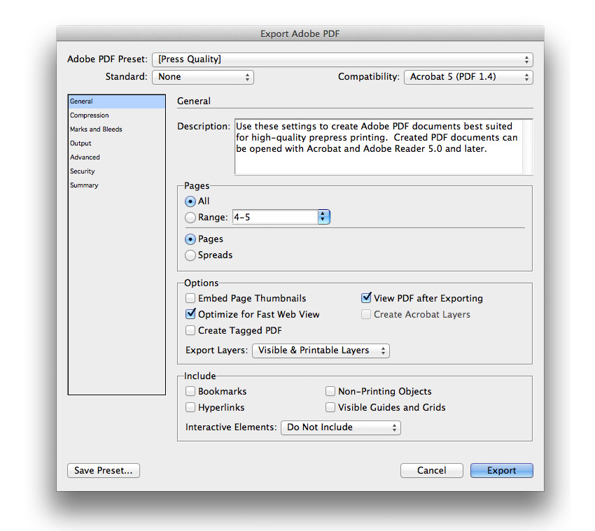
Go to File > Export... to open the Export window. Select Adobe PDF (Print) from the Format drop-down menu. Name the file and click Save.
In the Export Adobe PDF window select Press Quality from the Adobe PDF Preset drop-down menu.
Keep Pages checked, not Spreads, unless otherwise specified by your printer.
Step 2
Under the Marks and Bleeds section, click to select All Printer’s Marks under the Marks menu and click to select Use Document Bleed Settings under the Bleed and Slug menu. Click Export.
Well done!You now have your magazine layouts ready to be sent to the printers.
In this tutorial, we have learned how to design professional-standard layouts for a fashion magazine feature. The lessons we’ve covered here, such as setting up suitable Master pages, creating a simple grid, and experimenting with stylish typography, would also apply really well to any other kind of magazine you’re designing. Great work!
Want to jumpstart your next inDesign magazine design? Check out these high-quality templates—beautifully designed and ready to use in your next project.
Perfect for your fashion-centric projects, this template comes in two sizes: A4 & US letter. It includes both INDD and IDML files, as well as 30 custom pages!
Choose from 26 unique pages in this high-quality design. Master pages, character styles, and paragraphs are all included, in both A4 and US Letter paper size.
A stylish design with over 30 pages, this template includes images, paragraph styles, page numbers set up, alternative covers, and more—a great fit for a variety of InDesign projects.
Enjoyed this tutorial? Check out these other inDesign tutorials:


 InDesign TemplatesHow to Make Stylish Layouts for a Portfolio Template in InDesign
 InDesign TemplatesHow to Make a Book in InDesign
 Adobe InDesignHow to Create a Simple Magazine Template in Adobe InDesign
 BrochureHow to Make a Business Brochure in InDesign
 FlyersHow to Create an Event Flyer Template in InDesign