
An Interest In:
Web News this Week
- March 30, 2024
- March 29, 2024
- March 28, 2024
- March 27, 2024
- March 26, 2024
- March 25, 2024
- March 24, 2024
Some of Our Sources
- Engadget
- Techcrunch
- Technology Review
- TutsPlus - Code
- Smashing Magazine
- You The Designer
- Naldz Graphics
- Web Design Ledger
- 24 Ways
- Android Headlines
Help Webnuz
Referal links:
Advanced CSS: Quantity Queries Creating a Fluid Responsive Grid with Flex Zero Media Queries
Styling for every possibility is hard. Doing the CSS work for a CMS generated site where you have no control of the site's markup teaches you quite a few things about making the most out of the limited tools we're blessed with.
The problem
Our designer's latest challenge was this:
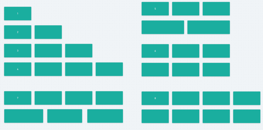
Create a grid of rectangles such that it behaves like this on desktop screens:
Use no JS to achieve this, make it work on IE 10 and up, and use no media queries as we want this to be fluid and work on any screen.
At first sight this might seem like a trivial problem to solve. A few flex-properties should solve most of this, but there's a problem here: If there are four items, they should all render on the same row, however if the user adds one more, the first three items should display on one row, then the next two should be rendered on their own row. How can this possibly be done with no JS?
CSS quantity queries to the rescue
Before we dig into the solution, I want to teach you a bit about CSS counting. CSS provides a set of pseudo-classes that together with a bit of clever maths can help us keep track of how many elements there are within a container. Quantity Queries for CSS by Heydon Pickering sums this up nicely, but as a tldr: By using the power of :first-child, :last-child, :nth-child(), and :nth-last-child(), we can e.g. tell how many <li>s there are in a <ul>.
The solution
<ul> <li></li> <li></li> <li></li></ul>:root { --margin: 1rem;}ul { display: flex; flex-wrap: wrap; list-style: none; margin: calc(-1 * var(--margin)); padding: 0;}li { flex-basis: calc(33.3333% - (2 * var(--margin))); flex-grow: 1; flex-shrink: 0; margin: var(--margin); min-width: 290px;}li:nth-last-child(4n):first-child ~ li, li:nth-last-child(4n):first-child, li:nth-last-child(7n):not(:nth-last-child(14n)):first-child ~ li, li:nth-last-child(7n):not(:nth-last-child(14n)):first-child { flex-basis: calc(25% - (2 * var(--margin))); } This method uses Heydon Pickering's ingenious Albatross strategy (must-read). The only caveat here is the min-width: 290px. We need to set a minimum width, and this minimum width will make things go sideways on screens narrower than it. Be sure to keep it low!
li:nth-last-child(4n) selects any element that's a multiple of four steps away from the last element (counting from 1). If there are ten elements inside the <ul>, elements number three and seven from the start will be selected (10, 9, 8, (7), 6, 5, 4, (3), 2, 1). li:nth-last-child(4n):first-child) then targets the any element that's a multiple of four steps away from the last element and also the first element. Add a General sibling combinator (~) and you can target every element that follows this first one.
See that the flex-basis changes whenever there's a multiple of four or seven <li> elements inside the <ul>.
Final result
After a little cleanup, here's the final result! (Go to fullscreen version)
Original Link: https://dev.to/boyum/advanced-css-quantity-queries-creating-a-fluid-responsive-grid-with-flex-zero-media-queries-5h6p
Dev To
 An online community for sharing and discovering great ideas, having debates, and making friends
More About this Source Visit Dev To