
An Interest In:
Web News this Week
- March 30, 2024
- March 29, 2024
- March 28, 2024
- March 27, 2024
- March 26, 2024
- March 25, 2024
- March 24, 2024
Some of Our Sources
- Mashable
- Technology Review
- Web Designer Wall
- Naldz Graphics
- Noupe
- 24 Ways
- CSS Tricks
- Android Headlines
- Willems Lab
- TechPowerUp
Help Webnuz
Referal links:
How to use Storybook with React
This post was originally published here
Streamline your UI component development workflow
What is Storybook and why would I use it?
From Storybook's website itself:
Storybook is an open source tool for developing UI components in isolation
Reusable components
React allows us to write what we call "reusable components". If you don't know what a reusable component is, think about buttons for example:
- you can have different variants:
- a
primarybutton with a red background - a
secondarybutton with a green background
- a
- you can also have different states: a button can be
disabledif the form is currently being sent
In React, a very simple way to handle it is to have a single Button component which takes different parameters:
- a prop called
disabled, which is eithertrueorfalse - a prop called
variant, which is eitherprimaryorsecondary.
But let's say you are writing this code and you want to see what it looks like. The usual approach would be to go to a page in your application, then include the button somewhere in the middle, pass props to it, and see what it looks like.
Comes Storybook
That's where Storybook comes into play: it basically allows you to run a second app in parallel, where you can play with the Button component, without having to include it in your application. You can develop your components in isolation.
Now, let's say someone in support team is talking to a customer that can't login. They come to you and ask: "Hey, could you show me this error screen?".
Without Storybook, the answer involves having to launch the application, try to replay what the user did, read some code to understand how to make it appear, etc.
With Storybook, you just type "Error Screen" in the search bar, and you instantly see it!
Set up Storybook in a React app
At this point you will need a React application. If you don't have one, feel free to clone this one, or follow the steps in this post to create one. This tutorial will assume that you use create-react-app.
Storybook makes it really easy to set everything up. In your terminal, just run:
npx -p @storybook/cli sb initThis will basically inspect your package.json to determine the framework you are using, then generate the right configuration for your project.
The command should have updated your package.json scripts, adding:
"storybook": "start-storybook -p 9009 -s public","build-storybook": "build-storybook -s public"The first one is the one we are interested in. Run:
npm run storybookThis should open something like this in your browser (if it doesn't, just navigate to localhost:9009):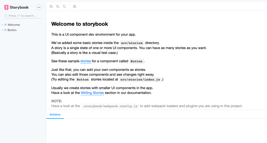
Let's have a look at the interface here:
- on the left, a sidebar: this is where you find your components. Click on
Button, and look at what's there! - at the bottom, something that looks like a console: this is actually the "addons" section. Storybook has a lot of addons, which allow you to enhance your experience while developing your components: change props dynamically with, log outputs, switch languages, etc.
So where do these components come from? When we installed Storybook, it generated these "demo" stories. They are in src/stories/index.js:
import React from "react";import { storiesOf } from "@storybook/react";import { action } from "@storybook/addon-actions";import { linkTo } from "@storybook/addon-links";// Importing the demo components from storybook itselfimport { Button, Welcome } from "@storybook/react/demo";storiesOf("Welcome", module).add("to Storybook", () => ( <Welcome showApp={linkTo("Button")} />));storiesOf("Button", module) .add("with text", () => ( <Button onClick={action("clicked")}>Hello Button</Button> )) .add("with some emoji", () => ( <Button onClick={action("clicked")}> <span role="img" aria-label="so cool"> </span> </Button> ));The magic that adds them to Storybook is in .storybook/config.js:
import { configure } from '@storybook/react';function loadStories() { require('../src/stories');}configure(loadStories, module);Write your first stories
Configuring Storybook
The first thing we need to do is to get rid of these demo stories, and change the way stories get included in Storybook. Remove the src/stories/ folder altogether, we won't need it.
Replace everything in .storybook/config.js with:
import { configure } from '@storybook/react';const req = require.context('../src/', true, /\.stories\.js$/);function loadStories() { req.keys().forEach(filename => req(filename));}configure(loadStories, module);This will tell Storybook to pick up every file that ends with .stories.js. You'll see that it's (in general) much easier to keep stories close to the components they test.
A simple Button component
Now let's write our first story. If you are using my github example, go to src/components/atoms and create the following files:
|atoms |Button |index.js |Button.js |Button.stories.jsButton.js:
import React from "react";const Button = props => { const { variant, disabled, children } = props; // This is the default style let backgroundColor = "white"; let color = "black"; // Which variant do we want? switch (variant) { case "primary": backgroundColor = "red"; color = "white"; break; case "secondary": backgroundColor = "green"; color = "white"; break; default: break; } // Let's build the style based on the variant // We also add properties depending on the `disabled` state const style = { backgroundColor, color, cursor: disabled ? "not-allowed" : "pointer", opacity: disabled ? 0.5 : 1 }; return ( <button disabled={disabled} style={style}> {children} </button> );};export default Button;Button.stories.js:
import React from "react";import { storiesOf } from "@storybook/react";import Button from "./Button";// You can see this as "folders" in Storybook's sidebarconst stories = storiesOf("atoms/Button", module);// Every story represents a state for our Button componentstories.add("default", () => <Button>Button</Button>);stories.add("default disabled", () => <Button disabled>Button</Button>);stories.add("primary", () => <Button variant="primary">Button</Button>);// Passing a prop without a value is basically the same as passing `true`stories.add("primary disabled", () => ( <Button variant="primary" disabled> Button </Button>));stories.add("secondary", () => <Button variant="secondary">Button</Button>);stories.add("secondary disabled", () => ( <Button variant="secondary" disabled> Button </Button>));index.js:
// This allows us to import `src/components/Button` directly,// without having to go all the way to `src/components/Button/Button`export { default } from "./Button";Now go to Storybook again, and have a look at what your story created:
Go through the different stories we've created, and notice how the Button changes.
Everything is real-time
Storybook has a very fast hot reload mechanism. This means that you can go to your component, change "red" into blue, and Storybook instantly re-compiles your stories to include your change!
Addons
Storybook provides various very convenient addons to help us develop components in isolation with confidence. Let's set up some of them.
addon-info
Sometimes when you browse through Storybook, you want to read the code for a specific story. This is exactly what the info addon does. To install it:
npm i -D @storybook/addon-infoAdd the plugin globally, by editing .storybook/config.js:
...import { addDecorator } from '@storybook/react';import { withInfo } from '@storybook/addon-info';addDecorator(withInfo);...This will add a show info button in the top right hand corner in your story, which displays some information about the story:
addon-actions
It can be useful to log when an action happens in our component. Let's say for example that we change our Button component so that it accepts an onClick prop:
...const Button = props => { const { variant, disabled, children, onClick } = props; ...return ( <button onClick={onClick} disabled={disabled} style={style}> {children} </button> );How do we test that clicking the button will trigger the onClick handler? Storybook provides an official addon, already installed, that can help with that. In your story, import action, then add the onClick prop:
import { action } from "@storybook/addon-actions";...stories.add("default", () => ( <Button onClick={action("clicked!")}>Button</Button>));stories.add("default disabled", () => ( <Button onClick={action("clicked!")} disabled> Button </Button>));stories.add("primary", () => ( <Button onClick={action("clicked!")} variant="primary"> Button </Button>));stories.add("primary disabled", () => ( <Button onClick={action("clicked!")} variant="primary" disabled> Button </Button>));stories.add("secondary", () => ( <Button onClick={action("clicked!")} variant="secondary"> Button </Button>));stories.add("secondary disabled", () => ( <Button onClick={action("clicked!")} variant="secondary" disabled> Button </Button>));Now, every time you click the button, Storybook will print a new log:
addon-knobs
Right now, we need to write a lot of different stories for the same component, because we need to handle every prop combination. What if we could edit the props in real-time, in Storybook itself? The solution is addon-knobs, and it greatly simplifies the way we write stories.
First, install the addon with:
npm i -D @storybook/addon-knobsThen, add this to .storybook/addons.js:
import '@storybook/addon-actions/register';import '@storybook/addon-links/register';// add this lineimport '@storybook/addon-knobs/register';And rewrite your story to use the new plugin:
import React from "react";import { storiesOf } from "@storybook/react";import Button from "./Button";import { action } from "@storybook/addon-actions";// add this lineimport { withKnobs, select, boolean } from "@storybook/addon-knobs";// You can see this as "folders" in Storybook's sidebarconst stories = storiesOf("atoms/Button", module);// add this linestories.addDecorator(withKnobs);// ---- add this blockconst variantOptions = { none: "", primary: "primary", secondary: "secondary"};// ----stories.add("with knobs", () => ( <Button onClick={action("clicked!")} // ---- and this one // syntax is (name, options, default) variant={select("variant", variantOptions, "")} // syntax is (name, default) disabled={boolean("disabled", false)} // ---- > Button </Button>));Now, when you go to your story, in the addons section, you can see a new tab, called knobs, and you can change theh props for your component by playing with them:
What's even cooler is that addon-info is kept in sync with these props!
Snapshot testing
Since React components are reusable, it's very common that a component gets included in many other components. Keeping track of all the places where the component becomes a dependency and estimating the impact of a small change can become very difficult. Storybook makes it very easy to set up snapshot tests, combined with jest (create-react-app already comes with it).
First, install the required dependencies:
npm i -D @storybook/addon-storyshots react-test-renderer require-context.macroThen, in .storybook/config.js:
import requireContext from 'require-context.macro';// const req = require.context('../src', true, /\.stories\.js$/); <-- replacedconst req = requireContext('../src', true, /\.stories\.js$/);Create the following structure in src:
|test |storyshots.test.jsAnd add this to storyshots.test.js
import initStoryshots from '@storybook/addon-storyshots';initStoryshots();Finally, run npm run test (or the npm test shorthand). This will create a snapshot file at src/test/__snapshots__/storyshots.test.js.snap.
Now, when you run the tests, Storybook will render every story and compare it to the snapshots created earlier. Try to change something in your Button component and run the tests again, for example:
switch (variant) { case "primary": backgroundColor = "red"; color = "white"; break; case "secondary": // change this... //backgroundColor = "green"; // ...into this backgroundColor = "gray"; color = "white"; break; default: break; }Jest will complain that the snapshots are not right, and give you a very useful report:
You can review the changes, and decide if you have broken something or if every change was intended. If everything looks OK, you can update the snapshots, using:
npm run test -- -uRunning snapshot tests after developing a big feature can be very helpful to review what you have done and the impact of your changes.
Find the final code on GitHub.
Original Link: https://dev.to/tducasse/how-to-use-storybook-with-react-10g1
Dev To
 An online community for sharing and discovering great ideas, having debates, and making friends
More About this Source Visit Dev To