
An Interest In:
Web News this Week
- March 29, 2024
- March 28, 2024
- March 27, 2024
- March 26, 2024
- March 25, 2024
- March 24, 2024
- March 23, 2024
Some of Our Sources
- Mashable
- Simplebits
- Spoon Graphics
- Six Revisions
- TutsPlus - Design
- Web Designer Depot
- Naldz Graphics
- CSS Tricks
- Android Dissected
- Codrops
Help Webnuz
Referal links:
Creating Pixel Art with CSS
I have always enjoyed looking at and creating pixel art. Before online pixel makers were a thing, I used to spend hours making my own pixel art in Photoshop with the pencil tool. This article will show you how using CSS (and a tiny bit of HTML), you can use code to make your own pixel art creations.
The Power of box-shadow
While it is 100% possible to create pixel art by creating a bunch of <div>s and changing their background color, that's a lot of <div>s to keep track of and copy if you want to reuse your pixel in multiple places. I prefer to create pixel art with a single <div>, which we can do thanks to the box-shadow property.
box-shadow is commonly used to create a drop shadow effect behind an element, like in the example below.
How does that help us with creating the straight-edged pixel art? By removing the blur & spread parameters from the box-shadow definition, we can straighten out the sides of the shadow.
Next, we want to move the shadow so it is beside the block instead of being behind it. We can do this by adjusting the X- & Y-offset parameters according to the rules below.
X-offset:
- Positive value moves right
- Negative value moves left
Y-offset:
- Positive value moves down
- Negative value moves up
Shadows inherit their dimensions from the element they're applied to. To move the shadow to the right of the block, we need to set the X-offset to be the same as the width of the block: 20px. If we change the Y-offset to 0, the result looks like if we had two blocks sitting side-by-side.
It's starting to look like pixel art! But this only gives us two "pixels", and we're going to need a lot more than that. Thankfully, the box-shadow property isn't limited to just one effect. By separating our effects with a comma, we can create multiple pixel-looking shadows.
Now that we know how we can use box-shadow, it's time to start making a real piece of pixel art.
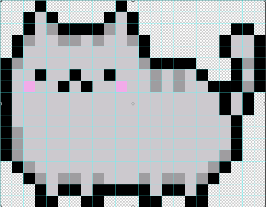
Creating a Pixel Cat
We're going to be creating a pixel version of Pusheen. If you're new to making pixel art, I recommend searching for existing art so you have a reference for where your pixels should be placed. I'm going to be recreating this version of pixel Pusheen.

It is made up of 414 pixels (23 columns x 18 rows). To help me easily identify the individual pixels, I've used Photoshop to overlay a grid on the reference image.
Although you could start drawing your pixel from anywhere, I'm going to start in the uppermost left corner so I don't have to worry about any negative offsets in my box-shadow effects.
Although you could do this in vanilla CSS, I'm going to use SASS to avoid writing 414 box-shadow declarations by hand. By utilizing a custom SASS function and lists, we can automate calculating the offset positions and make our code more DRY.
First, Im going to make some modifications to our #cat block. Instead of applying the box-shadow to the block itself, Im going to apply it to a pseudo element instead that is absolutely positioned relative to the block. Why? Because box-shadow doesnt take up space, meaning if I were to put another element next to my cat block, it would sit on top of my shadows. If we make the size of the cat block the final size of our pixel art, we can avoid this problem, but we need the pseudo element to separately define the width/height of our pixels (remember, the size of the shadow is inherited from the element the box-shadow is applied to). This is what those changes look like:
#cat { position: relative; width: calc(23 * #{$size}); // Pixel size * # of columns height: calc(18 * #{$size}); // Pixel size * # of rows margin: 1rem; &::after { content: ''; position: absolute; top: 0; left: 0; width: $size; height: $size; // box-shadow will be applied here }}Next, lets set up some variables.
// The width/height of each of our "pixels".$size: 20px;// Colors$t: transparent;$black: #000;$gray: #cdc9cf;$dkgray: #a09da1;$pink: #ffa6ed;Now were going to create a list to track what color each pixel should be. Starting on the left, lets create a list for the first row.
$first: ($t, $t, $t, $black, $t, $t, $t, $t, $black);We could create new variables for each of the subsequent rows ($second, $third, etc.), but a better approach is to create a nested list, like so:
$cat: ( ($t, $t, $t, $black, $t, $t, $t, $t, $black),// 1st Row ($t, $t, $black, $gray, $black, $t, $t, $t, $t, $black, $gray, $black)// 2nd Row // Additional rows);The nested list approach has the benefit of providing us with all the information we need to generate our box-shadow effect for each of the cell: the X/Y positions to calculate our offset and the color of the shadow. We'll access that information with a custom "pixelize" function.
Writing a SASS Function to Draw a Pixel
Our "pixelize" function is going to do the heavy-lifting of turning our list of colors into usable box-shadow definitions. I've provided line-by-line explanations of what this function does below.
@function pixelize($colors, $size) { $result: ''; $numRows: length($colors); @for $rowIndex from 1 through $numRows { $y: ($rowIndex - 1); $row: nth($colors, $rowIndex); $numCols: length($row); @for $cellIndex from 1 through $numCols { $x: ($cellIndex - 1); $color: nth($row, $cellIndex); $sep: ', '; @if $x == 0 and $y == 0 { $sep: ''; } $result: $result + '#{$sep}#{$x * $size} #{$y * $size} #{$color}' } } $result: unquote($result); @return $result;}- Line 1: The function takes two arguments: the list of
$colorsand the$sizethat the pixels should be - Line 2: Initializes our
$resultvariable as a string. This is the variable the function will modify and return. - Line 3: Returns the number of rows in the list using the built-in
lengthfunction - Line 5: Starts a loop that iterates X times, where X is the number of rows in our list. The
$rowIndexwill increment by 1 on each loop. - Line 6: Calculates the Y-offset of all cells in that row. SASS Lists are index-1 (not index-0), so we subtract 1 from the current index so the 1st row has a Y-offset of 0, 2nd has Y-offset of 1, etc.
- Lines 7 & 8: Returns the value of the current list item (the list of colors for the row) & calculates its length to determine the number of columns in the row
- Line 10: Starts a loop to iterate over each column in the row
- Line 11 & 12: Calculates the X-offset of that cell & returns the corresponding color
- Lines 14-17: Sets the separator for the
box-shadoweffects, but removes it for the first cell to ensure a valid property value. - Line 19: Updates the
$resultvalue to its existing value plus the new cell:- Separator
- X position *
$size= X-offset - Y position *
$size= Y-offset - Color
- Line 23 & 24:
$resultis a string, so we use theunquotefunction to remove the containing quotes. Finally, return the result.
The Final Result
Put it all together, and here is our final Pusheen pixel!
Pretty neat! With a little refactoring, the use of CSS Variables, & a smidge of JavaScript, we could even even allow users to select their own colors for their cats.
I hope this post has inspired you to make your own pixel art. Even if it hasn't, I hope you've learned how you can use the box-shadow property to create some neat effects in your projects. If you're interested in seeing more pixel art, including examples of how to animate them, check out "Fun Times with CSS Pixel Art" by Geoff Graham on CSS-Tricks.
Original Link: https://dev.to/jnschrag/creating-pixel-art-with-css-3451
Dev To
 An online community for sharing and discovering great ideas, having debates, and making friends
More About this Source Visit Dev To