
Some of Our Sources
- Web Designer Wall
- Just Creative
- Spoon Graphics
- TutsPlus - Design
- Inspiredology
- My Ink Blog
- Wal You
- Android Dissected
- Dev To
- Hashedout
Help Webnuz
Referal links:
Why the siren of the Starbucks logo is slightly asymmetrical
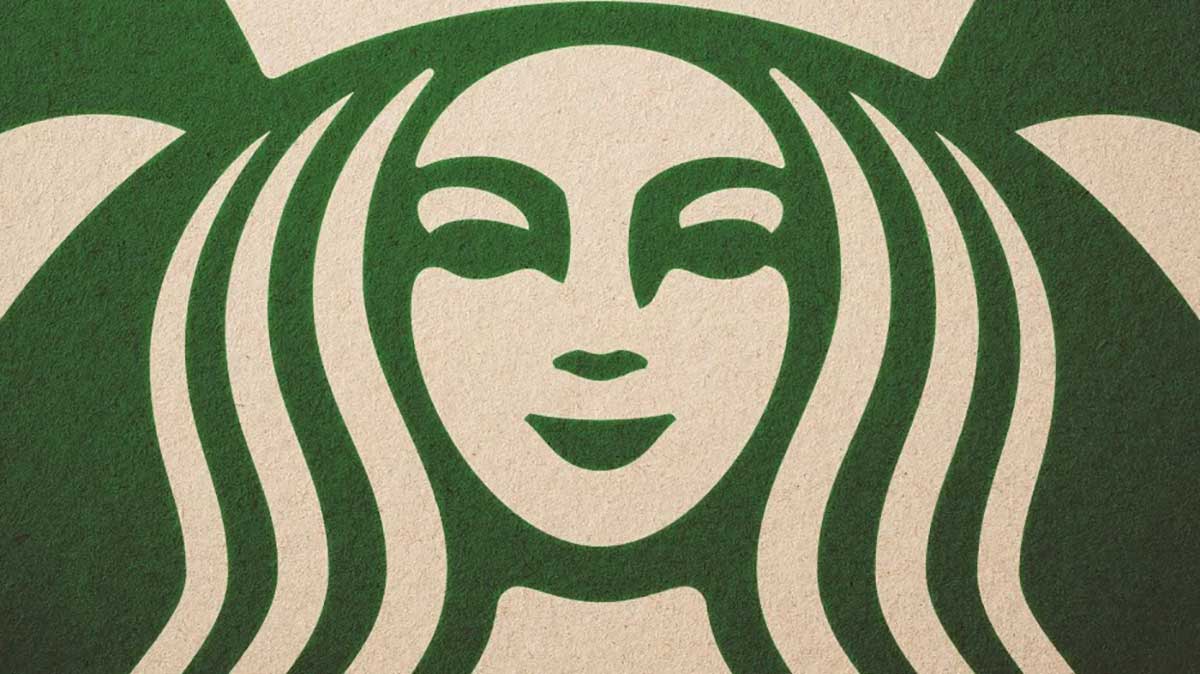
The designers of the Starbucks logo decided that making the siren's face slightly asymmetrical gave her the right mix of mystery and allure.
From Co. Design:
As a team we were like, Theres something not working here, what is it?' recounts global creative director Connie Birdsall. It was like, Oh, we need to step back and put some of that humanity back in. The imperfection was important to making her really successful as a mark.
Specifically, Lippincott realized that to look human, the Siren couldnt be symmetrical, despite the fact that symmetry is the well-studied definition of human beauty. She had to be asymmetrical. Can you see it now that you know? Look closely at her eyes. Do you notice how her nose dips lower on the right than the left? That was the fix of just a few pixels that made the Siren work.
In the end, just for the face part of the drawing, theres a slight asymmetry to it. It has a bit more shadow on the right side of the face, says design partner Bogdan Geana. It felt a bit more human, and felt less like a perfectly cut mask.
![]()
[Photo: courtesy Lippincott]
Original Link: http://feeds.boingboing.net/~r/boingboing/iBag/~3/XXKR413FQds/why-the-siren-of-the-starbucks.html
