
An Interest In:
Web News this Week
- March 27, 2024
- March 26, 2024
- March 25, 2024
- March 24, 2024
- March 23, 2024
- March 22, 2024
- March 21, 2024
Some of Our Sources
- Slashdot
- Simplebits
- Team Treehouse
- Six Revisions
- Fuel Your Creativity
- Naldz Graphics
- Noupe
- Crazy Leaf Design
- Codrops
- Hashedout
Help Webnuz
Referal links:
How to Format Your Excel Spreadsheets (Complete Guide)
Spreadsheets are often seen as boring and pure tools of utility. It's true that they're useful, but that doesn't mean that we can't bring some style and formatting to our spreadsheets.

Good formatting helps your user find meaning in the spreadsheet without going through each and every individual cell. Cells with formatting will draw the viewer's attention to the important cells.
In this tutorial, we're going to dive deep into Microsoft Excel spreadsheet formatting. I'll show you some of the easiest ways to bring formatting to your spreadsheet with just a few clicks.
How to Format an Excel Spreadsheet (Watch & Learn)
If you want a guided walk through of using Excel formatting, check out the screencast below. I'll show you many of my favorite tricks for bringing meaning to my spreadsheets. Adding style makes a spreadsheet easier to read and less prone to mistakes, and I'll show you why in this screencast.
Read on to find out more about the tools that you can use to change the look and feel of an Excel spreadsheet.
Format Based on Cell Type
As you probably know, Excel spreadsheets can contain a variety of data ranging from simple text to complex formulas. These spreadsheets can become complex and used in important decisions.
Formatting Excel spreadsheets isn't just about making them "pretty." It's about using the built-in styles to add meaning. A spreadsheet user should be able to glance at a cell and understand it without having to look at each and every formula.
Above all, styles should be applied consistently. One idea is to use yellow shading each time you're using a calculation. This helps the user know that the cell's value could change based upon other cells.
Let's learn more about the tools you can use to add meaning to your spreadsheet.
How to Use Elements of Style
When you're thinking about styling a spreadsheet, it helps to know the tools that you can use to add style. Basically, what tools change the look of a spreadsheet? Let's walk through how to use some of the most popular styling tools.
1. Use Bold, Italic, and Underline
These are the most basic tweaks that you can use, and you've probably seen them in practically every app with text editing, like Microsoft Word or Apple Pages.
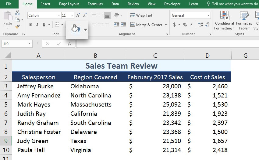
To apply any of these effects, simply highlight the cells that you want to apply the effects to, and then click on the icons on the Font section of the Home tab.
You probably already know what these three tools do, but how should you use them in a spreadsheet? Here are some ideas on how you can apply those styles:
Bold. Draw attention to key cells using bold formatting. Apply bold to totals, key assumptions in your math, and conclusion cells.
Italic. I like to use this style for notes or any text that should be less obvious, or build to a larger subtotal.
Underline. Adding an underline is ideal for a summary cell, like a subtotal or conclusion.
In the example below, you can see a simple financial statement for a freelancer, before and after I apply basic formatting. The combination of bold, italic, and underline effects really make the information more readable.

2. Apply Borders
Borders help to segment your data and wall it off from other sections of data in your spreadsheet. Excel's border tool can apply a variety of borders, but is a bit tricky to get started with.
First, start off by highlighting the cells that you want to apply a border to. Then, find the Borders dropdown menu and choose one of the built-in styles.

As you can see from the dropdown options, there are many options for applying borders. Simply click on one of these border options to apply it to cells.
One of my favorite border styles is the Top and Double Bottom Border style. This is ideal particularly for financial data when you've got a "grand total."
Another option is to change the weight and color of the border. With the bordered cells selected, return to the Borders dropdown menu. The Line Color and Line Style settings can be used to tweak the style of borders.

Thick borders are ideal for setting a boundary for header columns, or the subtotal at the bottom of your data.
3. Use Shading
Shading, also often called fill, is simply a color that you apply to the background of a cell. To shade a cell, click and highlight any cells that you want to add shading too.
Then, click the arrow next to the paint bucket dropdown on the Font tab on the Home ribbon. You can pick from one of the many color thumbnails to apply it to a cell. I also will frequently use the More Colors option to open a fully-featured color selection tool. Light shades are best to keep text readable.
Again, you can highlight key data using shading. As I mentioned earlier, one idea is to use a consistent fill based on the contents of the cell, such as blue for any "input" fields where you manually type data.
Don't overdo it with shading. With too many of these applied to your cells, it distracts from the content that's stored inside the spreadsheet.
4. Change Alignment
Alignment refers to the way that the content in a cell is aligned to the edges. You can left align, center, or right align text. By default, content is left aligned in a cell. When you've got large data sets, you might want to tweak alignment to enhance readability.
One common tweak that I make is putting text on the left edge of a cell, while numeric amounts should be right-aligned. Also, column headers look great when they're centered up at the top.

Change alignment using the three alignment buttons on the Alignment tab on Excel's Home ribbon. You can also align content vertically, adjusting if the content aligns to the top, middle, or bottom of the cell.
How to Use Built-in Cell Styles
One of my favorite ways to style a spreadsheet rapidly is to use some of the built-in styles that Excel has. On the Home tab, click on the Cell Styles dropdown to apply one of the built-in styles to a cell.
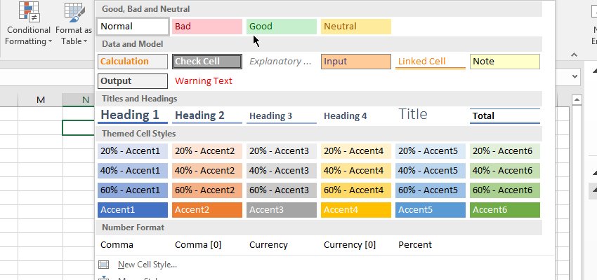
Using these pre-built styles is a major time savings versus designing them from scratch. Use these as a way to take a shortcut to a more meaningful spreadsheet.
How to Achieve Faster Excel Formatting in Excel with Format Painter
Who wants to recreate Excel cell styles over and over again? Instead of recreating the wheel for each cell, you can use the Format Painter to pick up formatting and apply it to other cells.

Start off by clicking in the cell that has the format that you want to copy. Then, find the Format Painter tool on the Home tab on Excel's ribbon. Click on the Format Painter, then click on the cell that you want to apply the same style to.

How to Turn Off Gridlines
As you probably already know, a spreadsheet is made up of rows and columns. Rows are ruled by horizontal lines and have numbers next to them. Columns are split with vertical lines and have letters at the top to refer to them.
Where rows and columns meet, cells are formed. Cells have names for which row and column they intersect. For example, where row 4 and column B meet is called B4.
Gridlines in Excel are one of the defining features of a spreadsheet. They make it easy to follow data across the screen into a cell. These lines are imaginary and only visible on screen. However, you might want to turn off gridlines for a stylistic effect.

Print with Gridlines
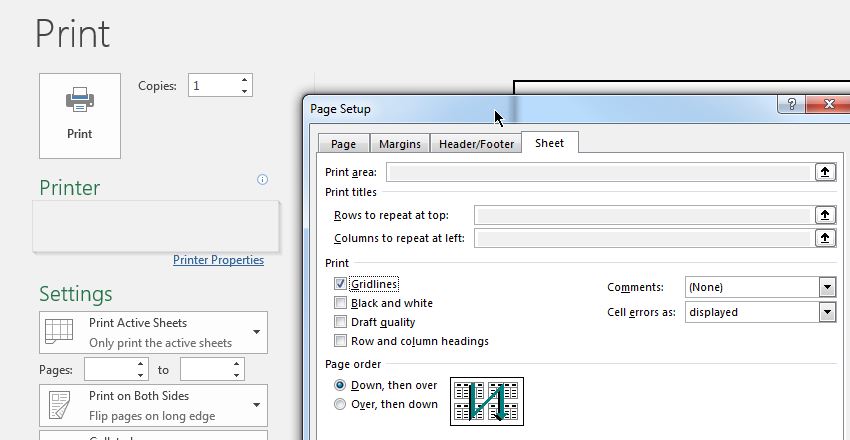
What if you wanted to show gridlines throughout the spreadsheet when you print it? Instead of having to manually add borders to each and every cell, you can simply print your workbook and include those gridlines.
To turn on gridlines when printing, start by going to the Print option. Then, click on Page Setup to open the settings.
On the Sheet tab, tick the box labeled Gridlines to include gridlines when you print your Excel workbook.
Keep in mind that this option will certainly use more ink when printing. However, it also might make it easier to read your printed spreadsheet.
How to Format Excel Data as Table
One of my favorite ways to style a dataset quickly is to use the Format as Table dropdown option. With just a couple of clicks, you can transform a few rows and columns into a structured data table.
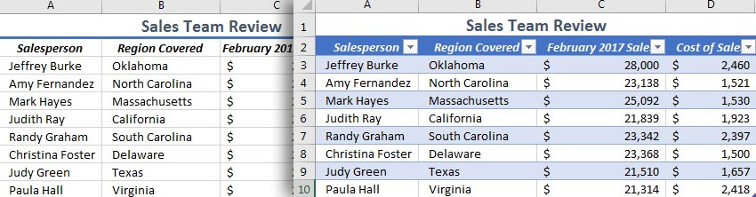
This feature works best when you already have data in a set of rows and columns and want to apply a uniform style. It's a combination of style and functionality, as tables add other features like automatic filtering buttons.
Learn more about why tables are a great feature in the tutorial below:
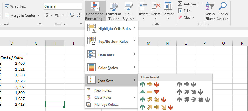
How to Use Conditional Formatting in Excel
What if the format for a cell could change based on the data that's inside of it? This feature is built into Excel and is called Conditional Formatting. It's easier to get started with than you may think.
Imagine using Conditional Formatting to highlight the top and bottom values in your cells. It makes it easy to visually scan your data and look for key indicators.

Conditional Formatting is best used with numerical data. To get started, simply highlight a column of data and make sure that you're on the Home tab on Excel's ribbon.
There are a number of styles that you can choose from the Conditional Formatting dropdown menu. Each of these applies a different style of Excel formatting to your cells, but each will adapt based on the cells that you've highlighted.
Recap & Keep Learning
Spreadsheets are often seen as boring and pure tools of utility. Sure, they're very useful for organizing data or making calculations. That doesn't mean that we can't bring some style and Excel formatting to our spreadsheets.
When we do formatting the right way, it adds a second layer of meaning to a spreadsheet. Formatting isn't a random exercise; it's a way of using targeted styles to signal what type of data is in a cell.
Check out these other tutorials if you want to level up your Microsoft Excel skills and master spreadsheets:
 Microsoft ExcelHow to Insert Slicers in Microsoft Excel PivotTables
 Microsoft ExcelHow to Link Your Data in Excel Workbooks Together
 Microsoft ExcelHow to Protect Cells, Sheets, and Workbooks in Excel
What are your favorite Excel formatting tips? How do you make sure that the right cells stand out to your user? Let me know in the comments section below.
Original Link:
Freelance Switch
More About this Source Visit Freelance Switch