
Some of Our Sources
- Slashdot
- BoingBoing
- Spoon Graphics
- Six Revisions
- Noupe
- 24 Ways
- Specky Boy
- Freelance Switch
- Design Modo
- TechPowerUp
Help Webnuz
Referal links:
Branding and Visual Identity: Wyre Case Study
Branding and Visual Identity: Wyre Case Study
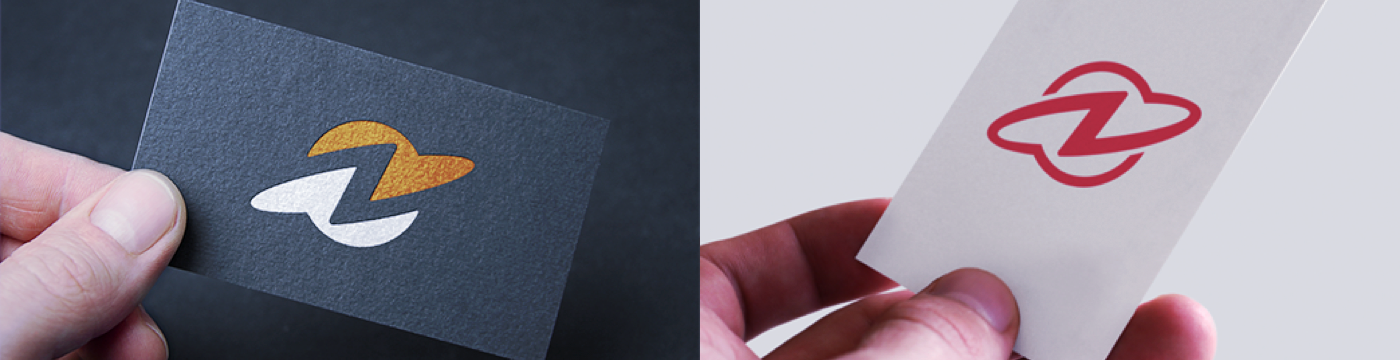
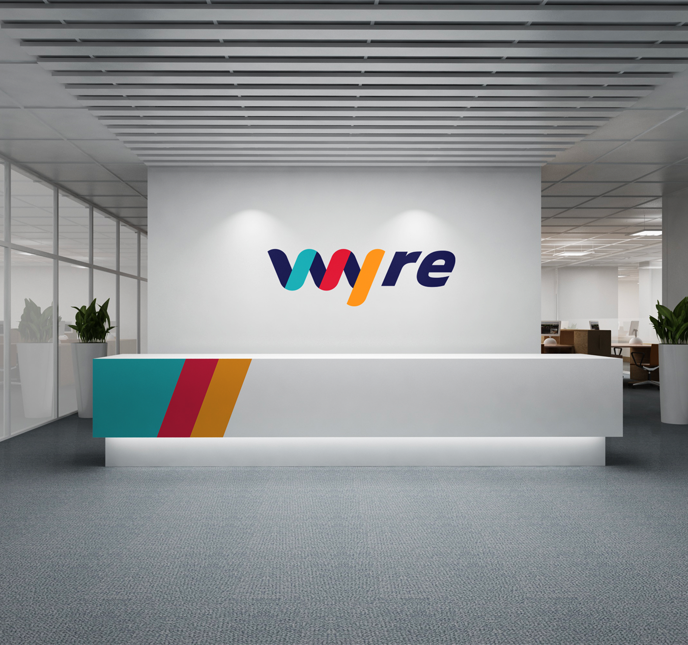
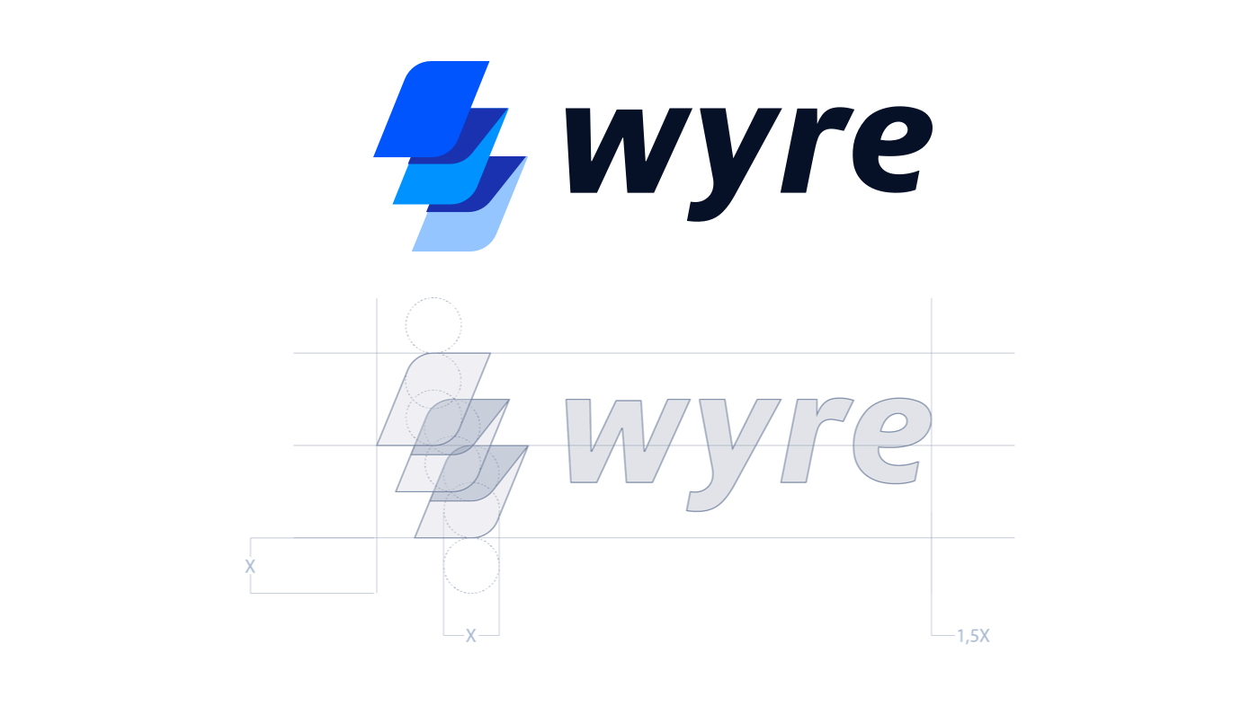
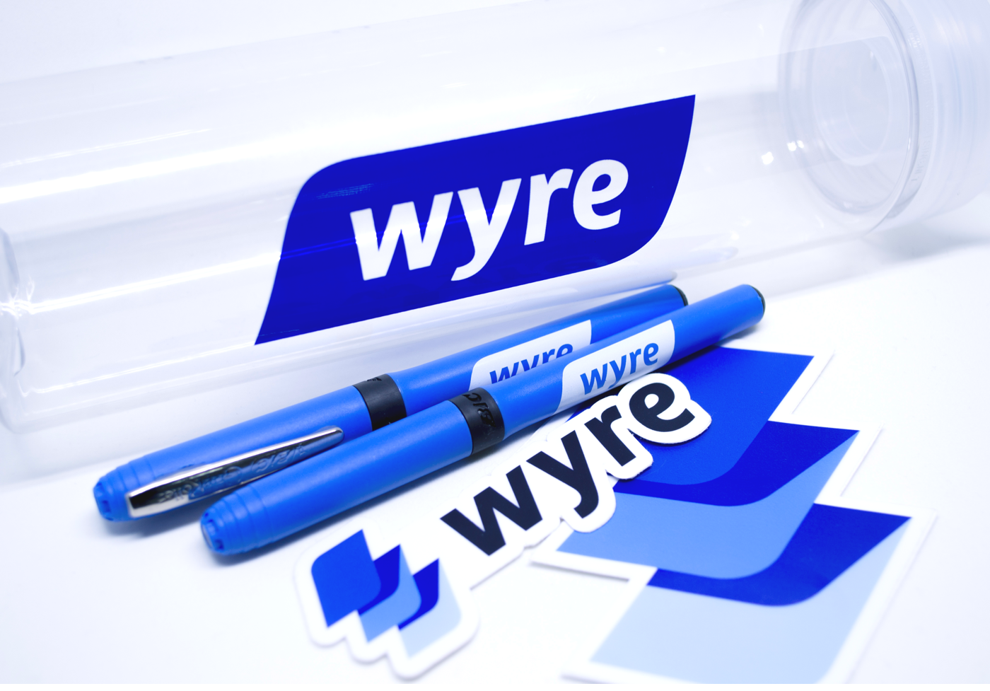
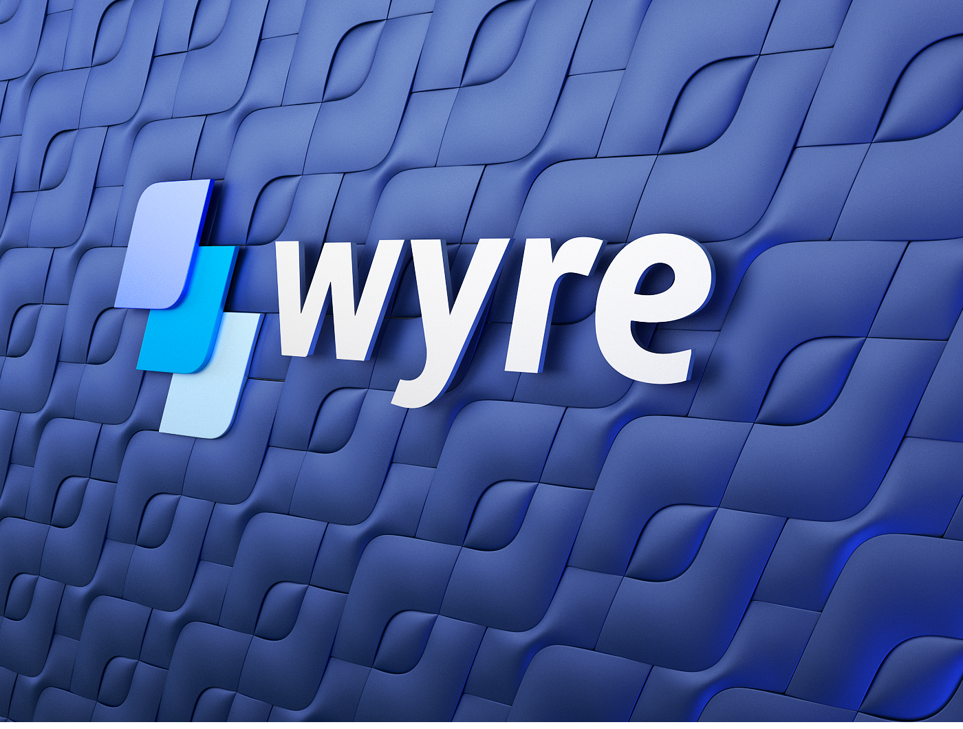
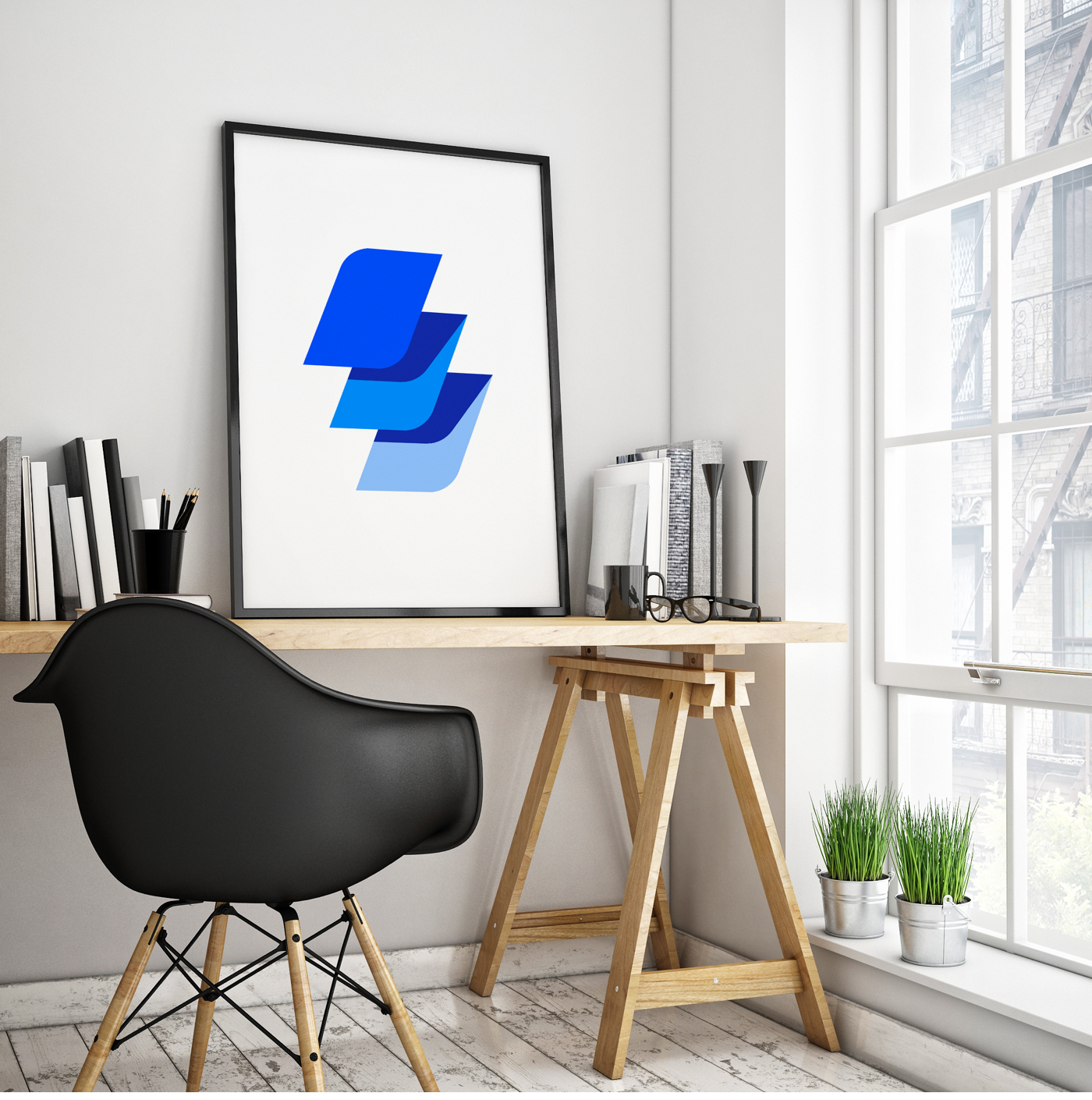
Wyre is a branding and visual identity project shared byRamotion on their Behance profile. It's really nice to see the process behind the constructioon of this visual identitysystem and how some decisions were made during it. Wyre is an enterprise-level API which allows companies to instantly send funds worldwidewithout taking on any price volatilityand for a fraction of the cost.The ultimate task was to re-brand Snapcard asWyre and design a dynamic branding language yet reflecting a trustworthy and stable feeling.
Brand Attributes
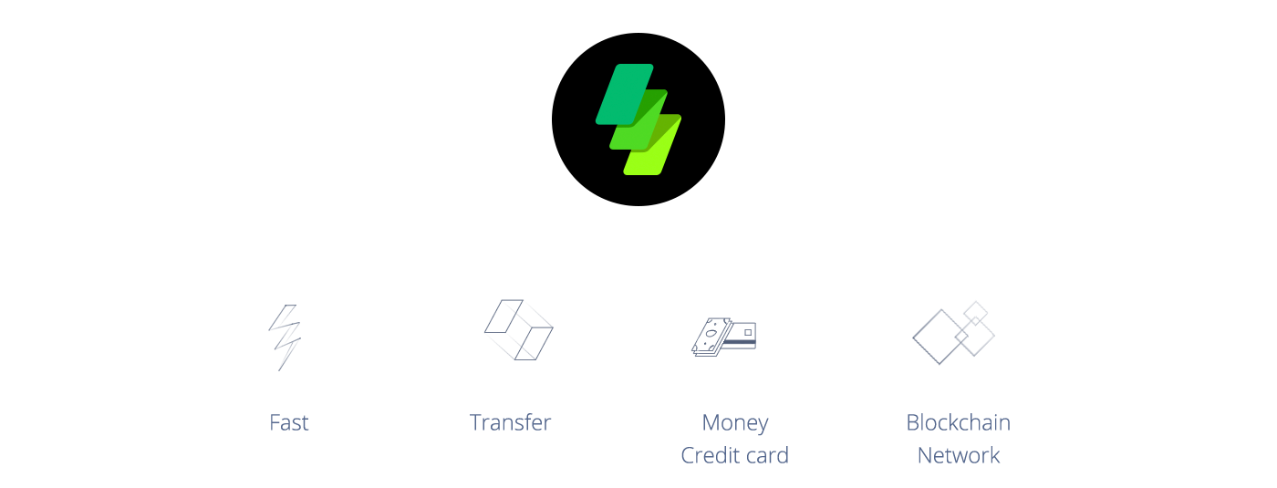
Each process starts with an understanding of a product's uniqueness and value.
To help a client figure out core values that need to be reflected in branding, we do an exercise with attributes. We brainstorm and write down as many attributes as possible and then select a few items that workthe best.
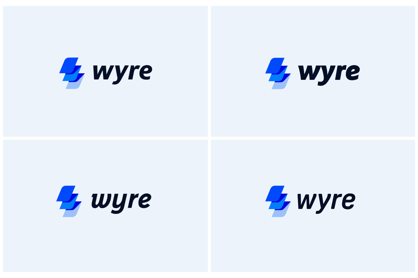
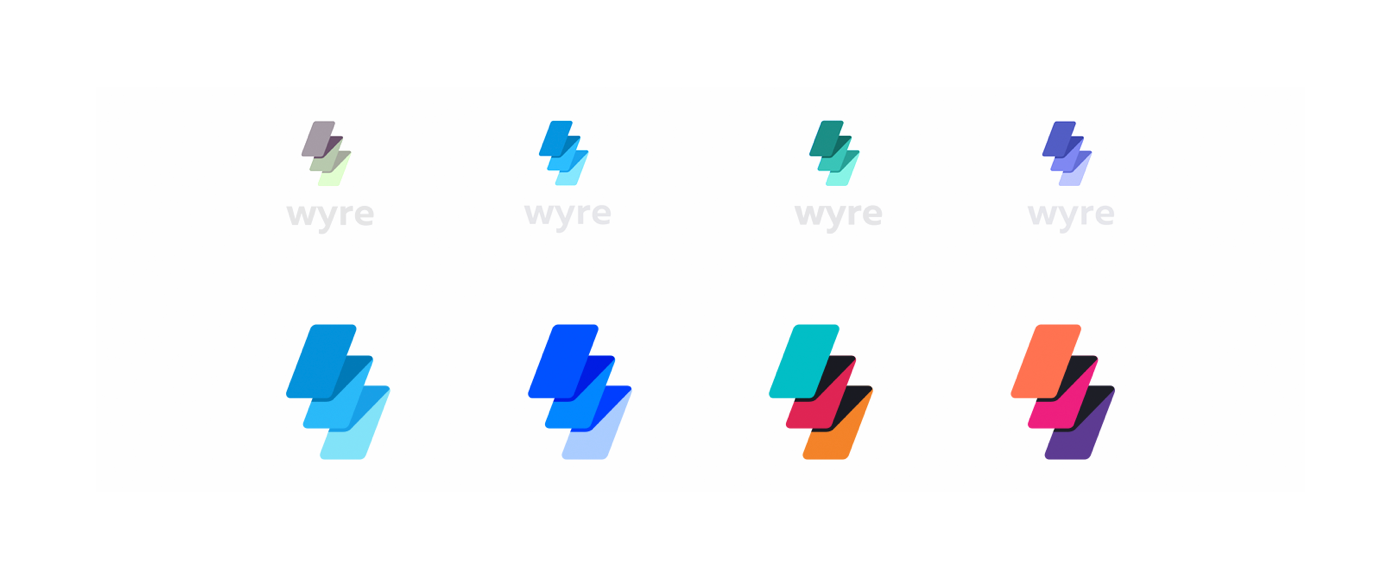
Branding

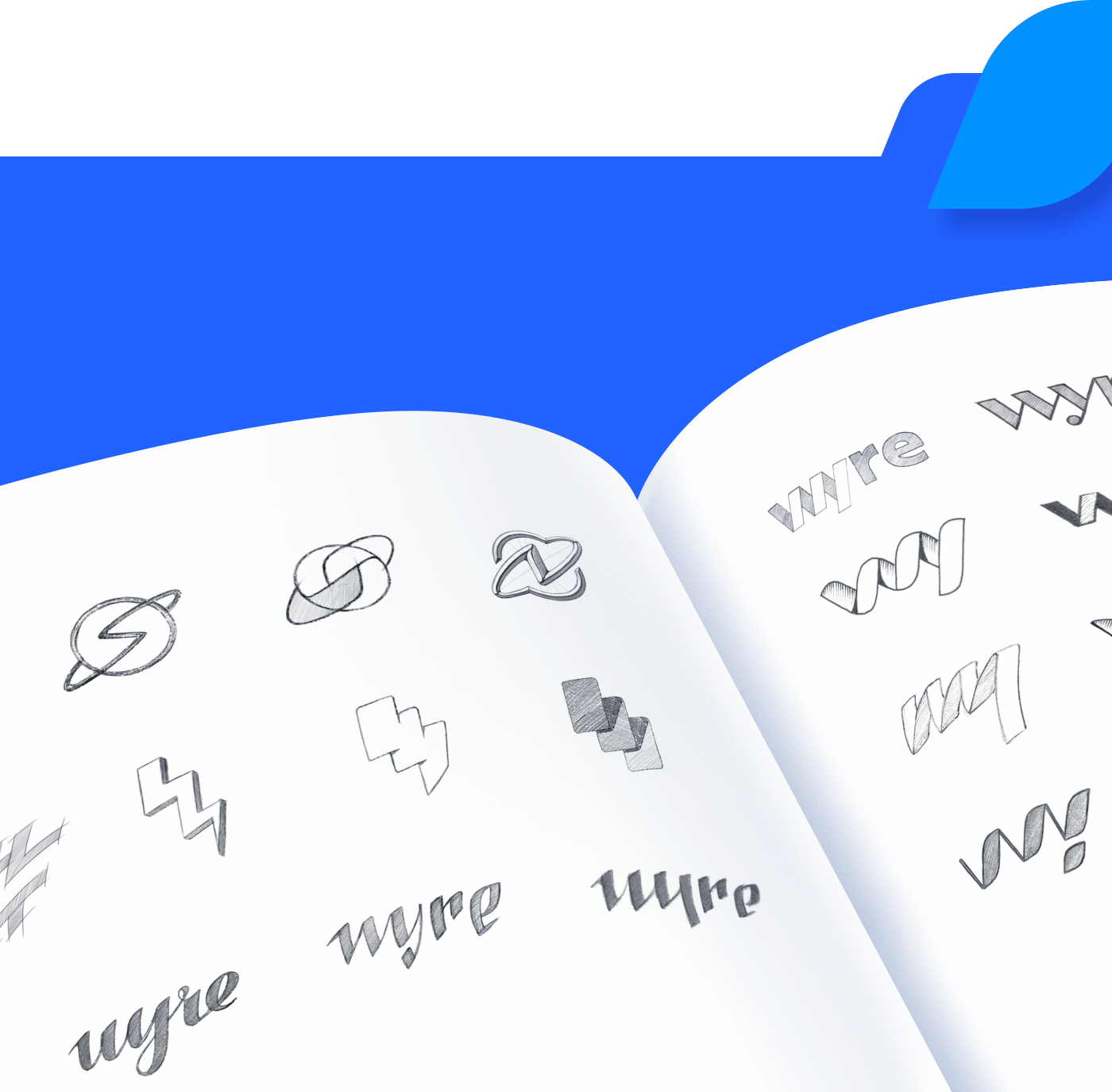
We quickly found a few promising directions. Next, we spent time exploringa few selecteddirections, testing them to make sure our final decision was justified.

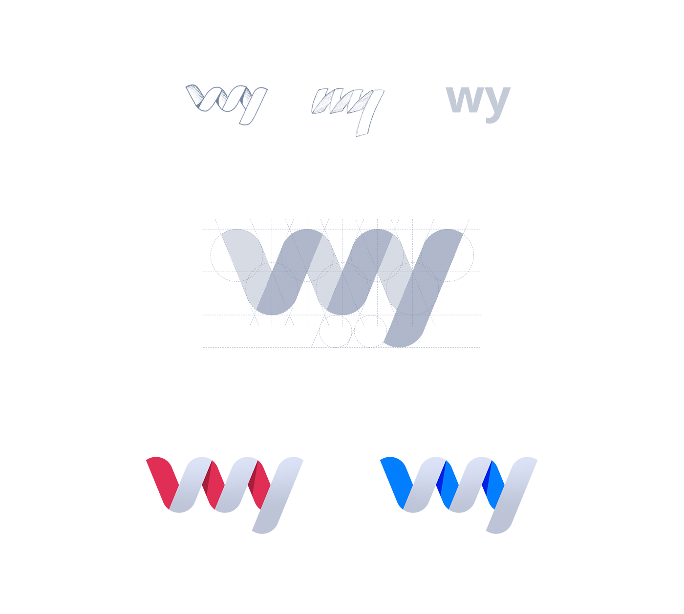
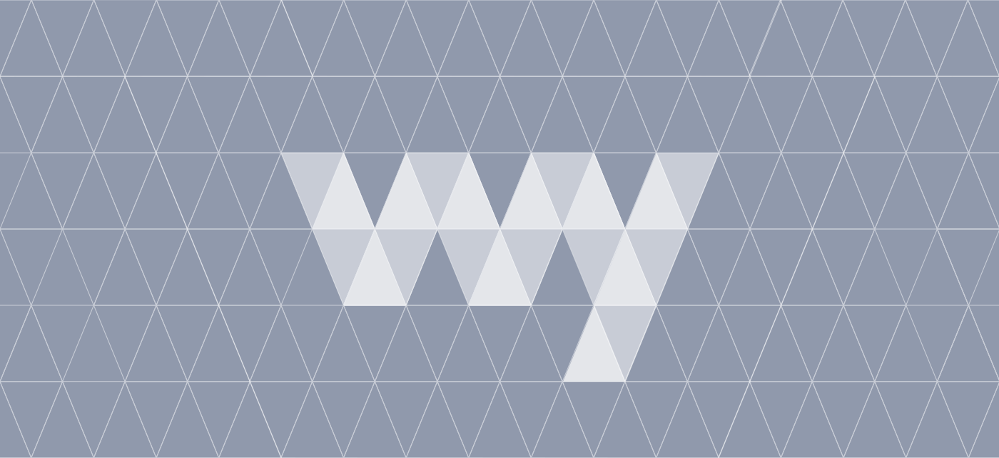

After all testing and discussion, we made a important decision to evolve the direction with a stack of cards. This option had the best potential and reflected the logic of how the product works. This is the most crucial moment in each visual identityprocess.


Ramotionis UX design agency and branding firm specializing in visual identity, mobile apps, and web design for startups and businesses. For more information check outhttps://dribbble.com/Ramotion
Original Link: http://feedproxy.google.com/~r/abduzeedo/~3/pMY7NHcQ0cY/branding-and-visual-identity-wyre-case-study
Abduzeedo
 Abduzeedo is a collection of visual inspiration and useful tutorials
More About this Source Visit Abduzeedo