
Some of Our Sources
- Slashdot
- Creative Curio
- Inspiredology
- Web Design Ledger
- Wal You
- CSS Tricks
- Spyre Studios
- Web Resource Source
- Hashedout
- The Verge
Help Webnuz
Referal links:
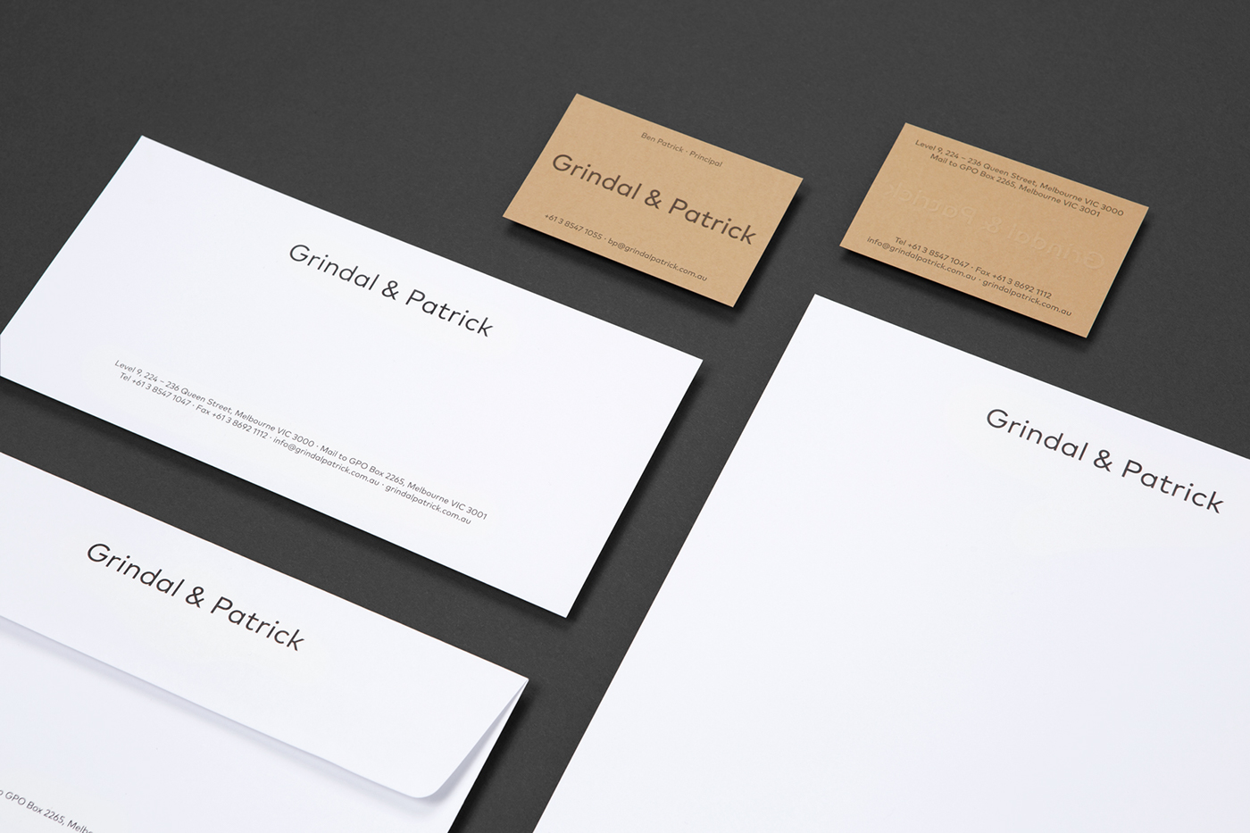
Branding and Visual Identity: Grindal & Patrick
Branding and Visual Identity: Grindal & Patrick
Grindal & Patrick is a branding and print design project shared byMildred & Duckon their Behance profile. It's a simple branding for a law firm, but that doesn't mean it's ordinary. In the end it's all about the presentation and I thinkMildred & Duckdo an excellent job at focusing on the details of the print quality, paper, emboss and colors. I am a fan of this type of project because at first it seems easy to be done, but when you try, you realize that it's much harder than you assumed. In my case, most of the times, when I try to create something simple, there's always this feeling of that design is not complete, something is missing. Anyways, check out this beautiful branding project.
Grindal & Patrick is a law firm that take a unique and modern approach to their practice. We created a visual identity to personify the firms philosophy of transparency and clarity, using a color palette that is contradictory to those typically seen in the industry. The resulting identity is warm and approachable, with letterpress finishes and tactile paper stocks, balanced with a simple and honest visual language that reflects the Grindal & Patrick ethos.
Branding and collaterals


Mildred & Duck is a Melbourne-based graphic design and communication studio established by Sigiriya Brown and Daniel Smith. We design for print, digital and environmental media, creating solutions that communicate and connect with people. For more information check out:https://mildredandduck.com/
Original Link: http://feedproxy.google.com/~r/abduzeedo/~3/aCxywVcqvK4/branding-and-visual-identity-grindal-patrick
Abduzeedo
 Abduzeedo is a collection of visual inspiration and useful tutorials
More About this Source Visit Abduzeedo